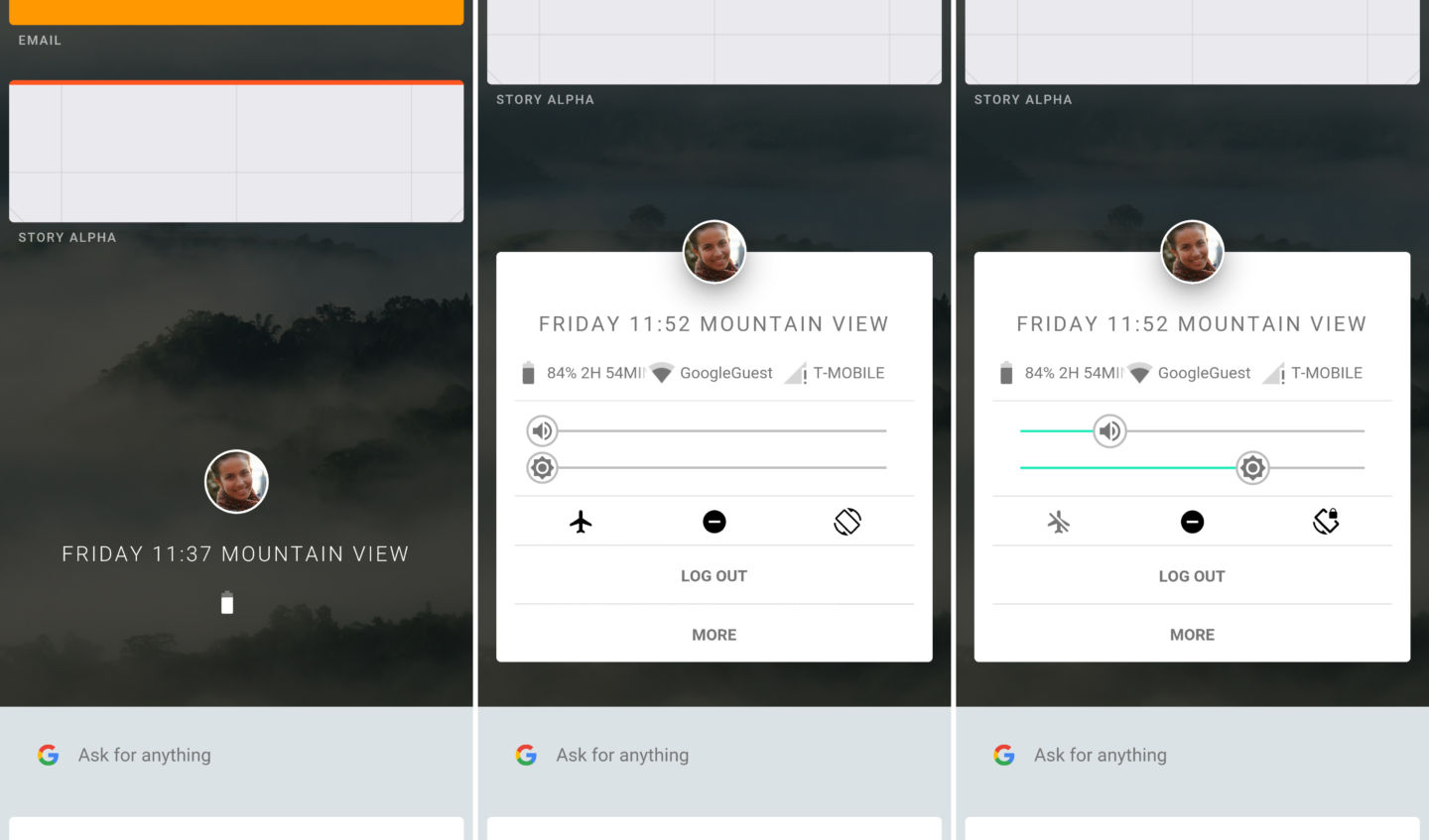
Today, we got a first look at a brand new operating system that Google has been building called Fuchsia. Although we do not know what Google plans to do with this new OS, the pre-alpha build does give us a quick peek into how it may work one day when completed. What do you think of Fuchsia’s user interface so far?
The biggest difference between Fuchsia and Android (besides how it looks) is the underlying software. Android runs on top of a custom Linux base while Fuchsia is powered by Google’s “Dart” programming language. What this means is that instead of having to work around Linux, Google can use its own in-house software and make the mobile operating system do almost anything it might like.
From what we’ve seen, Fuchsia looks to have taken UI influences from Material Design, Chrome OS, and even some aspects of Android. The main screen shows the user’s profile and allows the user to jump into a quick settings section. From here, a swipe down offers what looks like a card-based application drawer. A swipe up from the profile page brings up what looks like a Google Search section that offers recommendations similar to Google Now.
Obviously, Fuchsia is far from complete. While the video embedded below shows a walkthrough of the OS in which everything looks polished and smooth, this build is more of an outline of what is to come than anything else. We will most likely have to wait quite a while before we see Google potentially do anything with Fuchsia.
So, what do you think of Fuchsia? Do you think it will beat out Android in the looks department? Answer the poll below and let us know your thoughts in the comments!
FTC: We use income earning auto affiliate links. More.


Comments