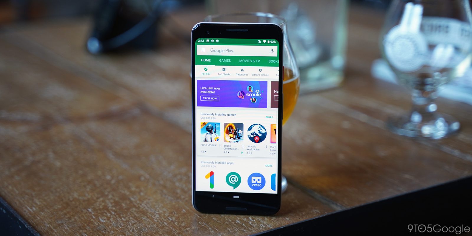
The Play Store is available on a variety of form factors, like phones, tablets, and Chromebooks. To make the browsing experience more consistent, Google Play is enforcing a new icon design specification in app listings.
Instead of allowing “freeform” icons, like circles and stars, against a transparent background, the Play Store is moving to a rounded square shape. This “uniformed” square with rounded corners is “visually more appealing and easier to digest.”
They help users focus on the artwork, as opposed to the shape. They fix alignment issues caused by random open space to better present surrounding information, such as the title, rating, and price.
The goal is to “bring consistency and a cleaner look to Google Play,” including on different UI layouts, form factors, and devices. This specifically refers to the Play Store on Android phones and tablets, as well as Chromebooks.

- Icon assets will remain the same size (512 x 512), but transparent backgrounds will no longer be allowed.
Google Play on Android and Chrome OS will dynamically apply rounded corners and drop shadows to icons. - The corner radius will be 20% of the icon size, to ensure consistency at different sizes.
This new design specification is coming into effect over the coming months. In early April, developers can begin uploading new icons to the Google Play Console. By May 1st, old icons that don’t meet the standard will not be accepted.
On June 24th, new icons must be added, or Google will automatically convert original icons to a “legacy mode.” This will place your existing icon of any shape into a white rounded square.
Google notes that “this does not affect your APK launcher icons for Android.” It’s intended for the Play Store on Android and Chrome OS, with no changes on Auto, TV, and Wear platforms. Google has posted guidance and resources for developers updating their app icons with respect to attributes, sizing, shadows, corner radius, and badges.

FTC: We use income earning auto affiliate links. More.


Comments