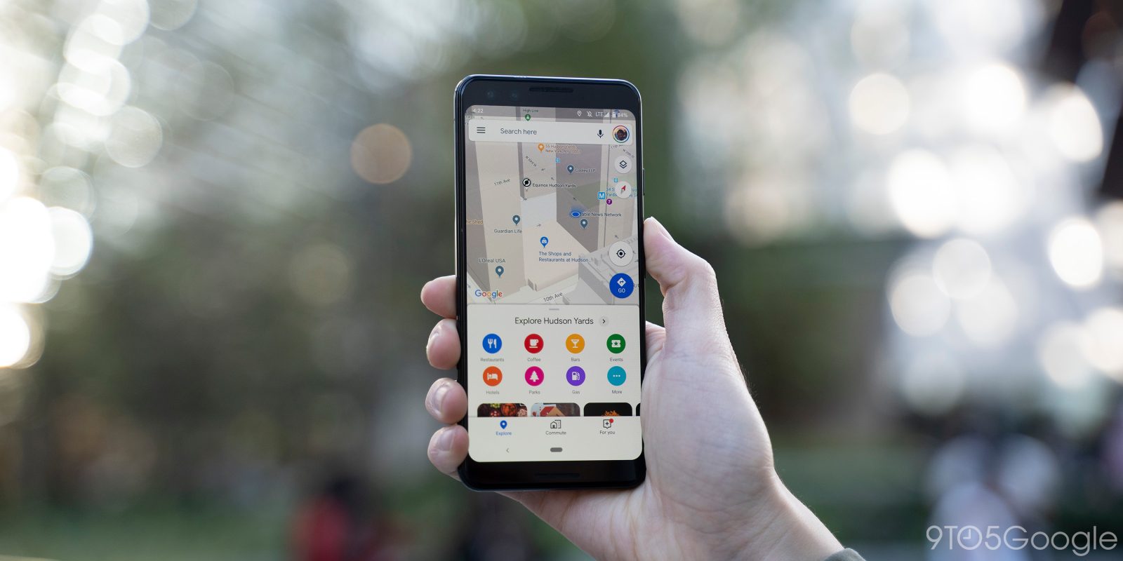
Discovery is a big focus for Google Maps as evident by the Explore and For you tabs. The Android app is now testing a carousel of search shortcuts right underneath the main lookup field.
This carousel replaces the grid of eight colorful icons that were accessible by swiping up the “Explore” sheet. Usually hidden by default, Google Maps is testing a new UI that’s always visible.
Underneath the search field are eight pills that dynamically update and are accompanied by Material Theme icons representing the category. That said, it’s pretty likely that “Restaurants” will be the first button. Other items include Coffee, Bars, Events, Hotels, Parks, and Gas.
Tapping immediately performs a query, while the last item in the Google Maps search shortcuts carousel is “More.” This opens the full list of “Categories” sorted by: Food & Drink, Things to do, Shopping, and Services.
These new Google Maps search shortcuts — resulting in a double bar look — somewhat clutter the screen, especially on older devices that do not have taller aspect rations. However, it is convenient for always being on display and saving users from having to type.
This new design is live on three devices (thanks Jonas) around the world running version 10.28.2 that we checked this afternoon. However, the redesign of search shortcuts are not live on all phones, and not yet available on the iOS client.
More about Google Maps:
- [Update: Rolling out] Google Maps incognito mode comes to Android this month, iOS ‘soon’
- Pixel 4 disables 90Hz display for these four apps, including Google Maps
- Maps adds more driving incident reports on Android, brings to iOS
- Google Maps adding detailed voice guidance for walking directions
FTC: We use income earning auto affiliate links. More.


Comments