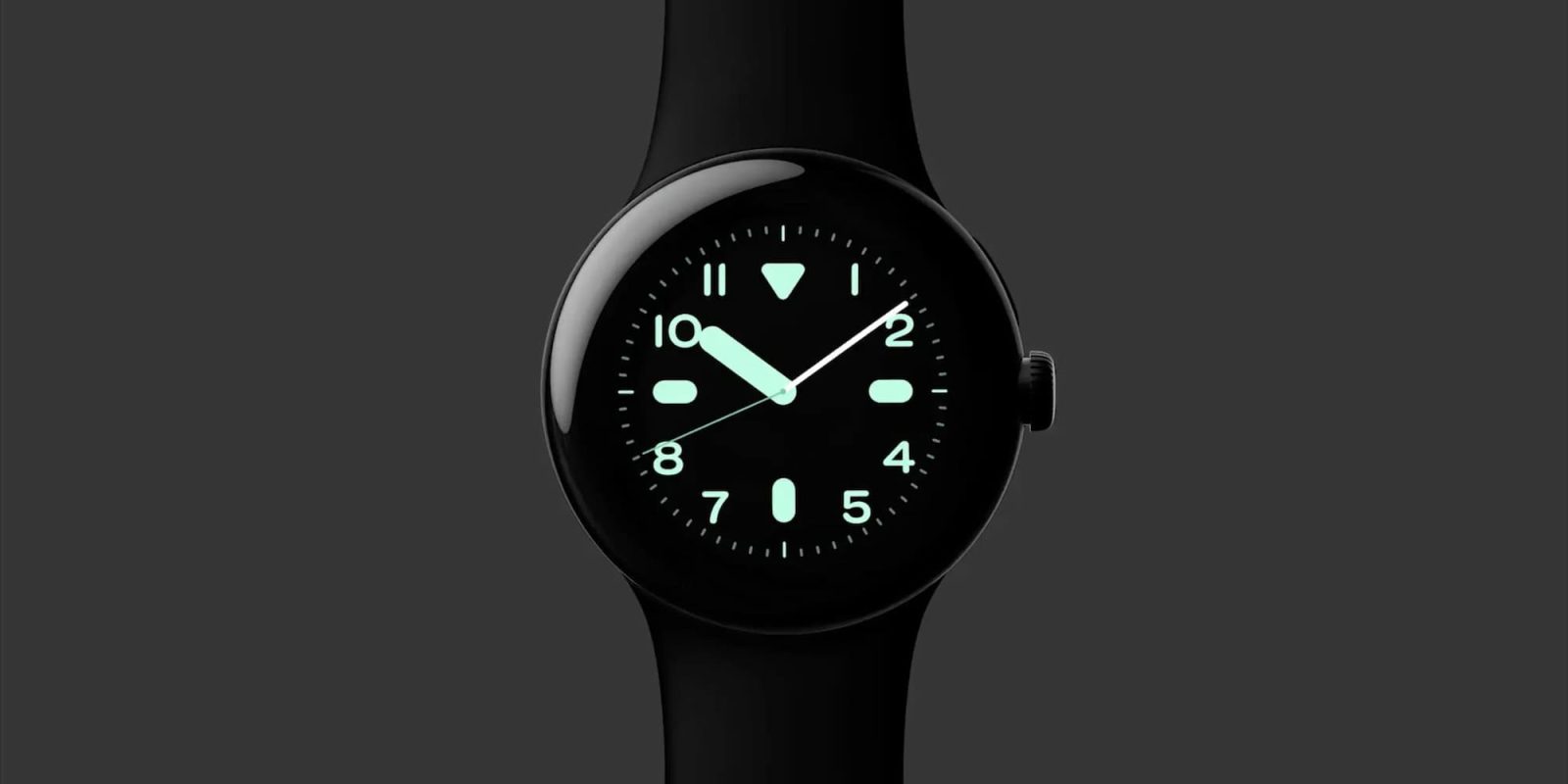
The Pixel Watch is a product that’s been developed for years, and is finally set to arrive in just a week. But as we approach the long-awaited arrival, new details give cause for hesitation. Recently, teaser videos posted by Google are raising questions around the thickness of the screen bezels on the Pixel Watch.
Google updated its own teaser video with smaller Pixel Watch bezels
Last week, Google posted a teaser video for the Pixel Watch which showed off some new watchfaces and hardware details, but that same teaser also seemingly showed off huge bezels around the circular display.
As pictured above, that one watchface in particular caught a lot of attention for seemingly showing the bezels as very, very thick.
But it seems that was a mistake on Google’s part, as the same Pixel Watch teaser posted to one of Google’s channels in Taiwan shows the same watchfaces, all with smaller bezels. The change isn’t drastic, but it certainly shows how a minor move in either direction for the bezel makes a big difference in the final look.
The altered size was spotted by a Redditor, and we’ve put side-by-side versions of each watchface below so you can see the difference (before on left, after on right).
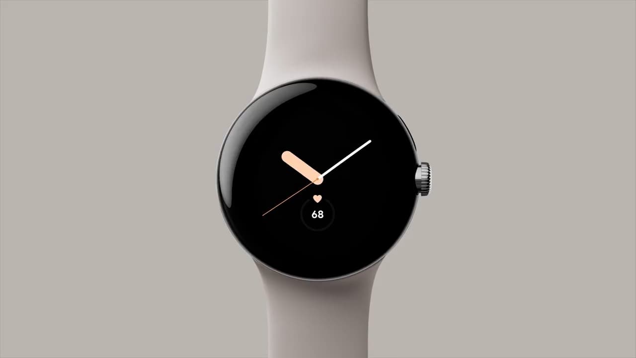
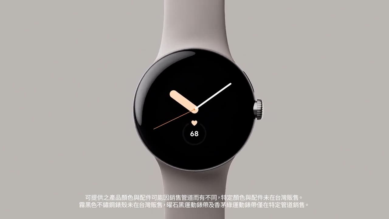
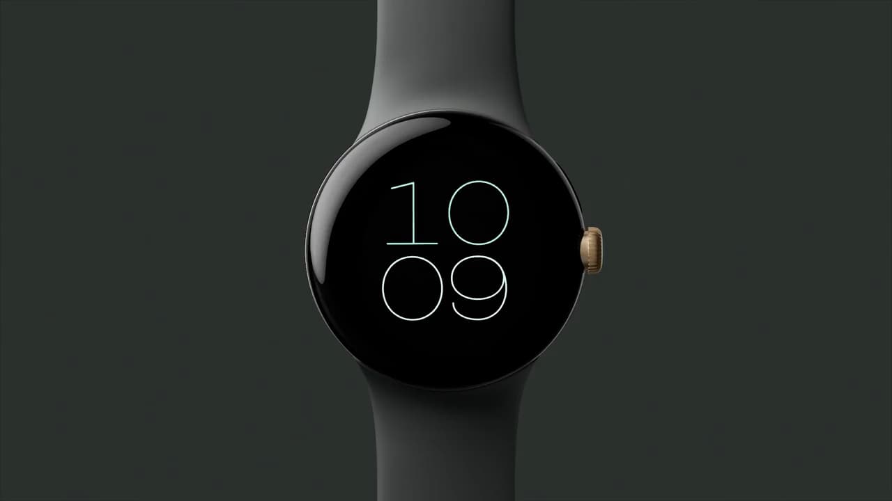
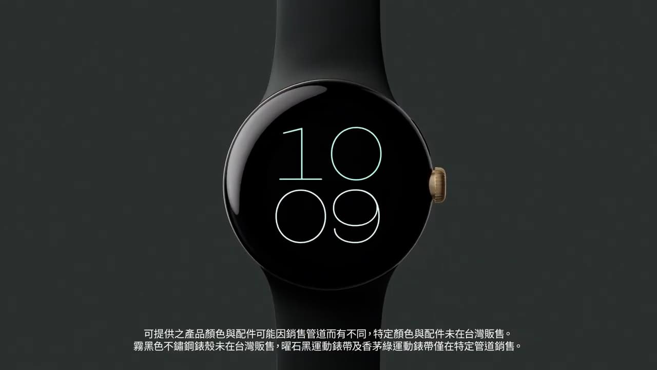
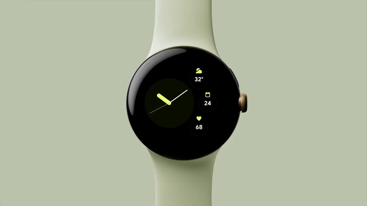
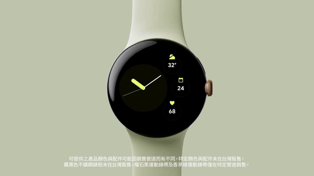
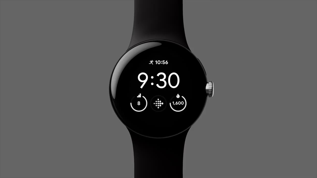
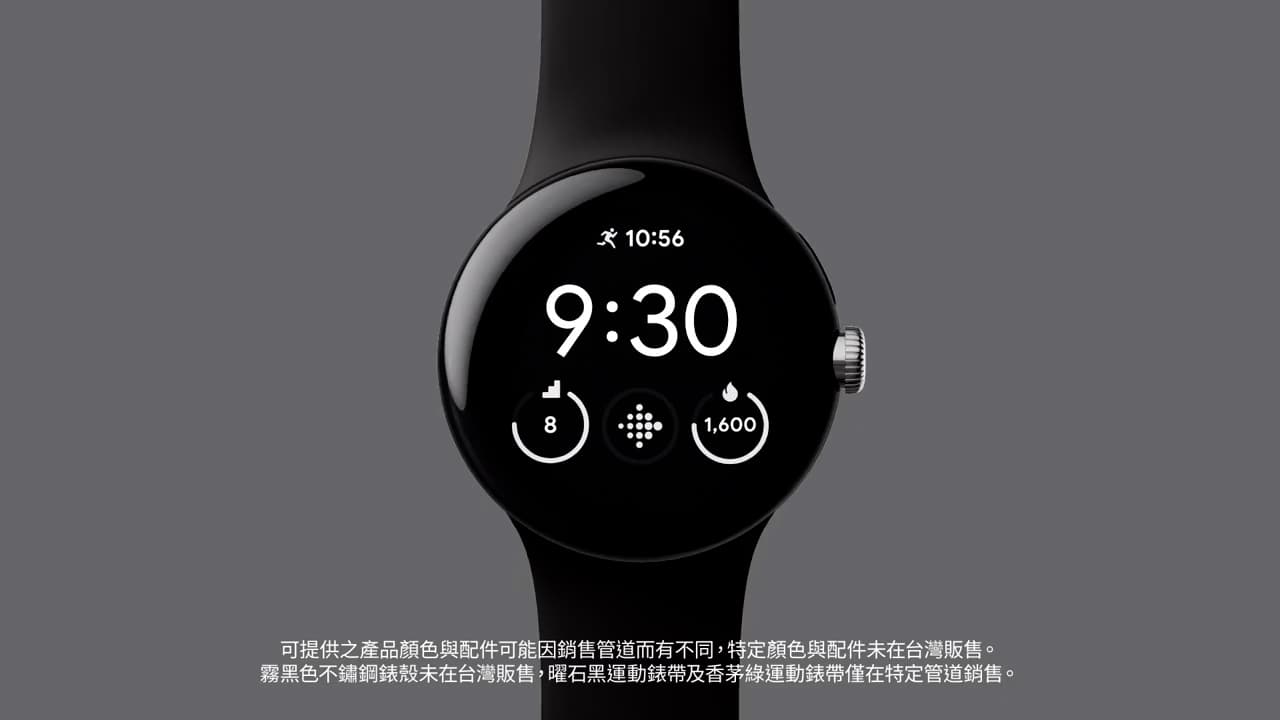
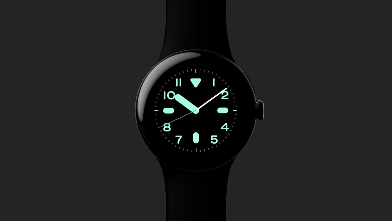
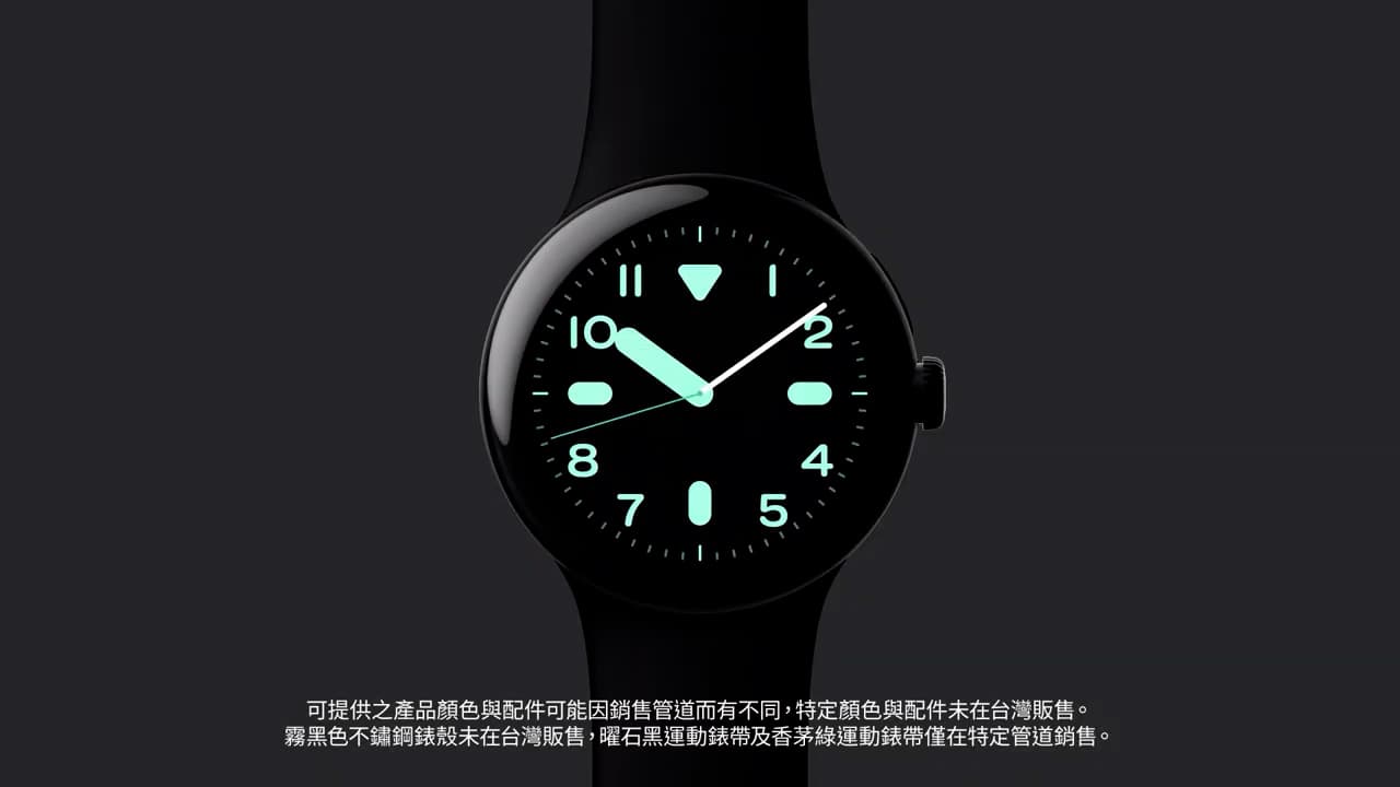
As you can see, these are pretty distinct differences overall. But as Droid-Life was quick to point out, it’s still hard to know for sure which one of these videos is correct. But we can look to previous marketing images for more context.
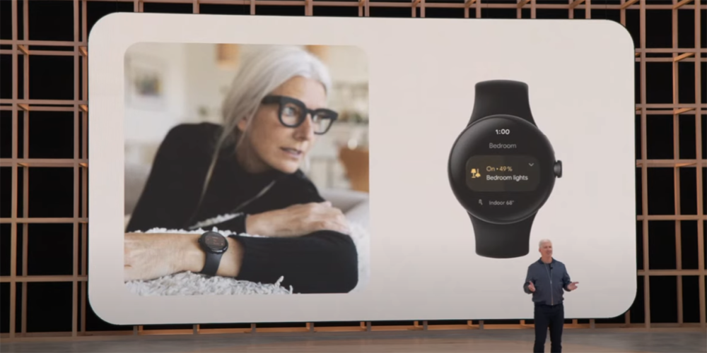
For example, this shot of the Google Home app on a Pixel Watch from Google I/O shows bezels that are way closer to the new teaser than the original one.
Do you think Pixel Watch bezels are too big?
Bezels are always a touchy subject on technology, and on wearables in particular. So where do you stand?
Personally, I’m not against the look of the bezels in most of the teasers we’ve seen so far.
They’re certainly a lot thicker than the Apple Watch, but they seem well within the realm of reason when looking at the Galaxy Watch 5 and other round-face competitors. For a first-generation smartwatch, it’s not bad at all.
Plus, Wear OS is a dark-theme OS, and that should hide the bezel size for the most part. I also think that having an edge-to-edge screen wouldn’t be particularly pleasant from a usability aspect considering the “dome” design of the Pixel Watch.
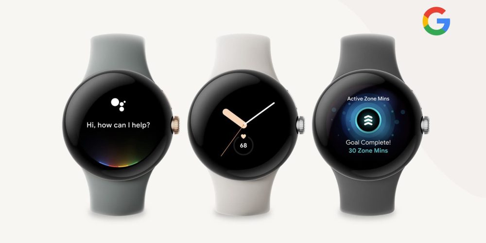
Google’s original teaser this week showed bezels that were too thick, but it seems that was a mistake. We’ve seen far more showing bezels that are thinner and more reasonable than we have this super-thick version, as shown above.
But what do you think? Even looking at Google’s revised teaser and the other marketing shots, are Pixel Watch bezels too thick?
More on Google Pixel Watch:
- Source: Google Pixel Watch to start at $349.99 in these colors
- On the wrist: Here’s Sundar Pichai wearing the Pixel Watch [Gallery]
- Black Pixel Watch will have a matte finish as case colors vary by country
FTC: We use income earning auto affiliate links. More.


Comments