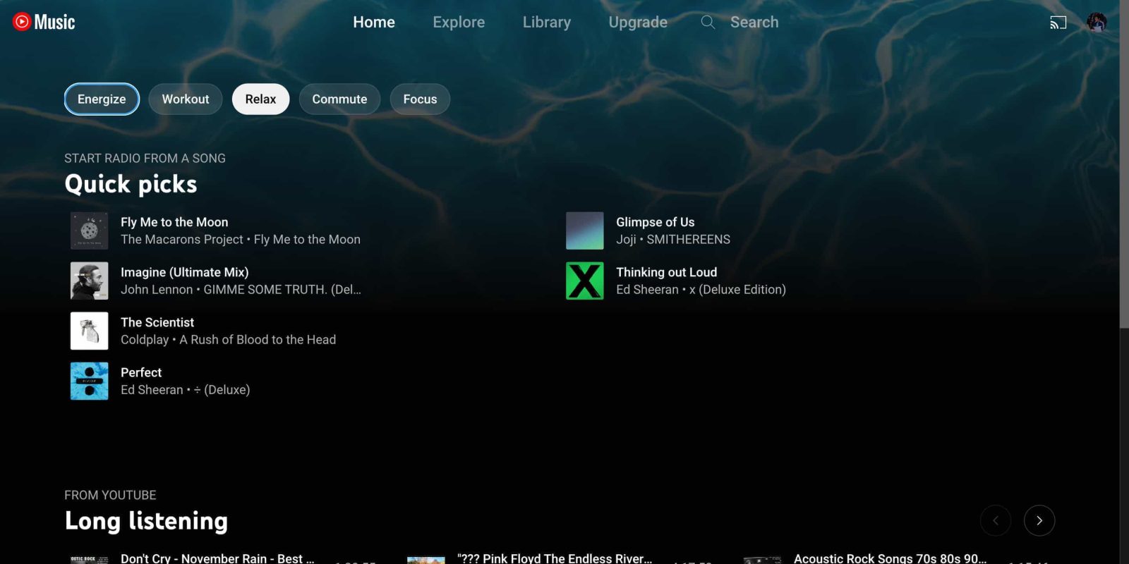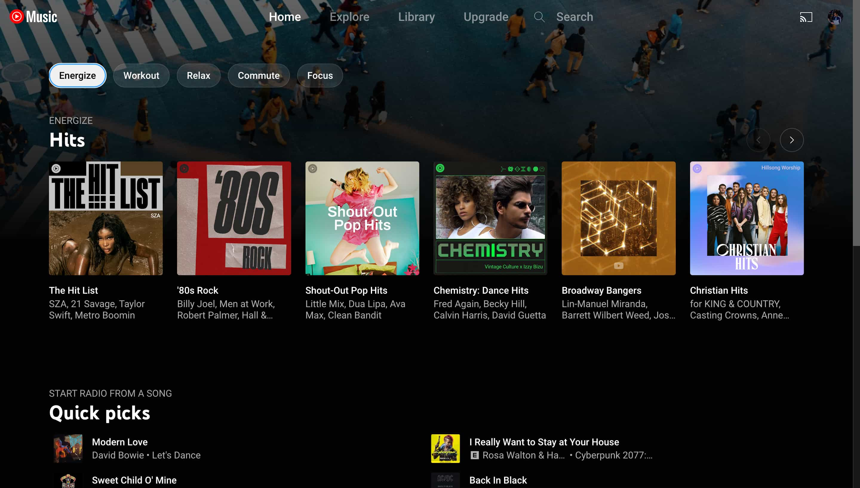
In November 2020, YouTube Music introduced an “activity bar” with various moods to tune what appears in the Home feed, and it’s now available on the web.
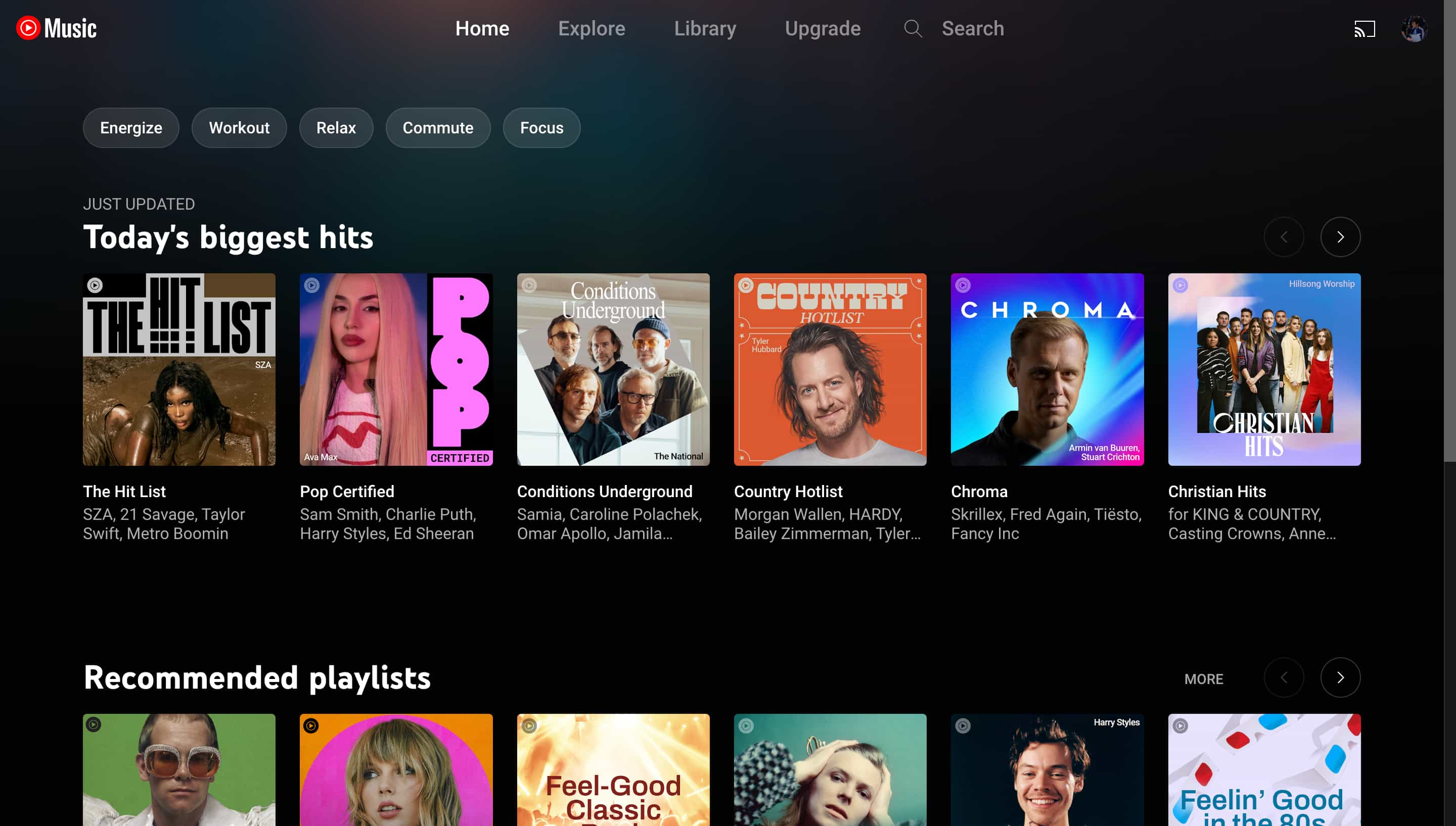
On the web, it’s left-aligned (like on tablets) and appears underneath the app bar where you switch between Home, Explore, Library, and Search. Pill-shaped buttons, instead of rectangles with rounded corners, are used for a less Material You look.
Selecting one — Energize, Workout, Relax, Commute, and Focus — updates YouTube Music with a feed of songs, albums, and playlists that matches the mood. YouTube Music also updates the background image at the top. To go back to the main feed, click the mood you selected again.
Meanwhile, YouTube Music on the web added a gradient similar to the mobile apps in recent weeks, though it’s much more subdued. The Library tab on the web was also redesigned to match the big mobile revamp.
In other news, the Now Playing screen on Android remains stuck on the older UI. This suggests an intentional rollback instead of a bug.
More on YouTube Music:
- YouTube Music goes down in partial outage [Update: Fixed]
- New YouTube Music Library removes ‘Downloaded songs’ playlist
- YouTube Music ‘Listening Room’ beta program launching [Update: Sign-ups closed]
- YouTube Music finally rolling out Library redesign on Android and iOS
FTC: We use income earning auto affiliate links. More.


Comments