In addition to a new Search tab that is rolling out slowly, Google’s upcoming Play Store redesign brings a persistent bottom bar.
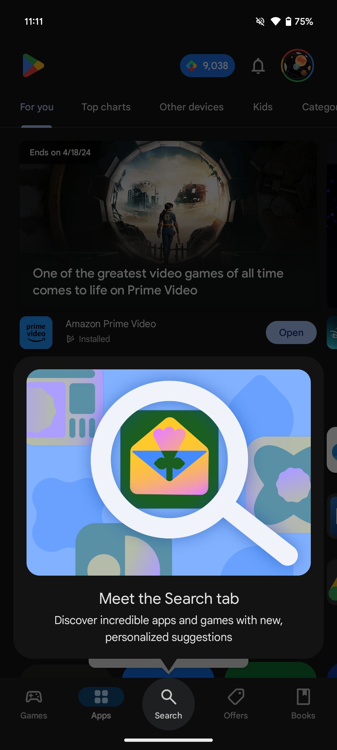
Once rolled out, you’re greeted with a “Meet the Search tab” prompt (“Discover incredible apps and games with new, personalized suggestions”). The new section appears in-between Apps and Offers, with a slick rotating magnifying glass animation upon selection. When you’re in the new tab, you can tap the bottom bar icon again to quickly launch the actual search UI.


The top of the Games, Apps, and Offers feeds now show the Play Store logo at the left, while the account switcher and notification bell is at the right. There’s also a persistent Play Points counter. Notably, the Books tab is unchanged and the search bar remains in place. At this point, it feels somewhat tacked on and probably better left to the Google Play Books app, which recently got a Material You redesign.
Search is split into four sections. “Discover” shows suggestions related to recent queries. “You might like,” “Explore Games,” and “Explore apps” are filled with a grid of search term cards.


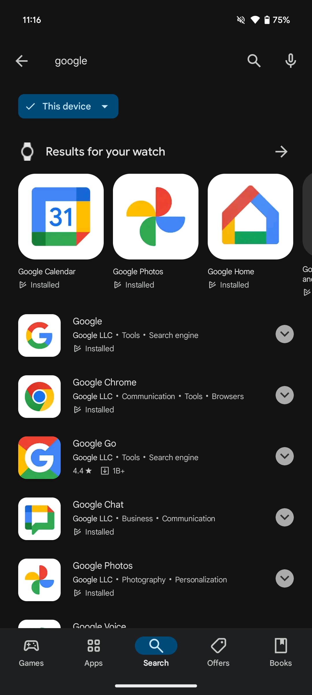
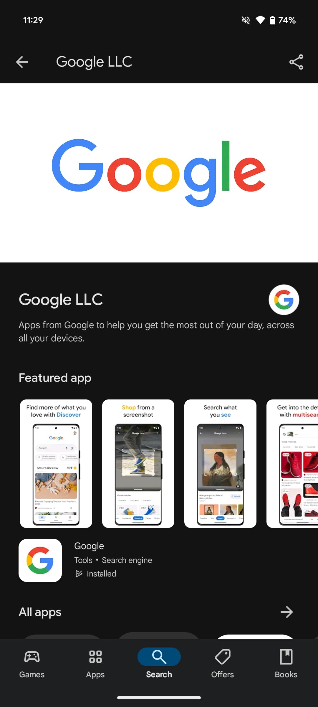
When you actually search, you’ll notice that the bottom bar is now persistent. It also remains visible when you open app listings and developer pages, which should let you move around the app much quicker but makes for an interesting look.
The Search tab redesign with the persistent bottom bar is now yet widely rolled out to Google Play Store users.


More on Google Play:
- Google Play Store bug removes ‘My apps’ shortcut
- Google Play Pass subs have grown 120% in the past year, 220M Play Points users
- Google Play details ‘external offers’ program for Android apps in Europe
FTC: We use income earning auto affiliate links. More.


Comments