
Since the debut of Material Design, Google’s designs have been my favorite. However, it’s been quite a long time since Material Design first landed, and the look of various Google apps is starting to get stale. With Material Design 2 supposedly on the horizon, we’ve been curious what the company has in store, and thanks to a new concept, we can imagine what that will look like…
So far, our looks at Material Design 2 have been limited, to say the least. Things such as a refreshed Google Chrome and the new rounded elements in Android P have given us some insight on Google’s general direction as far as design is concerned.
Using that coming version of Android as a baseline, designer Morphicsn0w put together some concepts for what the future of the Google Play Store could look like with this new design in tow.
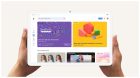
Provided exclusively to 9to5Google, these concepts show off what Google Play’s Android app could look like if Google gave it a major redesign for Material Design 2. Obviously, rounded elements are front and center with this design, with everything from trending apps to section dividers having rounded elements. This is something we’ve seen in the Wear OS companion app as well. The UI is largely white, which many may find controversial, though.
Digging further into the app, this concept also shows off the search and app listing pages. On an app listing, there’s a lot more color with inline ratings, download totals, app size, and an install button. There’s also a clear changelog, as well as obvious shortcuts for viewing app information and reviews.
On the search page, the UI is again largely dominated by the white color scheme. Rounded elements are once again seen throughout the concept, with a highlighted app at the top with quick information and an install button easily accessible. Under that, there are quick filters for the remaining results, as well as different categories.
These are all just concepts, which means there’s absolutely nothing that hints at Google actually developing this design, or anything like it. However, with what we’ve seen in Material Design 2 and Google’s various other recent moves in UI design, something like this seems entirely possible.
9to5Google’s Take
Personally, I’m a massive fan of this look. The clean layout is nice, and even though the entire UI is white, I think it’s very good for usability with the added filters and quickly accessible information. If Google brings anything like this to its own design, I’ll be absolutely ecstatic.
What do you think of this design? Would you want Google to bring it to its own design? Drop a comment below and let us know!
Be sure to check out the rest of Morphicsn0w’s work on Reddit.
Check out 9to5Google on YouTube for more news:
FTC: We use income earning auto affiliate links. More.

Comments