
Following Gmail earlier this week, the latest G Suite app to get the Google Material Theme is Google Voice. The core navigation and user experience of the VOIP service is unchanged, but this update does provide a clean refresh.
The most notable change is the new animated bottom bar that makes use of Google Material Theme icons characterized by bold outlines and hollow interiors. When selecting a tab, the currently selected icon moves upward to make room for the text label that otherwise disappears when not in view.
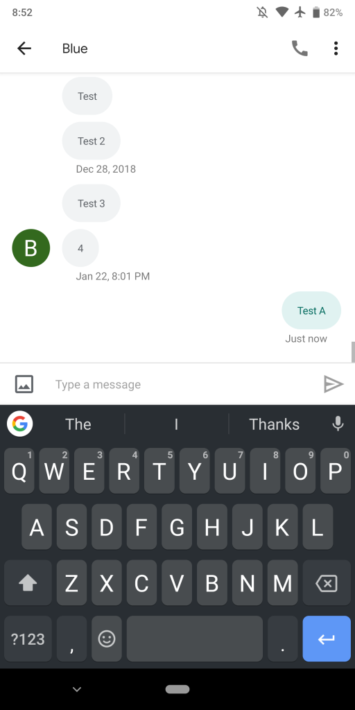
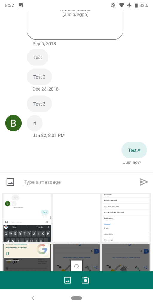
Meanwhile, the compose FAB when in the Messages tab is now a pencil instead of a text bubble. Refreshed icons for Gallery and Send are also present in conversation view.
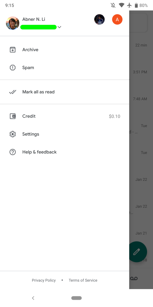
At the very top of Google Voice is a new full-width field to “Search messages & contacts.” On initial load, the Google Voice logo briefly appears and then animates out. It replaces the app bar that previously noted what section you’re currently viewing. A hamburger icon is at the left, with the navigation drawer fully revamped.
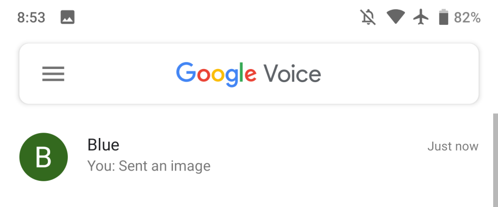


The account switcher no longer makes use of cover images and is more compact. Expanding lists all your available accounts, as well as shortcuts to add another or manage the ones on your device. Below this is Archive and Spam, as well as the “Mark all as read” button. Other options here include Credit, Settings, and Help & feedback.
When selecting messages in bulk, highlights feature the new rounded selection indicator and menu to archive or delete. Another change sees the system navigation bar switch from black to stark white, while the status bar is also brighter instead of being partially tinted.
Overall, Google Voice’s Material Theme helps freshen up the Android app. The new bottom bar and removed app bar make for a cleaner experience with less duplicated section names. Version 2019.05.230825622 of Google Voice is rolling out now via the Play Store.
Check out 9to5Google on YouTube for more news:
FTC: We use income earning auto affiliate links. More.


Comments