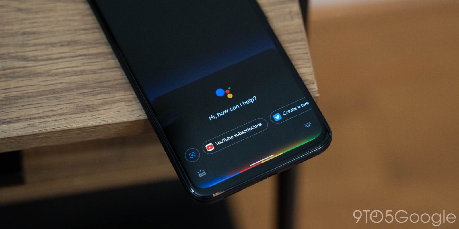
In mid-November, Google appeared to settle on a compact design for Google Assistant where the activation panel is half as tall and answers don’t take up the entire screen. Google is now widely testing an Assistant design that brings the light bar to all Android phones.
Google first tested this design in June. The most notable aspect involves light — upon activating Assistant — streaming in from the lower sides of your phone and pooling together at the bottom just before the Assistant panel slides up.
This panel is taller than the compact variant and features a centered Assistant logo with “Hi, how can I help?” below. This is followed by a carousel that first features a Lens shortcut and then actions for apps installed on your device.
The Snapshot feed can be launched from the bottom-left corner, while keyboard input — with a new icon — is on the right. This design also removes the center pill. Compared to the June variant, you can swipe up to get a list of “Things you can try.”


As you issue commands, the light bar pulsates. [Update: A bug where the corner icons are doubled has been resolved.]
Like before, this is not the faster, on-device Assistant that’s currently only available on the Pixel 4, 4a, 4a 5G, and 5 as Continued Conversation is not present.
All non-new Google Assistant phones appear to have gotten this light bar design today. We’re seeing it on the Pixel 2 and 3, as well as OnePlus phones. It’s not limited to those enrolled in the Google app beta.
More about Google Assistant:
- [Update: Rolling out] Apple Music is now available on Google Assistant speakers
- Google Assistant routines can now be added to your homescreen, rolling out now [U]
- Assistant rolling out multi-account sign-in and access; available for Calendar, Meet
- Google Assistant ‘spoken notifications’ now available on all wired headphones
Dylan Roussel contributed to this article
FTC: We use income earning auto affiliate links. More.


Comments