
The latest Google app beta is rolling out a redesign to the player screen in Google Podcasts. Simplification is the focus with more spacing given to key controls, while other actions are hidden in the process.
Update 2/8: The Google app 12.4 beta makes tweaks to the redesigned Podcasts Now Playing screen. The Sleep timer is back in the bottom row with the previous sliding UI restored. It slots in between Playback speed and Cast to. The queue is still in its new left edge position, while the overflow menu remains a sheet for “Share” and “Mark as played.”
Original 1/7: In this new UI, the scrubber appears immediately below the cover art, scrolling episode title, and podcast author. It’s no longer on the second to last row, and ever so slightly wider than before. This is followed by a play button that’s flanked by the half-minute skip/jump and 10-second rewind.
Google Podcasts player redesign
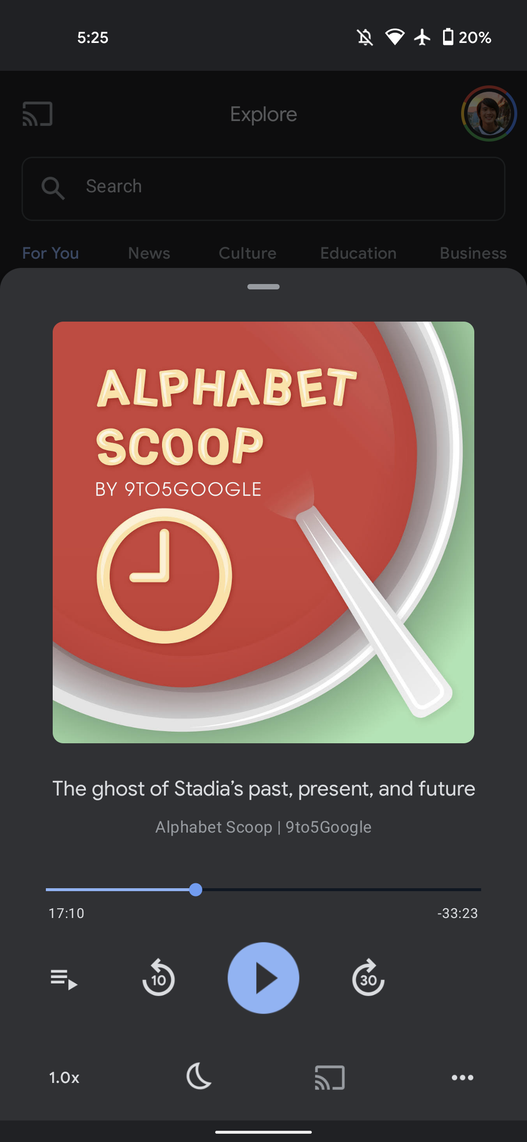


Next to that latter element is a button to access the play queue, with the new placement unfortunately breaking symmetry. The biggest change today is to the bottom row of buttons, with the clear intent being to space out controls so that buttons are not accidentally tapped.
Version 11.42
With the queue moved out of the left corner, playback speed takes its place. “Cast to” is centered just underneath play, with an overflow button at the right sliding up a new sheet. “Share” and “Mark as played” appear first, while the “Sleep timer” has been moved here. The UI for this feature has been tweaked to a simple list, and only default increments are now provided: 5, 10, 15, 30, 35 minutes, 1 hour, or “end of episode.”
This player redesign for Google Podcasts is rolling out with version 11.42 of the Google app beta. It’s not yet rolled out to the stable channel on Android, while the iOS app has yet to see an update.
Previous Now Playing UI
More about Google Podcasts:
- Google Podcasts web client adds simple subscriptions feed, matching Android and iOS
- Podcasts on Android, iOS, and web now lets you add shows by RSS feed
- Google Podcasts for Android adds Cast button to Now Playing screen
FTC: We use income earning auto affiliate links. More.
Comments