
Zoom became a household name in 2020 as a result of COVID-19 lockdowns. It was clear pretty quickly, though, that the company wasn’t fully prepared for the massive influx of customers as security flaws and missing features quickly became evident. This week, over a year into the pandemic that’s made video calls more important than ever, Zoom is debuting its new PWA that enhances its functionality on the web and, specifically, on Chromebooks.
The new Zoom Progressive Web App was first announced last week, albeit quietly, and came with the promising of an overall improvement to the experience of using Zoom without a fully native application. After spending a bit of time comparing the previous app to the new one, I can certainly say the new one is significantly better in several ways, but it still falls down a bit compared to other platforms.
First and foremost, what is new to the updated app. Compared side-by-side, there are three key changes.
One of the new changes is the overall interface, which now more closely mirrors what you’d find on the native app on a platform such as Windows. This is, frankly, great to see. Over the course of the pandemic, I’ve had to set up Zoom for countless people, even writing up some instruction documents to detail the setup from scratch. The web app for those on Chromebooks always presented some friction because it’s so different. Now, the setup is pretty much identical to Windows/Mac.
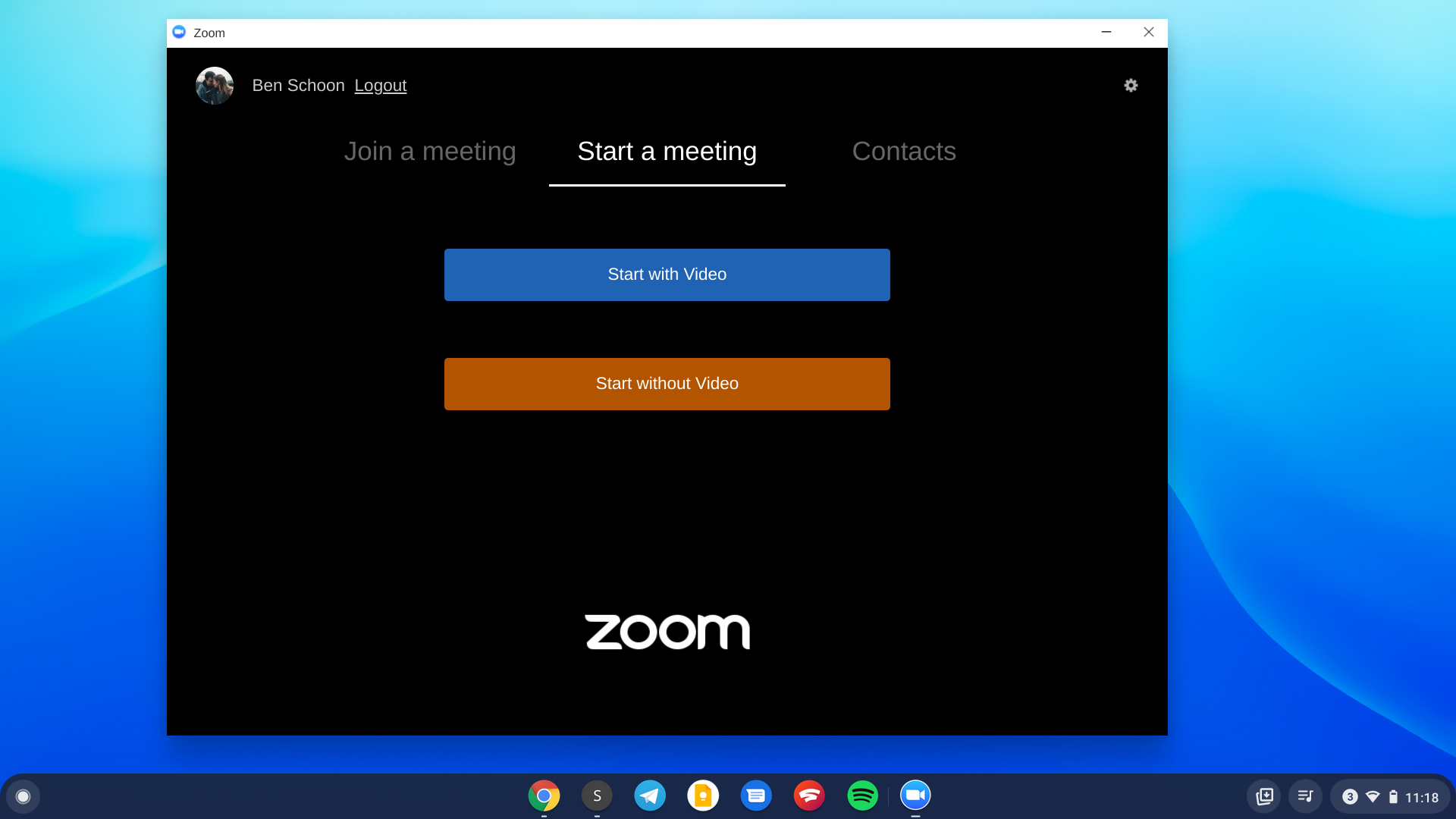
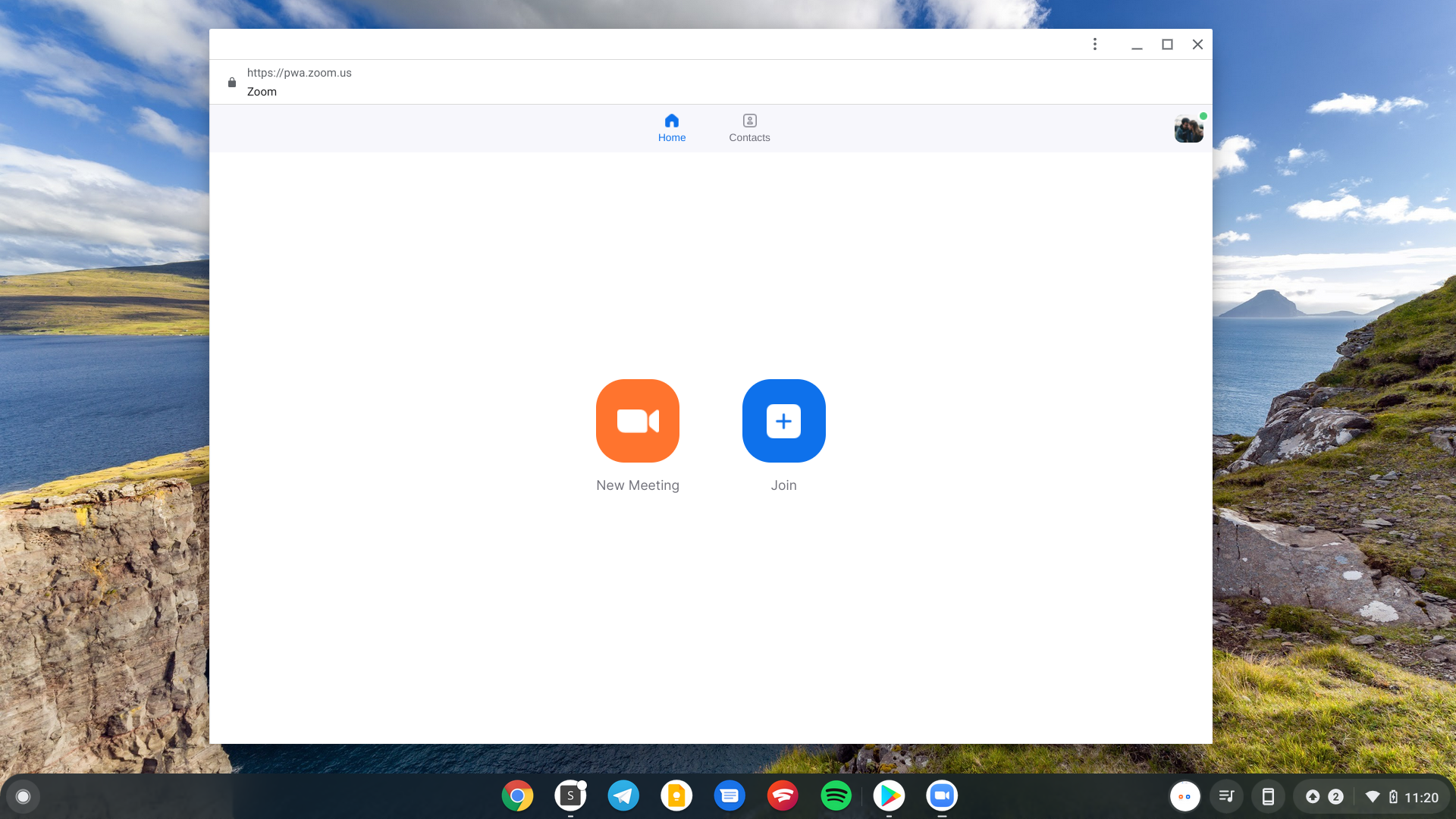
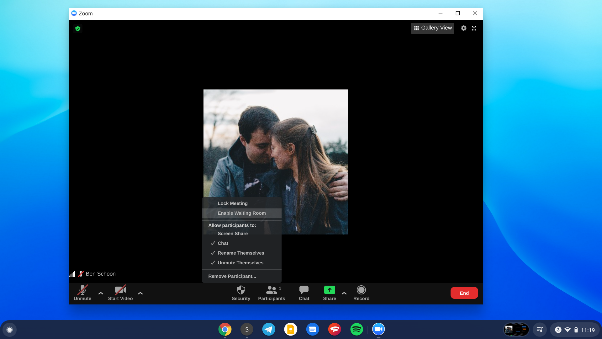
Beyond the UI, reactions are also now in line with other platforms. The Zoom PWA puts the “Reactions” button along the bottom bar just like on Windows/Mac where, previously, the “Raise Hand” option was still living in the Participants menu and underneath an overflow menu.

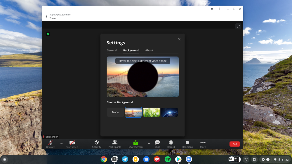
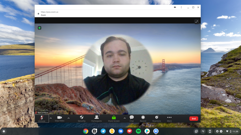
The other big addition is support for Zoom video backgrounds on Chromebooks through the web app. This is a feature that the platform has long been lacking. That’s unfortunate for Chromebook owners since that feature on its own was one that really made Zoom stand out earlier on in the pandemic.
While it’s great that video backgrounds finally work on Zoom on Chromebooks, the method in which they work is almost so bad it’s hilarious. Instead of superimposing the user’s face over the background of choice, a simple circle is cut out in the middle of the screen to leave room for the user’s face. This behavior can’t be changed from the look of it, even on a Chromebook that’s running a high-end Intel Core i7 that’s surely capable of rendering the normal look. It’s unclear if this will be changed later, but Zoom did promise updates would be coming to the PWA over time.
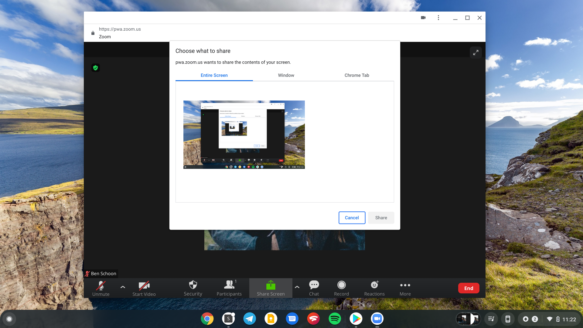
Beyond that, the rest of the changes are relatively minor and mostly cosmetic. Sharing your screen now defaults to Chrome’s window picker versus a custom one for Zoom. There are also some nice animations when opening the participants tab or the chat tab. You can see some of the side-by-side comparisons below.


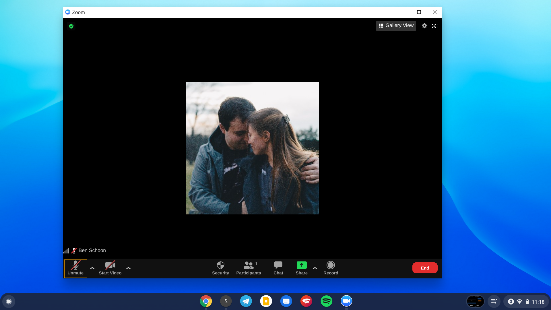
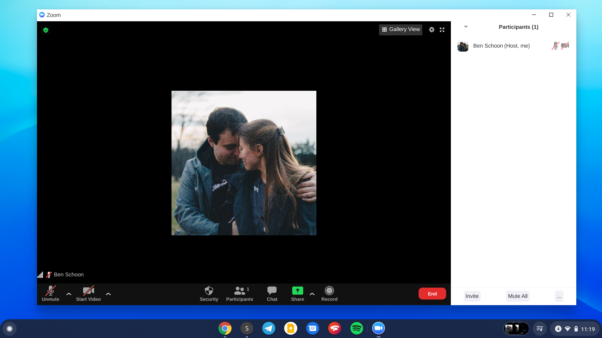
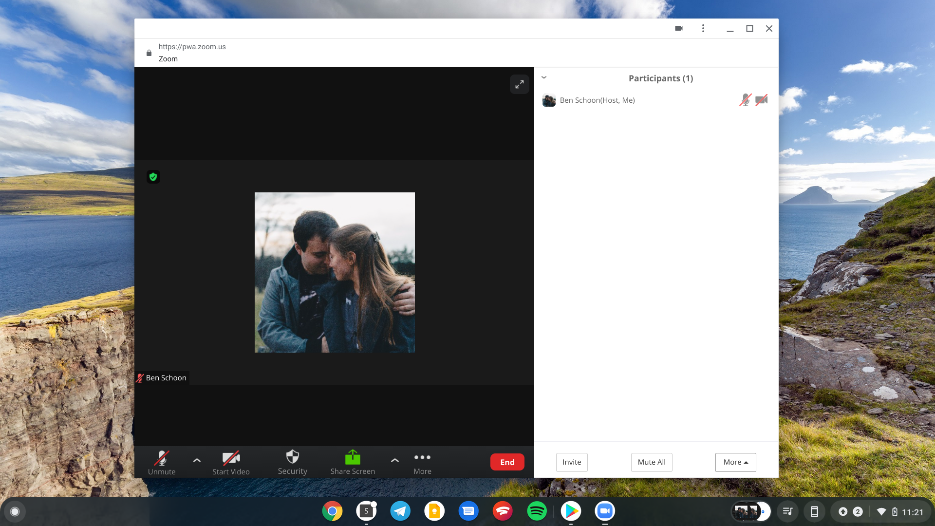
The Zoom PWA is now available for Chromebooks and any device with a compatible browser; we’ve tested it on both Windows and Android. You can access it directly by going to pwa.zoom.us/wc. Alternatively, if you’d like to install it on a Chromebook, you can download it from the Play Store.
More on Chromebooks:
- Chromebook gaming gets a boost as Unity makes it easier for developers to target the platform
- Lenovo launches IdeaPad 5i and Flex 5i Chromebooks
- Asus starts selling its CM3 Chrome OS tablet w/ built-in stylus, specs to match IdeaPad Duet
FTC: We use income earning auto affiliate links. More.


Comments