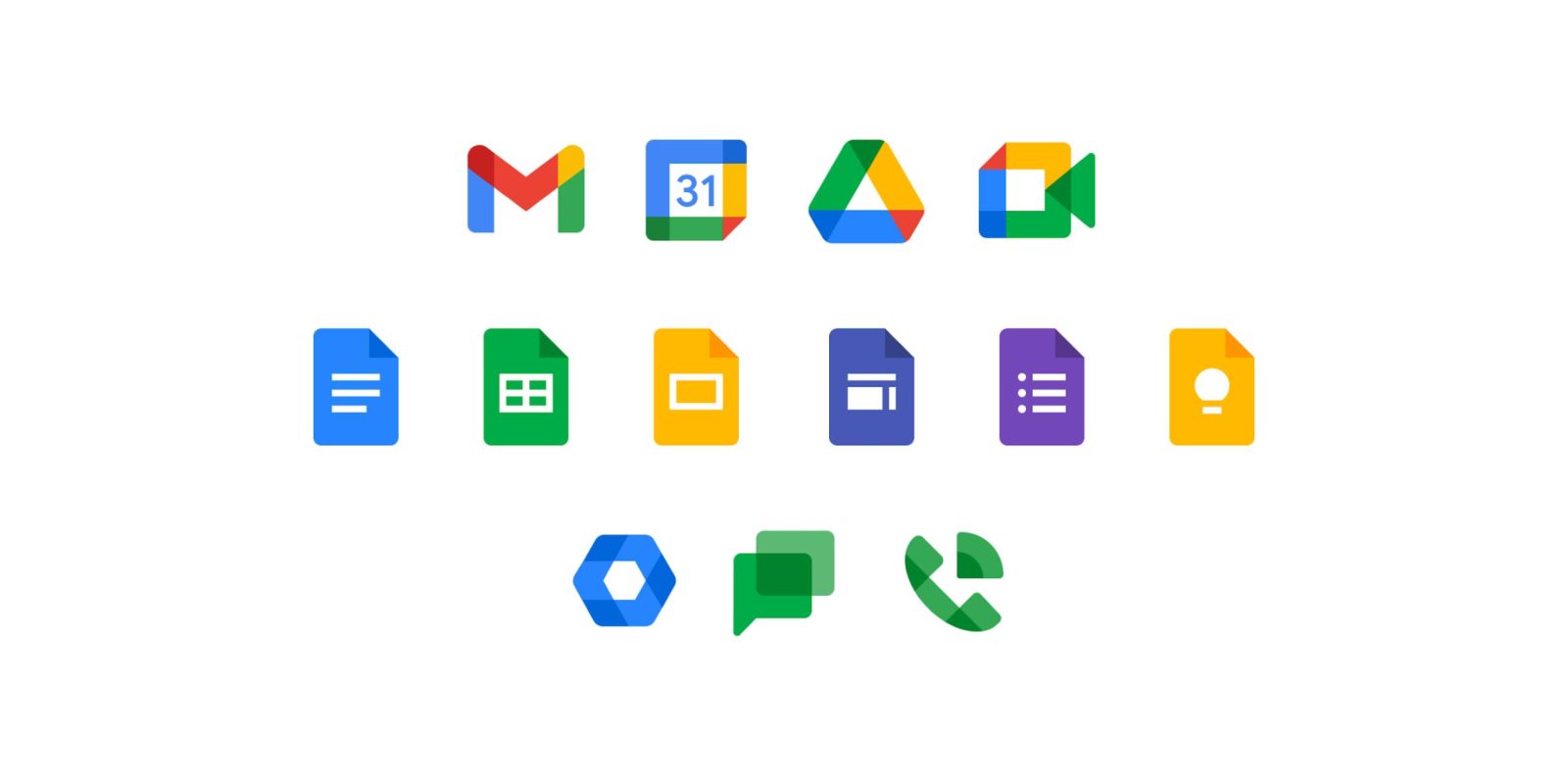
Google Workspace was announced at the start of October as a rebrand of G Suite and revamped approach to office-less productivity. As part of these changes, all of Google’s Workspace apps are seeing new icons, with the rollout now underway.
Google Currents
Update 9/27/21: From mid-October to late-November, Google rolled out 11 new Workspace icons on Android, iOS, and web as part of the G Suite rebrand. This covered the company’s biggest productivity apps, but two were left out.
Google Currents is a service (formerly the Google+ app) that allows companies to host internal social networks for employees. While it was unveiled in 2019, the Currents logo already matched the new Workspace design direction. As such, it was left out of the initial rebranding late last year. In August, Google introduced an updated logo that shrunk the height of the waveform. The use of a darker shade of blue was also limited to a diamond area where the lines intersect.

Google Tasks
Meanwhile, Google Tasks today was updated on both Android and iOS, as well as the web on some services. Instead of an abstract dot and pill forming a checkmark, the new icon is much more straightforward. Like the other secondary Workspace apps, this logo is now entirely blue.


Google Admin
Update 11/24/20: The very last icon featured in the cover image above has rolled out. Google Admin replaces its early Material Design gear (in green) and silver wrench with a blue hexagon. Like the other, more consumer-facing icons, darker colors are used to represent overlap.
This app allows Workspace admins to “manage [a] Google Cloud account on-the-go.” This includes adding/managing users and groups, as well as contacting support, viewing audit logs, and checking notifications.
Google Voice
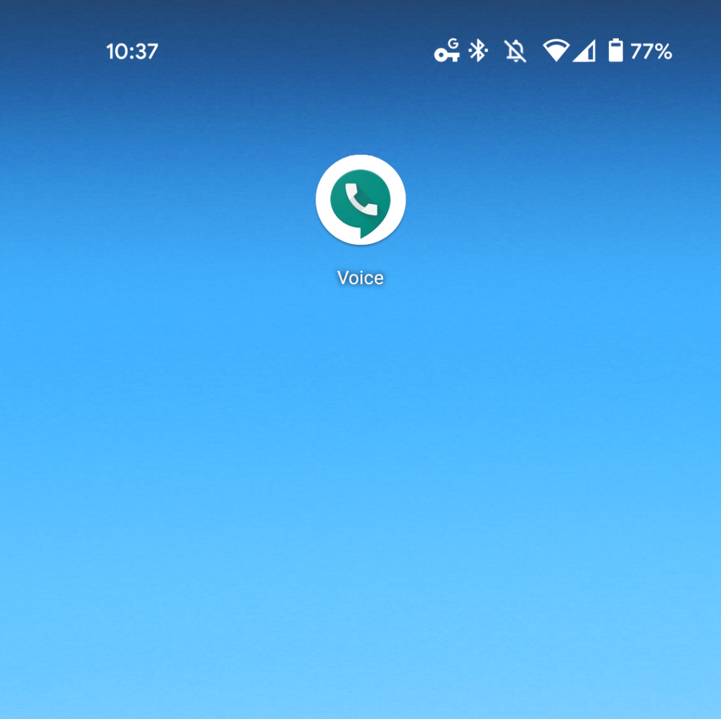
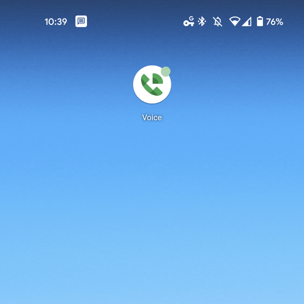
Similar to Chat and Meet, Google Voice removes the dark green message bubble background. The icon is now a landline phone with a signal emanating from it. Two shades of green are leveraged for a more modern icon.
Like Keep, the new Voice icon made its first appearance on the web before coming to Android. This service is not technically part of Google Workspace, but it is the last consumer application to see its brand refreshed.
Version 2020.46 also introduces a new status bar icon for texts where a message is placed in a white, rounded square. It’s so bold that people will not mistaken it for the RCS Messages client.
Google Keep
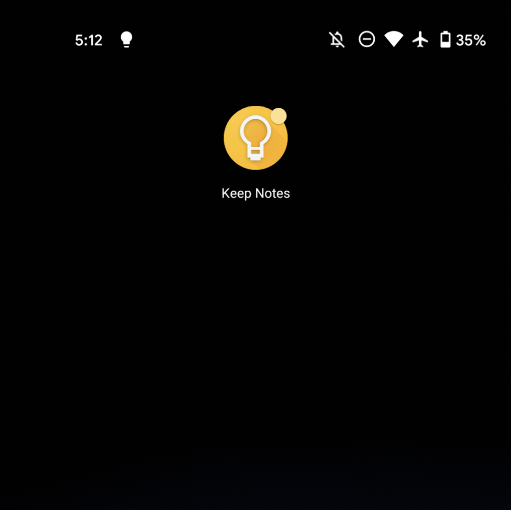
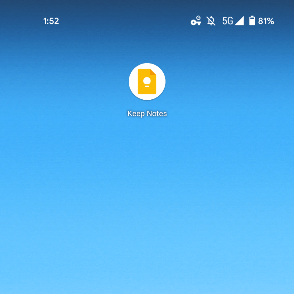
The Keep icon has been brought in line with Google’s other productivity/editing applications. Instead of a rounded square, the light bulb — which is now solid — is placed on a sheet of paper. Just like Docs/Sheets/Slides, the slightly darker fold is in the top-right corner.
After rolling out to keep.google.com, the new “Keep Notes” icon is available on iOS and Android (version 5.20.441.01.40). Both mobile platforms see the yellow rectangle displayed against a white background and lack a splash screen.
Google Calendar
Calendar gets a similar treatment to the new Gmail icon by dropping the physical object it was previously modeled after. It’s now a square with the bottom-right corner creased. Blue is the primary color, while “31” is in the center.
Version 2020.42 of Google Calendar for Android is rolling out with the new logo. The date at the center still refreshes daily, while the new icon does not appear — save for the splash screen — anywhere else in the app. The status bar icon is essentially the number “31” in a square. An update brought this branding to iOS last week, and it is now making its way via the Play Store.
Meanwhile, the website has also been updated, with the new icon first appearing in the Google Workspace side panel of several apps.


Google Docs, Sheets, Slides
The icons for Google Docs, Sheets, and Slides, as well as Sites and Forms, are mostly unchanged. That said, the earmark in the top-right corner is now darker. Inside, Google has simplified in various ways, including one less line of text/row and thinner glyphs.
On Android, there is a big change that sees the entire page shape being placed against a white background. The apps previously used full-width launcher icons. So far, Google Docs and Sheets have adopted the new design with version 1.20.422.01, with Slides joining a few days later.


Google Meet
The Meet icon is very much in line with Gmail and Drive in that it’s formed by the four Google colors. Green here is the dominant shade — in another nod to communications and classic Hangouts, while there’s only a tiny bit of red.
10/19: Google Meet is also rolling out today on Android with version 2020.10.04.337166131. The previous icon was notable for having a crease.


Google Chat
Chat is getting a new flat logo, but is entirely green in an homage to Hangouts. The inner ‘@’ symbol has been removed, while the circular message icon is now rectangular and intersects with a rectangle.
10/19: Google Chat is next on the docket with version 2020.10.04.336992968 for Android. This is not yet widely rolled out, and features a larger status bar icon that’s more glanceable.


Gmail
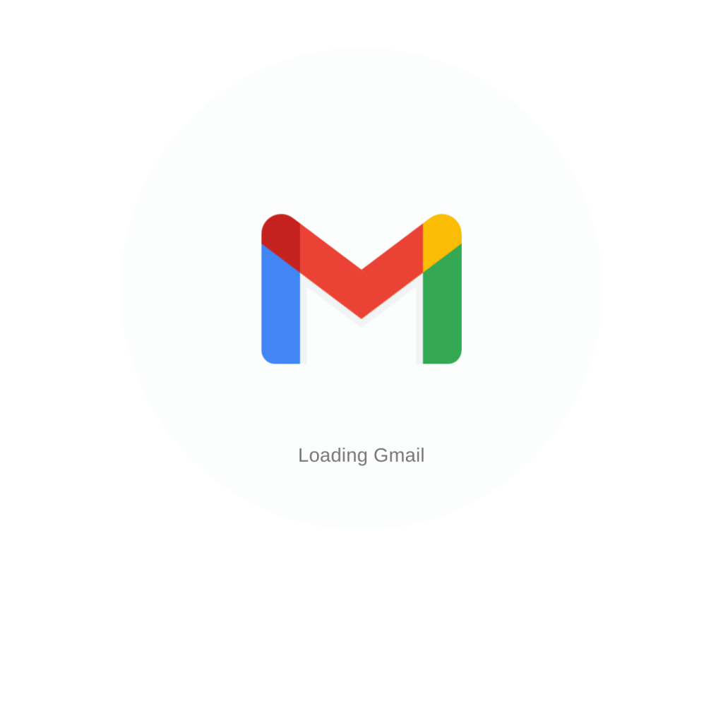
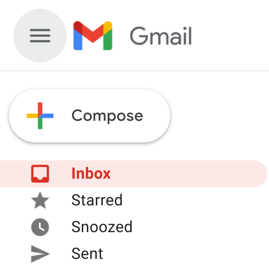
Just like Maps and Photos earlier this year, Gmail is adopting an icon that leverages the four Google colors of blue, red, yellow, and green to form an “M.” Red still has the largest share, but it comes as Google moves away from accent colors in its apps.
All past Gmail icons distinctly feature an envelope. It’s now only implied, with Google leveraging the whitespace above and below the center caret/chevron to form an envelope. It’s clever in that all modern smartphone icons are going to be placed against a white background anyway.
10/16: Version 2020.10.04.337159408 of Gmail for Android is beginning to roll out today with the new icon. Besides the homescreen, it’s not visible anywhere else in the app, which was also the case before given the lack of a splash screen. That said, the status bar icon is now an outline of Gmail’s logo.
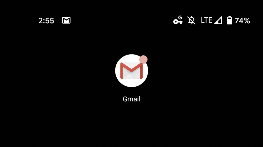
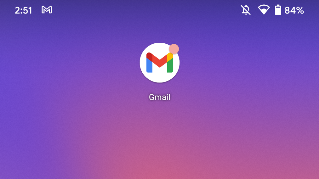
The revamped branding is also making its way to the web client for some users, but is not yet widely visible.
Google Drive
Drive is relatively unchanged, but the triangle gets slightly rounded edges. There is also a very subtle splash of red after the icon previously only had three colors. It’s the most minor change, but ends up being one of the most delightful.
10/14: Google Drive is the first app to see its new Workspace icon become available for end-users. On Android, it’s still rolling out with version 2.20.401.06.40 via the Play Store, though the listing has yet to be updated. The new icon is visible on the homescreen icon and splash screen.
Another change sees Google update the icon that appears in the Android status bar. It gets the Material Theme treatment and is now just a hollowed outline.


The new Drive icon is also appearing in the web app. This is a straightforward replacement in the top-left corner and to the favicon. The icon in the web app launcher is also still the older variant.
FTC: We use income earning auto affiliate links. More.


Comments