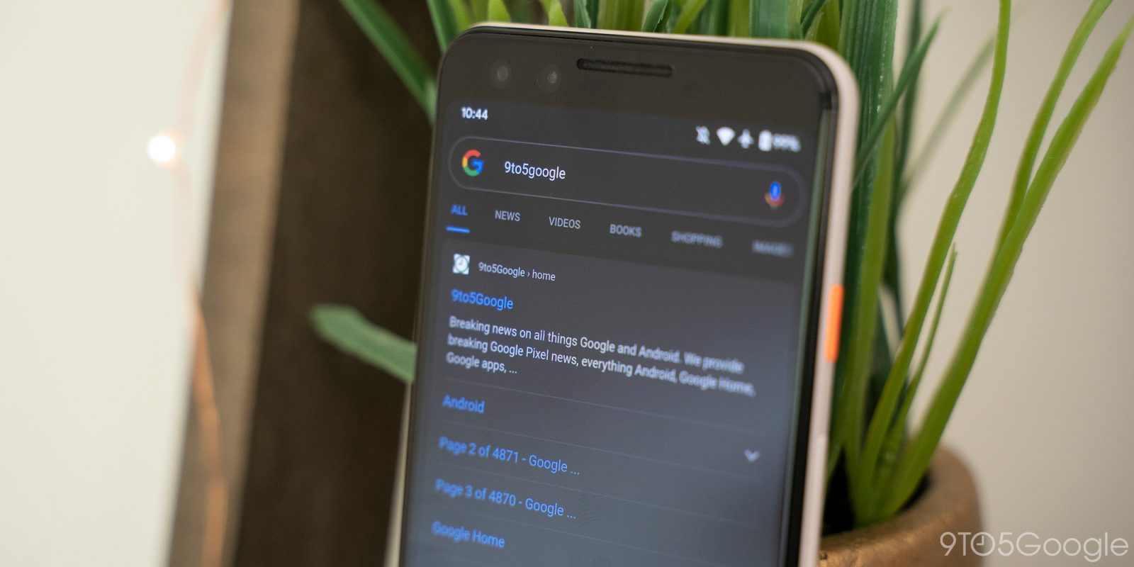
In addition to a bottom field, the Google app is testing a Search bar that appears at the very top of your screen. It matches other first-party apps, but it is a departure from what Google Search has looked like on mobile for the past several years.
This A/B test sees the pill-shaped search field appear above the Google logo/Doodle. In the process, Google removes the weather condition and temperature button at the top-left, while your profile picture is now part of the field in a change that matches every other first-party application.
As part of that integration, you can now swipe down on the avatar to switch between accounts. There’s a faint divider with the microphone and Lens icons moving left. In shifting down, the Doodle gets a bit more space. Meanwhile, there is no change to the design of Search (tab) result pages. There’s still a compact logo and avatar with the bar coming after.
The change introduces a uniformity with the likes of Gmail and the Play Store in how the search bar becomes the very first thing you can interact with. That said, Google has long placed the bar underneath its logo on mobile and the web.


We first spotted the change on one device this Thursday, and it has since rolled out to all Android phones signed into the same account. However, switching to another Google Account loads the old design.
Given that Google is also trialing a search bar above the bottom bar, it’s safe to assume that several designs are being A/B tested. The company could ultimately decide to just stick with the current iteration.
More on Google Search:
- Google app readying a Search chat head for quick text & voice queries on Android
- Healthcare providers in Google Search, Maps can now list which insurance they accept
- Search adds 3D monuments, including Big Ben, Eiffel Tower, Parthenon, & Tokyo Skytree
- Google working to make sure food banks that aren’t online appear in Maps, Search
FTC: We use income earning auto affiliate links. More.


Comments