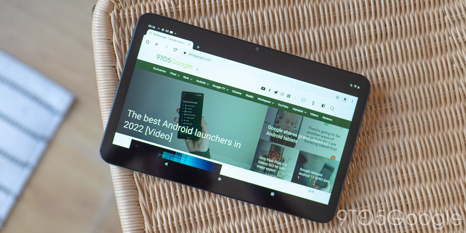
I want to use a tablet. In that fantasy, I’d use a large screen to quickly go through tweets, email, news, and other torrents of information during more laid back periods of the day (breakfast, lunch, etc). With the launch of Android 12L and the impending launch of updates and/or new devices, I tried to live that dream. The entire time I was conscious of Google’s track record, but I was not ready for its first-party apps to disappoint me as much as it did.
The bad |
Google Keep
While you might assume that Keep’s “Multi-column view,” which is a more interesting way on phones to look at a lot of notes than a list, naturally scales to larger screens, it’s actually overwhelming on tablets. You get four columns that make the reverse-chronological ordering hard to comprehend. Instead of the index cards on pinboard analogy, a simple two-column approach with a list on the left and note content next to it would have been much better in this case.
Meanwhile, the actual note-taking view is a pain that, like on the web, does not take up the entire screen, but rather appears in the middle with the background grid still visible. It’s just an unfocused experience that complicates what should be a straightforward task.


Google Voice, Home, & more
Too many first-party Google tablet experiences are still just stretched out phone apps. Google Voice is guilty of this even as the desktop website and iPad app have two columns. Stretched out phone apps should simply not exist in 2022.
Other apps guilty of this include Google Home (and its ridiculously stretched out two-item bottom bar), Contacts (main view), Duo, Fit, and One. Having content stretched out is hard to read in landscape orientation.


Google Clock
While tablets don’t serve as most people’s morning alarm, I found Google Clock’s layout choices to be a real wasted opportunity. In most tabs, Google places the contents of the application at the left, while there’s a right sidebar of sorts for the floating action button (FAB). As seen in the Alarm, Timer, and Stopwatch tabs, this FAB just occupies an odd space.
The Clock tab is even weirder with your current timezone taking up the first of three columns. In the middle is a list of different cities, while the FAB is again last with a whole lot of padding. The list was the most unimaginative way to show a lot of cities.


The tablet versions of these apps are just not good. They look nice but are just way too busy to the point of uselessness (Keep) or they just plain require reading from the left end of the screen to the right (Voice). In both those cases, I’d rather use my phone or – if offered – use the app in a letterbox format, which is something Android 12L introduces for unoptimized apps. That way, the app meets the requirement of being comfortable with nearby touch targets. A stretch tablet app, in my opinion, is not better than a phone client that has everything working as intended.

The basic |
Chrome
Chrome on tablets is exactly like the desktop version, and I’m mostly fine with that. The tab strip does get unwieldy when you have a lot of pages open and Google should probably have added a grid view by now.

Google app, Drive, News, Podcasts
These apps mercifully list articles/stories, files/folders, podcasts, etc. with two columns rather than one big list.


Play Store
Google Play’s tablet optimizations only exist on the homescreen with a navigation rail variant. Of course, this is clearly just the bottom bar, while the primary large screen optimization is in the form of all the top tabs being fully shown underneath the search field. Like Photos, this feels like the Play Store website more than an optimized tablet experience. Meanwhile, the listings are just pretty much stretched out.

There’s nothing exceptional about these apps. Two-column layouts should be a bare minimum in terms of how to take advantage of increased screen real estate. Besides Chrome, the apps in the list above seemingly have no other optimization that reflects great commitment to the tablet experience.
The good |
Gmail
Gmail is one of Google’s flagship apps and one that I consider to be recently, if not actively, updated. Besides Material You, the company in the past year integrated a whole chat client into it.
It features a straightforward two-column layout with a list at the left and the contents of an email at the right. This interface is so obvious that Google shouldn’t receive any points for that in an ideal world, but the work was clearly put in.
Nifty design touches include how a toolbar emanates out of the search field when tapping a sender’s avatar to always-present buttons for archiving, deleting, marking unread, and “moving to folder” in the top-right corner.


That said, it’s not without bugs, with the message list not highlighting the current email you’re viewing after archiving and the aforementioned “moving to folder” button sometimes disappearing into the overflow menu.
Google Maps
Google Maps is simply a good app for browsing the literal world. The homescreen is light on UI with just a search bar at the left and the layer switcher at the top-right, though the bottom is a little bit inelegant for how much space it consumes. Tapping the field to search loads a column for results and listings that slides away when not needed.


Google Photos
Like Maps, the content informs the primary view of Google Photos. There’s a navigation rail at the left instead of a bottom bar that gets out of the way. If there’s one nitpick, I can’t help but think I’m using the desktop website every time I use the tablet client. It comes down to an app bar that just doesn’t feel like Android.

YouTube Music
YouTube Music is in the good list – and not basic – because of its Now Playing screen that’s split between controls and your up next queue. That said, there’s an upsetting lack of bottom padding on the player half.
The Home tab that shows carousels of suggestions mercifully is broken up with different-sized shelf layouts that break up the monotony. Additionally, the YTMusic team hints at more tablet updates in the future.


YouTube
Like the Music version, the player screen with it’s list of additional videos on the right that’s also used to show the video description is pretty good. It’s basically the website, down to the docked mini player when browsing the feed tab. That said, YouTube avoids the overly desktop feel that Google Photos suffers from.

The great |
Google Calendar
My favorite Google app on Android tablets is Calendar. For starters, the Month and Week views get the space they need to show off events at a glance. Size here does not hurt.
However, the real star of the show is the Day and Schedule view where you can see the entire month – which serves as a date switcher – at the left, while there’s a list next to it. The background is kept lively by Calendar’s – at this point – iconic monthly illustrations, which are unique to mobile.
While there’s obvious reuse from the website, the Calendar team has meaningfully differentiated the app for tablets and that’s surprisingly a rare occurrence for Google.


What’s next
Beyond the straightforward idea of how to use the additional screen real estate, developers of apps listed in the bad and basic sections would do well to think about what large touch surfaces allow for. It cannot just be about showing more information. That display has to be done thoughtfully and in a smart manner that is delightful.
Google needs to have its first-party tablet apps serve as a guide, if not template, for third-party developers. The company’s wide portfolio of applications cover many classes of experiences (feeds, browsing, tools, etc) and good implementations of each would go a long way to inspire others on building their own.
Similar to how relatively quickly Google rolled out Material You for its biggest apps, such a push is needed for tablet experiences. This is necessary for any first-party device or renewed push that calls for “tablet-first apps” that take advantage of styli. Google needs to walk before it can run, and its first-party apps are a pretty good indicator of their conviction to tablet this time around.
FTC: We use income earning auto affiliate links. More.

Comments