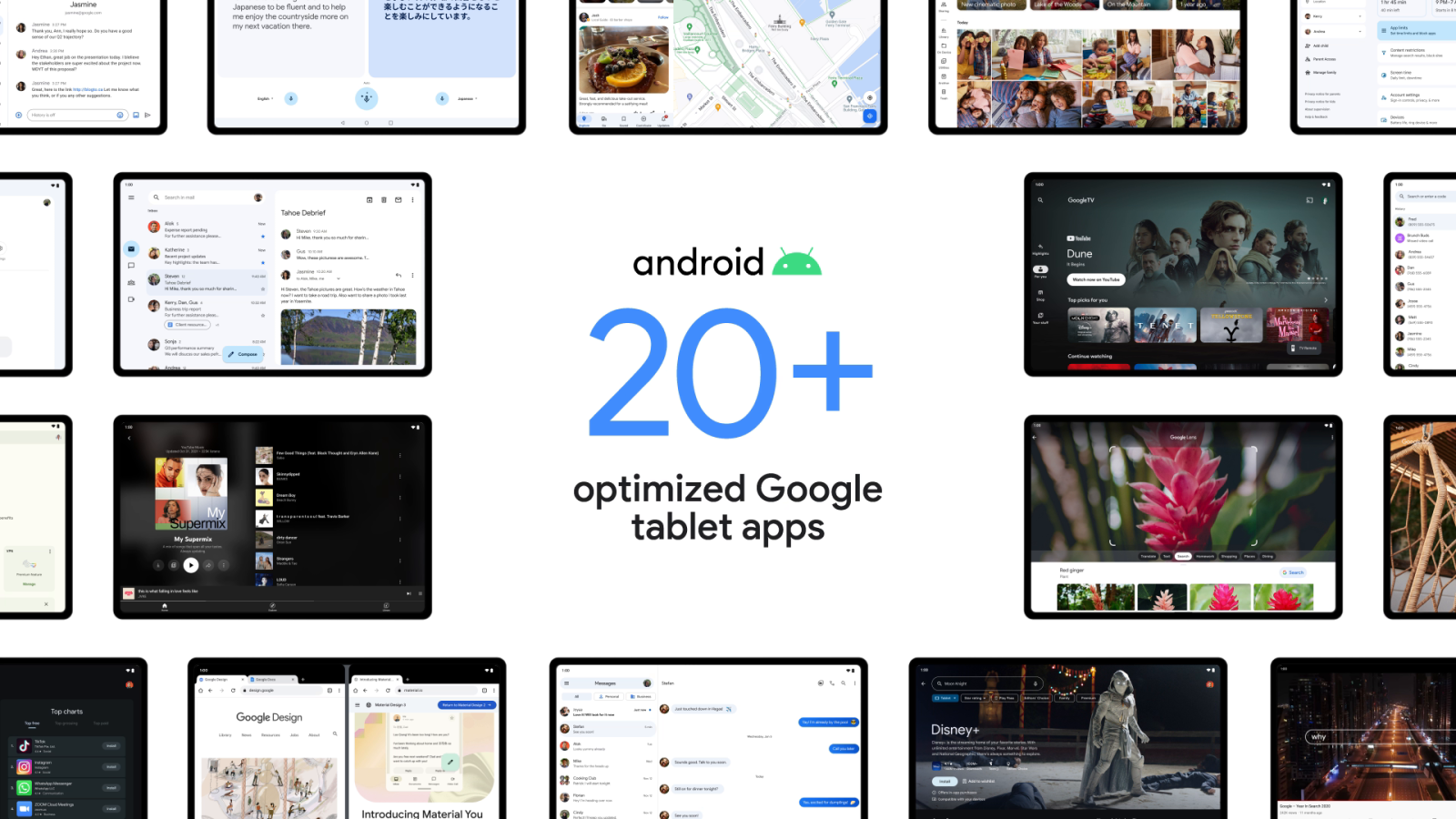
On stage at I/O 2022, Google announced that over 20 of its first-party apps will soon be optimized for large screens. Some were already previewed yesterday, and there’s now a look at how Google Clock and Calculator are being updated for their Android tablet redesigns.
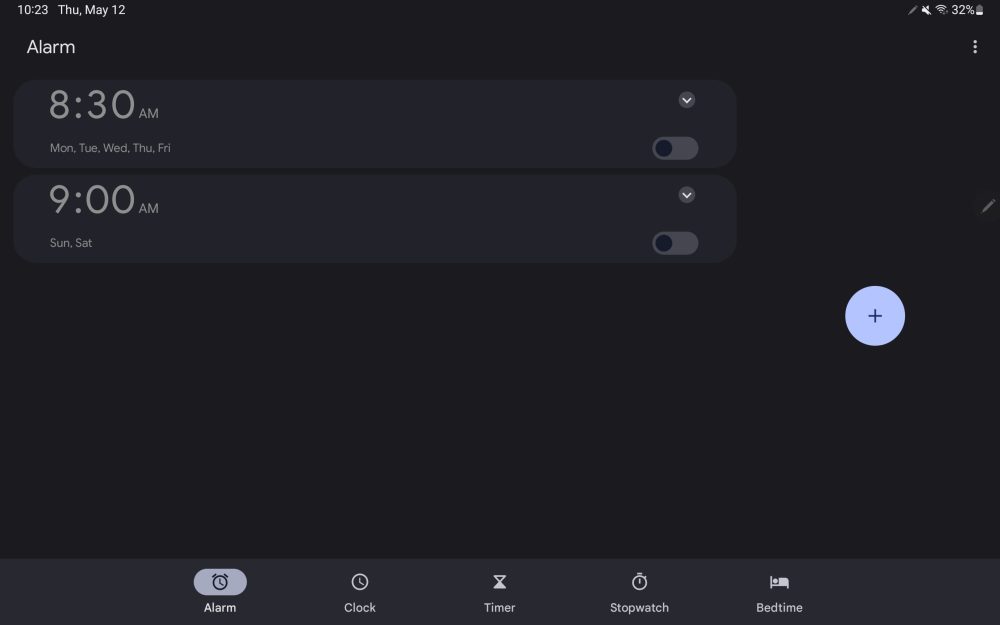
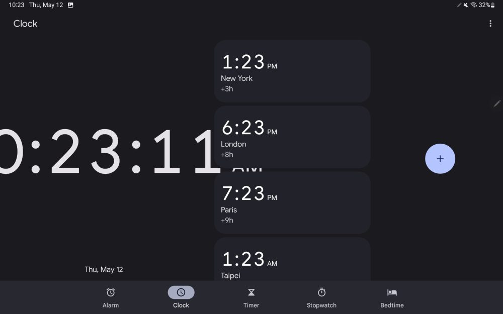
In the “Designing apps for large screens” session, Google showed two new tablet updates. At the moment, Google Clock on large screens is just a stretched out phone app with some optimization, but it’s not that well done (e.g. see picture #2 in the slideshow below).
Instead of a bottom bar, Google Clock will switch to a navigation rail at the left, like the Photos app. Other apps like Gmail and Google TV should also switch to that new UI element. It’s a much better use of space with the main area of the app housed in a window with curved corners. The navigation element is black, though Material You’s pill-shaped indicators noting what tab you’re viewing continue to be themed.
Meanwhile, the Alarm tab makes use of columns with set alarms appearing at the right, while the left shows a friendly prompt. This comes as Google Clock just launched a Play Store beta at the start of this week.
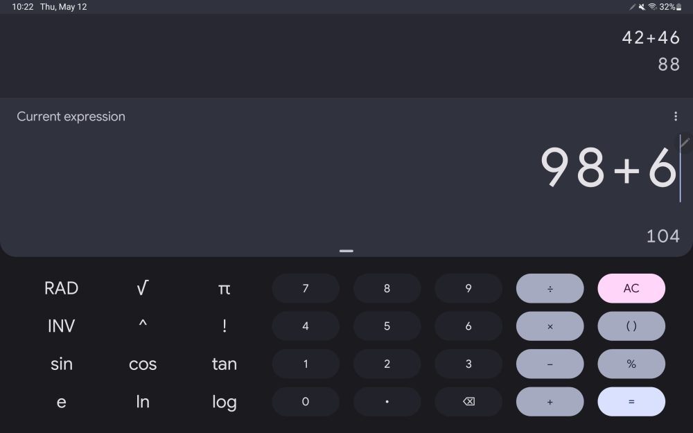
The other Android tablet redesign previewed is Calculator. The tablet app today is actually fine and friendly, but the upcoming update makes better use of space by showing a more complete calculation history at the left. This means you can fully view old results, while calculating new ones simultaneously.
In the screenshot above, there are no obvious changes to Google Calculator (Day view) or the Play Store/Translate in split screen mode.
You can also expect large screen updates for YouTube Music, Google Maps, and Messages.
More Android at I/O 2022:
- Here’s every device currently eligible for the Android 13 Beta
- Android TV OS now has over 10,000 apps
- You can now test Android 13 on tablets with Lenovo P12 Pro beta
- Android Auto redesign brings split-screen mode to in-car displays of all sizes
FTC: We use income earning auto affiliate links. More.


Comments