The latest Android 13 public preview has arrived with a number of new tweaks, a little tuning, and some extras thrown in. To better work out just what top features you need to know, we’ve gone hands-on with Android 13 Beta 3.
As we’re now well into the Android 13 Beta phase, we’re bound to see a slowdown of new additions and intense functions as Google fleshes out some of the existing features. Given that this is a refinement build rather than a huge overhaul, we were not expecting sweeping changes because Beta 3 brings the Platform Stability milestone. That said, there’s still plenty new here to dive into.
Table of contents
Video — Android 13 Beta 3 hands-on: top new features!
For more video content, subscribe to 9to5Google on YouTube.
Platform Stability
This is not exactly user-facing, but it will affect most Pixel and Android owners in the coming months when Android 13 arrives in a stable fashion. Platform Stability means that Android 13 Beta 3 includes finalized system behaviors and APIs. Effectively this means that Android app developers can start final compatibility testing for apps, SDKs, and libraries. What’s more, more apps will now hit the Alpha and Beta channels in preparation for the stable Android 13 release.
So, while you might not initially notice anything, you may see more apps start to utilize some of the core functions previously added throughout the Android 13 Developer Preview and Beta process.
Universal device search returns and adds web search

One major frustration in the previous Android 13 Beta was the removal of the universal device search. In Android 13 Beta 3, this is back and fully functional. That’s not all as it even includes some neat new tricks such as the ability to search the web for any of your queries as well as scouring your on-device storage.
There are a number of other neat tweaks here that might help you as you can quickly search on a number of pre-installed apps right from the Pixel Launcher search bar. Enter a query, and you can choose an individual quick action to search on Google, YouTube, Maps, the Play Store, or on-device Settings. This could certainly save time compared to needing to open each of these apps individually and jump into a search bar or enter a search field.
New fingerprint registration UI
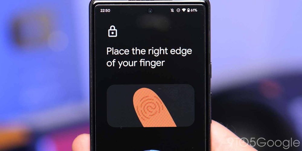
The fingerprint setup or enrollment UI has been slightly adjusted in Android 13 Beta 3 to better accommodate devices with in-display scanners. At present, that is limtied to just the Pixel 6 and 6 Pro, but this change has likely been implemented to ensure that the upcoming Pixel 6a and Pixel 7 series have a more seamless biometric registration process.
When adding a new fingerprint within Android 13, you get more obvious visual cues to help you better register your finger and add the extremities or edges. In Android 12, a text prompt alongside guide brackets are currently used, which are actually not entirely visible when pressing your finger on-screen.
Making this change to the fingerprint enrollment section within Android 13 could have major benefits for the upcoming Pixel 7 series and could also help those with problems with their existing Pixel 6 series handset and ensure better unlock times when using the new unlock method. Unfortunately, it’s too early to tell if it will help those currently suffering from fingerprint issues on the Pixel 6 series.
Larger gesture navigation bar
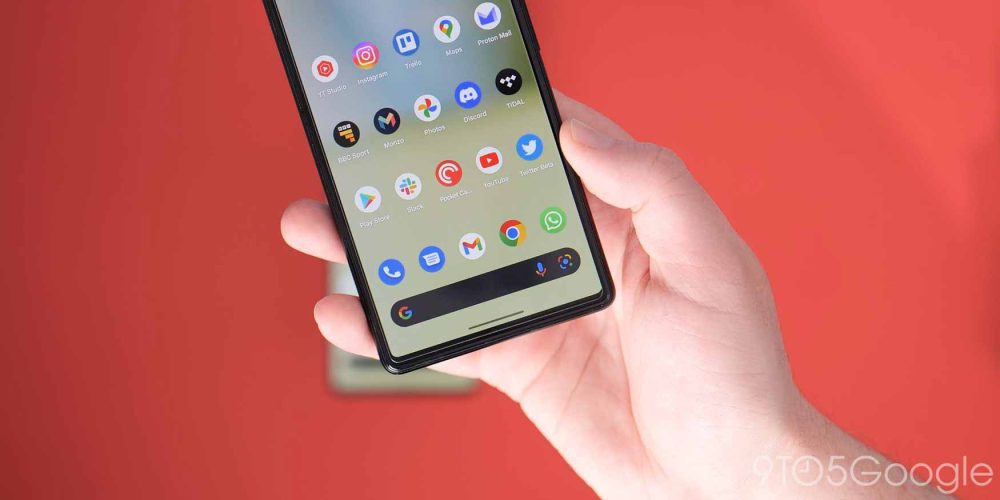
Although a minor cosmetic change, the gesture navigation bar in Android 13 Beta 3 has been updated to be subtly bolder and more prominent than it has been previously. This is actually the first change to the navbar since it was first introduced back in Android 10. The previous three-button and two-button navigation methods have steadily been sidelined as Google fully focuses on gestures with all new devices.
The update sees the navigation “pill” get thicker and wider. Google seems to be mimicking the iOS navigation bar, which would make a lot of sense given that Apple has helped lead gesture-based navigation on smartphones since the introduction of the iPhone X.
This change has absolutely no effect on usability, but it will certainly help improve visibility for those who have made the switch from iOS or come from another Android device that might use an alternate navigation method.
Minor media player tweaks
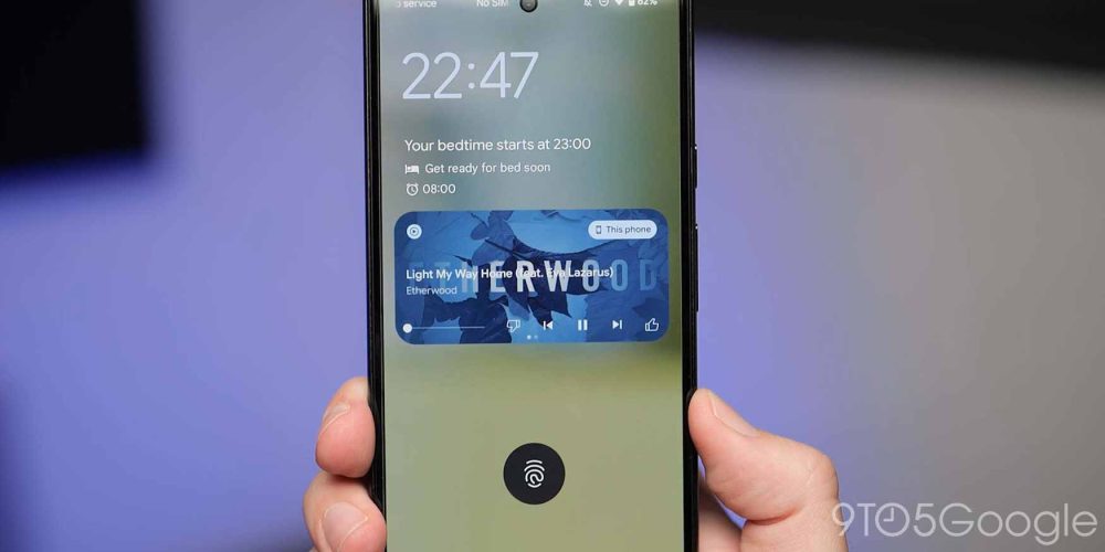
Google’s obsession with the media player in Android continues with yet more changes. The previous tweaks that felt somewhat out of place have been rectified with Android 13 Beta 3. When using the skip/forward or play/pause buttons from the lockscreen or notification shade media player, you’ll instantly notice that these are smaller and more compact than in Beta 2.
Will this change once again in Beta 4 and beyond? There’s a chance that it could, meaning that it’s impossible to totally rule out. That said, it wouldn’t be an Android preview without plenty of attention on the media player.
Miscellaneous changes and UI tuning
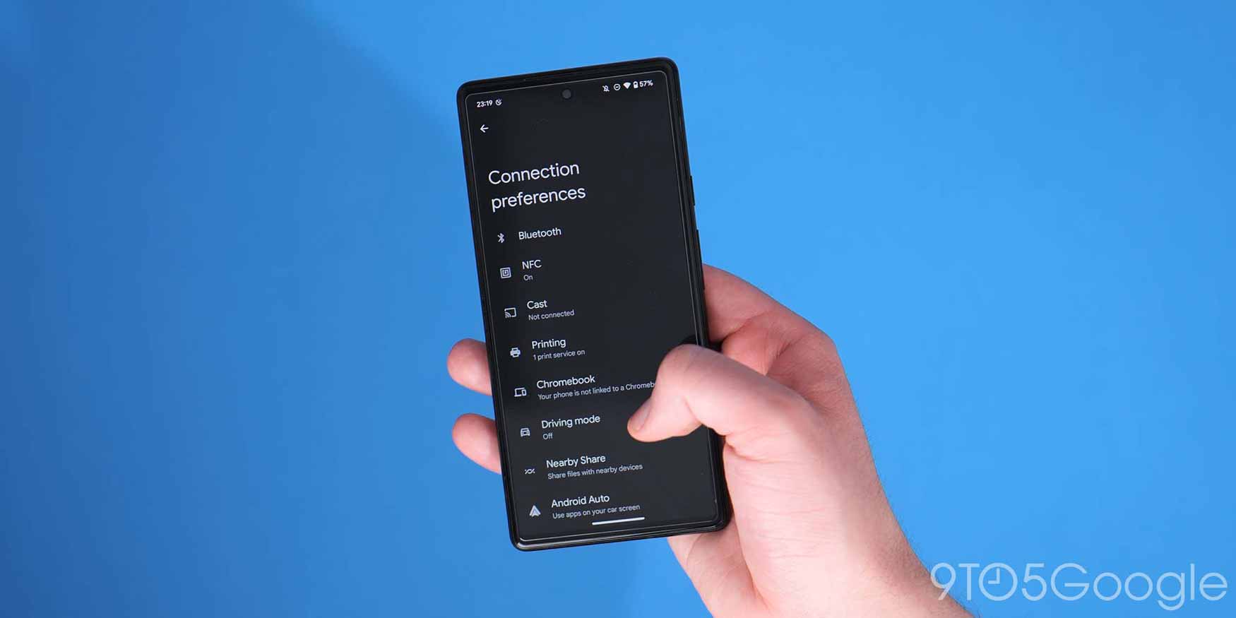
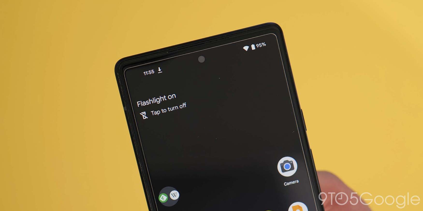
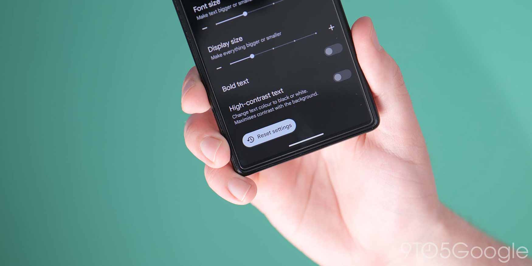
There are some added adjustments to Android 13 Beta 3 that are notable but will not affect device usability when spotted. An example of this is the introduction of more pill-shaped buttons within Settings menu sections. This will no doubt help visibility, but offers no added functionality.
The recent June Pixel Feature Drop added a Flashlight alert to the At a Glance widget. However, it is not live for many running the latest stable version of Android 12. If you are running Android 13 Beta 3 the option appears to be live already for many (but not all) and can be enabled or disabled within the deeper At a Glance settings.
Sadly, the Fast Pair option has been removed from the “Connection preferences” menu in this update too. Luckily, this didn’t do a great deal beyond letting you enable or disable local scanning for devices with the Google Fast Pair feature.
Android 13 Beta 3: What is your favorite new feature?
That’s a hands-on review of everything new in Android 13 Beta 3. When combined with the developer previews, there’s quite a lot new to unpack. However, this shortlist includes all of the top user-facing features that we’ve found thus far.
Undoubtedly, more little tweaks and toggles might slip through the cracks, and we’ll see hidden options appear over the coming days and weeks. We likely will have a deeper dive into every single thing that has been added, including some features that require a little work to get fully operational in our full overview, coming with the full stable release of Android 13.
What is your favorite new feature or features? Let us know down in the comments section below!
FTC: We use income earning auto affiliate links. More.


Comments