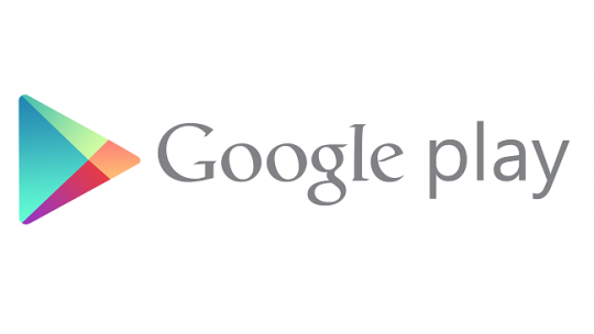
Google last changed the Play icon in 2016 when Play Movies & TV, Music, and Newsstand were still vibrantly kicking. Over six years later, the Google Play Store is getting a new logo.
Update 7/27: The new logo is starting to appear on Android with version 31.6.13-21 of Google Play. It’s a pretty straightforward replacement with not a lot changing in terms of proportions or triangle size. There’s also a new outline-style status bar icon with bold lines.
That update is not yet widely rolled out, but it has already appeared on one of our devices. You can also manually sideload it here.
Update 7/26: Following the official 10th anniversary announcement yesterday, the new logo is live on play.google.com , as well as the developer site. It’s meant to better reflect the “magic of Google and matches the branding shared by many of our helpful products — Search, Assistant, Photos, Gmail and more.”
blue (#4285F4), red (#EA4335), yellow (#FBBC04), and green (#34A853)
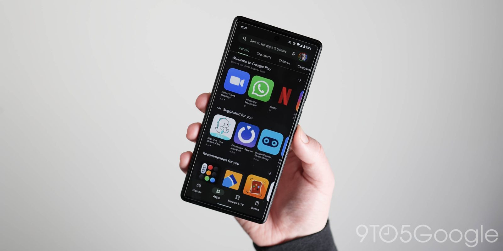
Of course, most users will encounter it when the Android app is updated and the homescreen icon changes.
Update 7/16: Additional proof that Google Play is getting a new logo comes from the US Patent and Trademark Office. We see the more rounded triangle with updated coloring in much higher-resolution, though it’s still somewhat blurry. The company officially describes it as such:
The mark consists of a triangle comprised of rounded corners, divided in four colored sections; the color blue appears at left; the color green appears at top; the color yellow appears at right; and the color red appears at bottom.
Original 7/6: Before the 2016 redesign, which also placed everything in triangles, the icon had more shadows.
This new Google Play logo is still a triangle, but notice how the corners are much more rounded compared to the current one. Meanwhile, the four colors in use are more closely aligned with that of the four Google colors, which is the clear trend and mandate of recent revamps. That said, we can’t help but note how muted and dark the icon is compared to other first-party services.
Blue and green are definitely less vibrant, while the internal partition has been tweaked so that the parts are more equal in size. Today, the blue triangle is oversized compared to the other three components.
Current vs. upcoming
Only a low-resolution version of this icon is available today. It can be found in both GPay and Google Pay – soon Wallet – when you make a Play Store transaction, like adding credit to your account, as the merchant icon. There’s no obvious indication when it was updated.
It’s not live anywhere in the Play Store app or play.google.com, which was just redesigned. That would have been an optimal time to unveil it.
At this point, it’s not clear when Google will introduce the new Play Store logo. Google Play did just remove the Movies & TV tab, while the likely exit of Play Books to make the Play Store entirely focused on Android apps makes eventual sense. Meanwhile, the fate of the “Play” in Play Games is slightly more solid given the big push into Android gaming on Windows. However, the future of the dedicated Android app is not as firm.
More on Google Play:
- Wild Play Points promo is a peek into the world of mobile gaming whales
- Google Play settlement would create $90M fund to reimburse US app devs, more
- You can now use Google Play Points to pay for Apps – here’s how
- Play app listings adding ‘Compatibility for your active devices’ section
Dylan Roussel contributed to this article.
Thanks Jordan
FTC: We use income earning auto affiliate links. More.
Comments