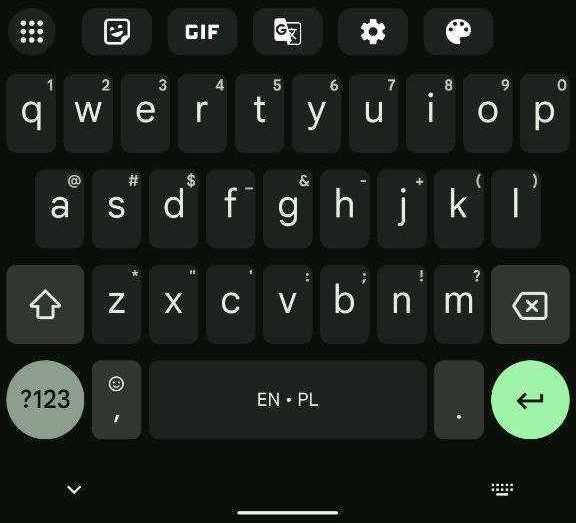
Last August, Google rolled out a handful of Material You flourishes to Gboard for Android, and a few more are now coming to the keyboard, including the shortcuts bar.
About APK Insight: In this “APK Insight” post, we’ve decompiled the latest version of an application that Google uploaded to the Play Store. When we decompile these files (called APKs, in the case of Android apps), we’re able to see various lines of code within that hint at possible future features. Keep in mind that Google may or may not ever ship these features, and our interpretation of what they are may be imperfect. We’ll try to enable those that are closer to being finished, however, to show you how they’ll look in case that they do ship. With that in mind, read on.
At the moment, tapping the chevron icon in the top-left corner slides out various tools, layout, and shortcuts. The list today includes: Settings, Theme, Text Editing, Clipboard, GIF, Floating, One-handed, Translate, Share, and Sticker. There’s also the split keyboard on foldables (but not tablets).
Gboard 12.1 is rolling out to the beta channel today and reveals work on a Material You redesign of that bar that a friend of the site RKBDI has successfully enabled. The corner button is still a circle but now uses a 3×3 grid icon.


Meanwhile, the shortcuts (or “access point” items as they’re referred to) are now housed in rounded rectangles that are very reminiscent of Material You (MD3) chips. It’s not too different from the Assistant voice typing UI on Pixel phones (as seen in the cover image above). The background of each item is lighter than the keyboard, which is more pronounced on colorful themes.
You can now have one more shortcut for a total of five in the bar, though Gboard is working on the ability to let users customize how many appear if they really only need one or two. However, the new maximum is due to Gboard removing the three-dot/overflow at the right and using the existing corner button for entry.


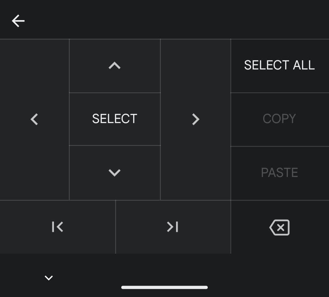
Google has redesigned this view with a more compact grid that’s no longer centered. It allows more functions to be easily added in the future, while the Text Editing layout is getting a Material You modernization of its own with rounded corners for each button.
Another Material You update is to settings. The main list is getting larger, while MD3 toggles are now used throughout.
It’s not clear when Gboard will widely roll out the Material You bar and other design changes.


FTC: We use income earning auto affiliate links. More.


Comments