Given the large user base, Google rarely makes major changes to the interface of its browser. However, one in-development redesign plans to “modernize” the Chrome Omnibox on Android, and the end result looks a lot like the Pixel Launcher.
Update 12/10: Since September, Google’s work on the address bar redesign has continued and it’s now being more widely A/B tested. One of my devices received it naturally on the current stable release (Chrome 108), while it’s also live in beta (version 109). The company hasn’t committed to launching, but the wider availability is a good indication.
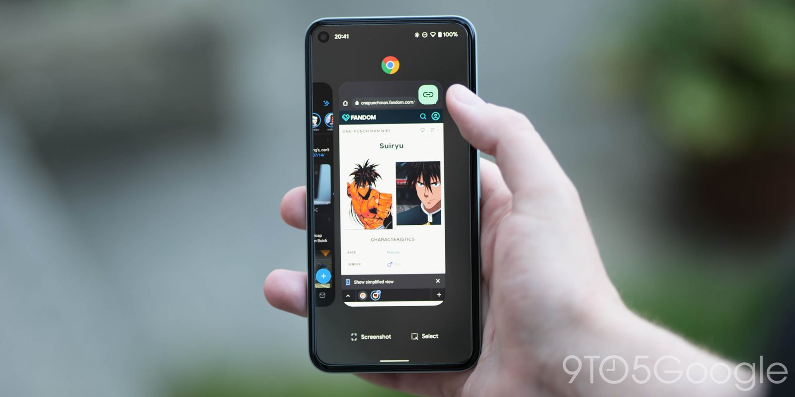
After using it for the past few days, I’m struck by how much it looks like the unified Pixel Launcher search that just rolled out with Android 13 QPR1. The similarity can be quite jarring, and I thought I navigated to the wrong screen.

L-R: Pixel Launcher, Chrome current, Chrome new
The search fields, which are box-less, feature a colorful version of the “G” logo and voice/Lens shortcuts at the right. The list layout is also identical with an icon at the left and arrow on the other side.
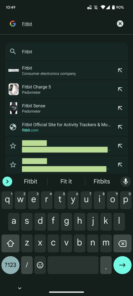
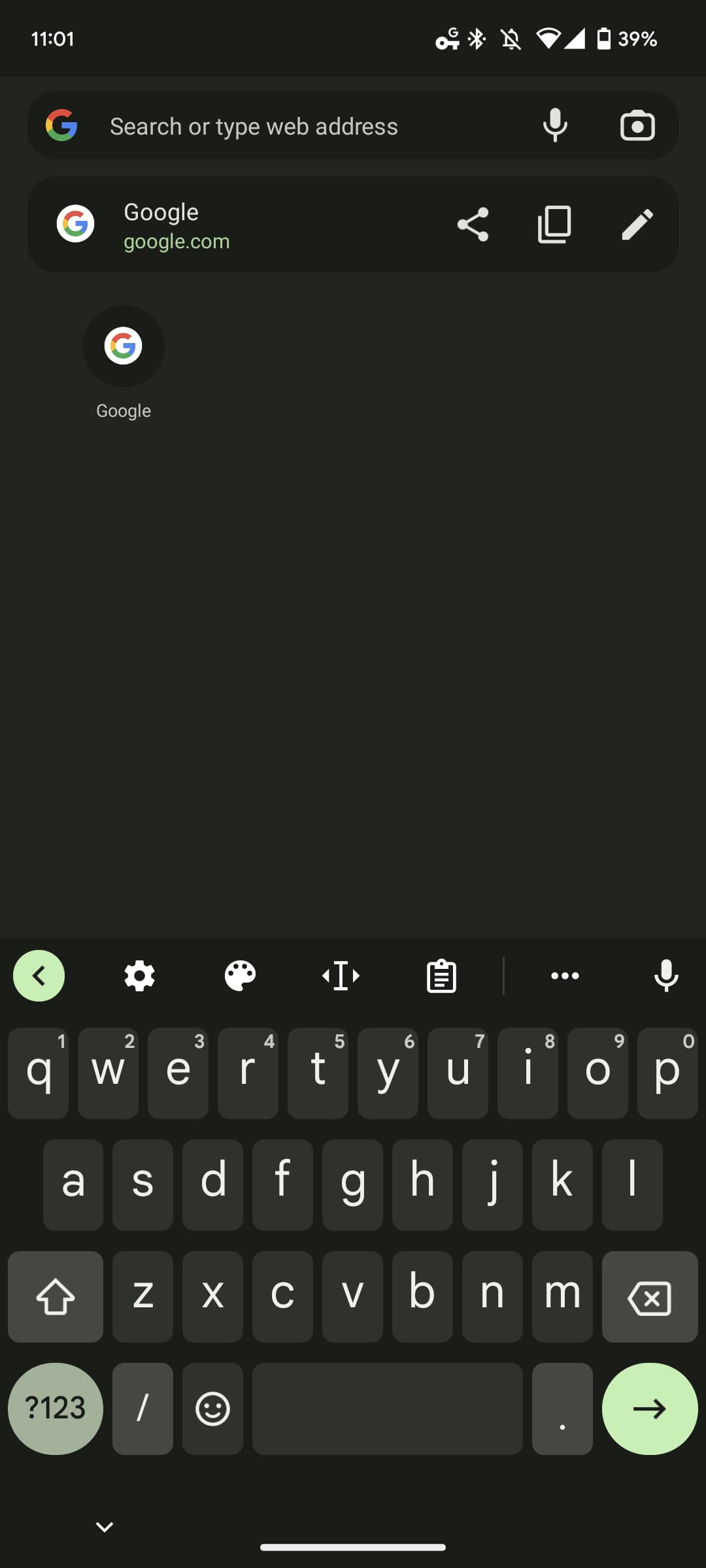
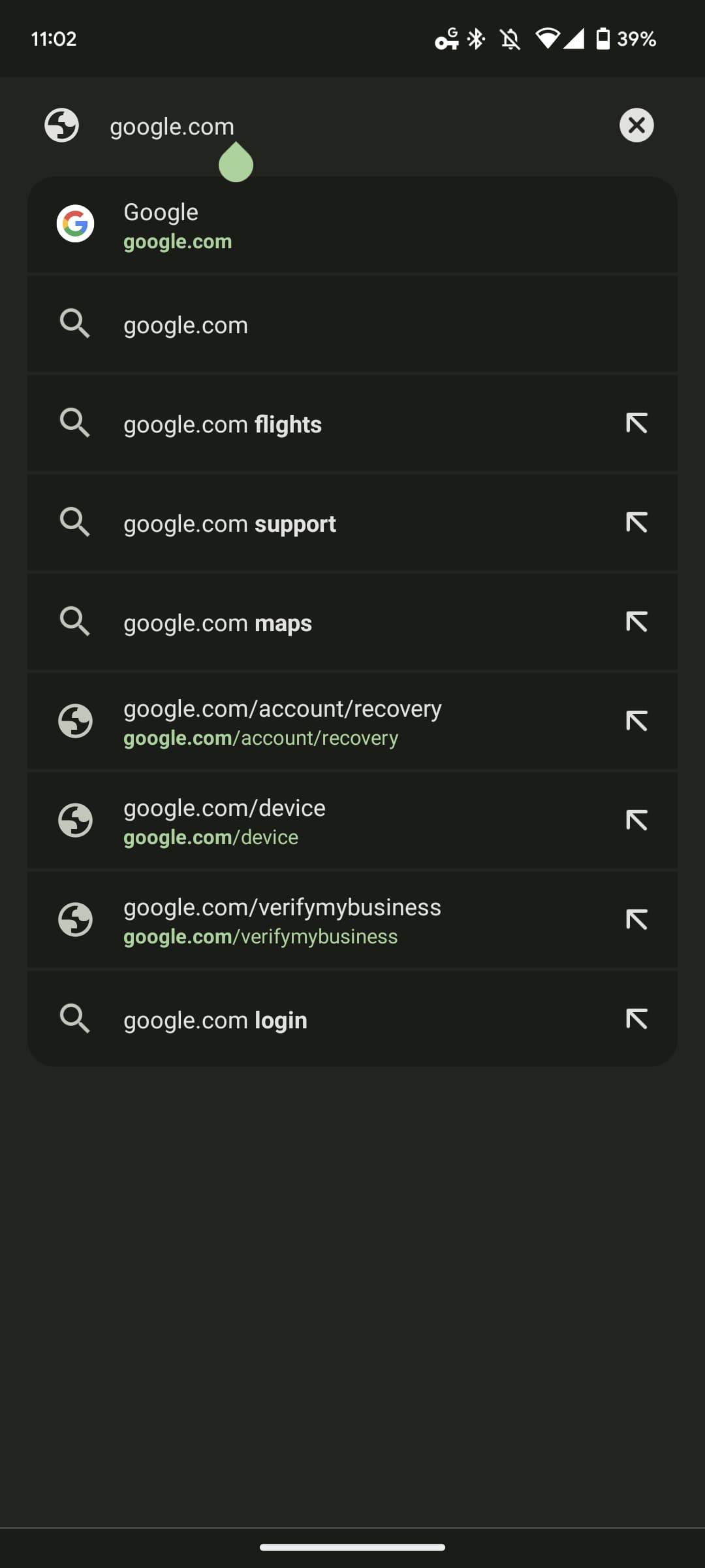
Original 9/22: When Chrome launched in 2008, one signature aspect of the design was how there was just one field for entering/viewing URLs and searching the web. Google dubbed this the Omnibox and in recent years has been working to make it more helpful by adding “Chrome Actions” that link to key browser settings. This joins how the box already shows quick answers to select queries and pictures.
Since at least Chrome 105 (currently in stable), there’s a flag called “Omnibox Modernize Visual Update.” Only available for Android, chrome://flags/#omnibox-modernize-visual-update “will show a new UI which is visually updated.”
Chrome 108 (Canary) offers the most evolved design with three “Enabled” variants in addition to the general option.


The existing design is a very straightforward list of URL and search suggestions. That’s not really changing with the revamp, but each result gets placed in a card (with darker background) to help distinguish items. Additionally, the top and bottom cards feature rounded corners. This design is rather reminiscent of the unified Pixel Launcher search that’s live in the Android 13 QPR1 Beta. The consistency is an interesting approach.
Meanwhile, the “no active color omnibox” variant/flag interestingly removes the pill-shaped container for a look that really mimics Pixel Launcher lookup.
In the description, Google notably says that “this flag is for the step 1 in the Clank Omnibox revamp plan.” It highly suggests that Google has more planned that might also impact Omnibox functionality.
Like with all flags, this Omnibox redesign in Chrome for Android might not actually launch. That said, it’s less of a visual departure than Chrome Duplex/Duet, so the odds are definitely better.
More on Chrome:
- Chrome Incognito tab access can now require your fingerprint on Android
- Steam on ChromeOS set to move from Alpha to Beta testing, open to more players
- Chrome Custom Tabs are now more explicitly labeled on Android
Thanks RKBDI and Michael!
FTC: We use income earning auto affiliate links. More.


Comments