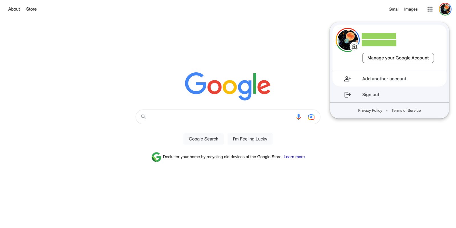
After debuting in Messages on Android, the Google Account switcher on the web is getting a Material You redesign.
It features rounded corners for all elements with two main containers. The foreground one features a larger profile avatar with name and email address next to it, followed by a “Manage your Google Account” button that’s housed in a rounded rectangle instead of the usual pill.
If you’re signed into more than one account, that will appear next with “Add another account,” rounding out the inner container. “Sign out” or “Sign out of all accounts” is part of the background with “Privacy Policy” and “Terms of Service.”
There are light (white/light gray) and dark (black/dark gray) themes, but no Dynamic Color, which would only really be useful in Gmail, which supports different backgrounds. The effect is more obvious in dark mode.
We’re seeing this Material You Google Account switcher with several email addresses we signed in to today, including Workspace domains. In fact, this design uses the container to emphasize when “This account is managed by [x]” at the very top.
On Android, the latest version of this element is only live in Messages, with Google TV using an older iteration. This unification of components found on the web and mobile is rather nice and a good step forward for Google design.
More Material You:
- Find My Device finally gets a Material You redesign with dark theme
- Project Relate gets wider Play Store availability, Material You redesign
- Google rolling out Material You tweaks to Nearby Share on Android [Gallery]
- Android 13 QPR2 Beta readies forced Material You themed icons for all apps
FTC: We use income earning auto affiliate links. More.


Comments