If what has emerged pans out, Fitbit’s “new app design” is a bit on the minor side and not the Material You revamp we’ve been waiting for. While we wait for that, here’s what the Material You team thinks modern Fitbit widgets would look like.
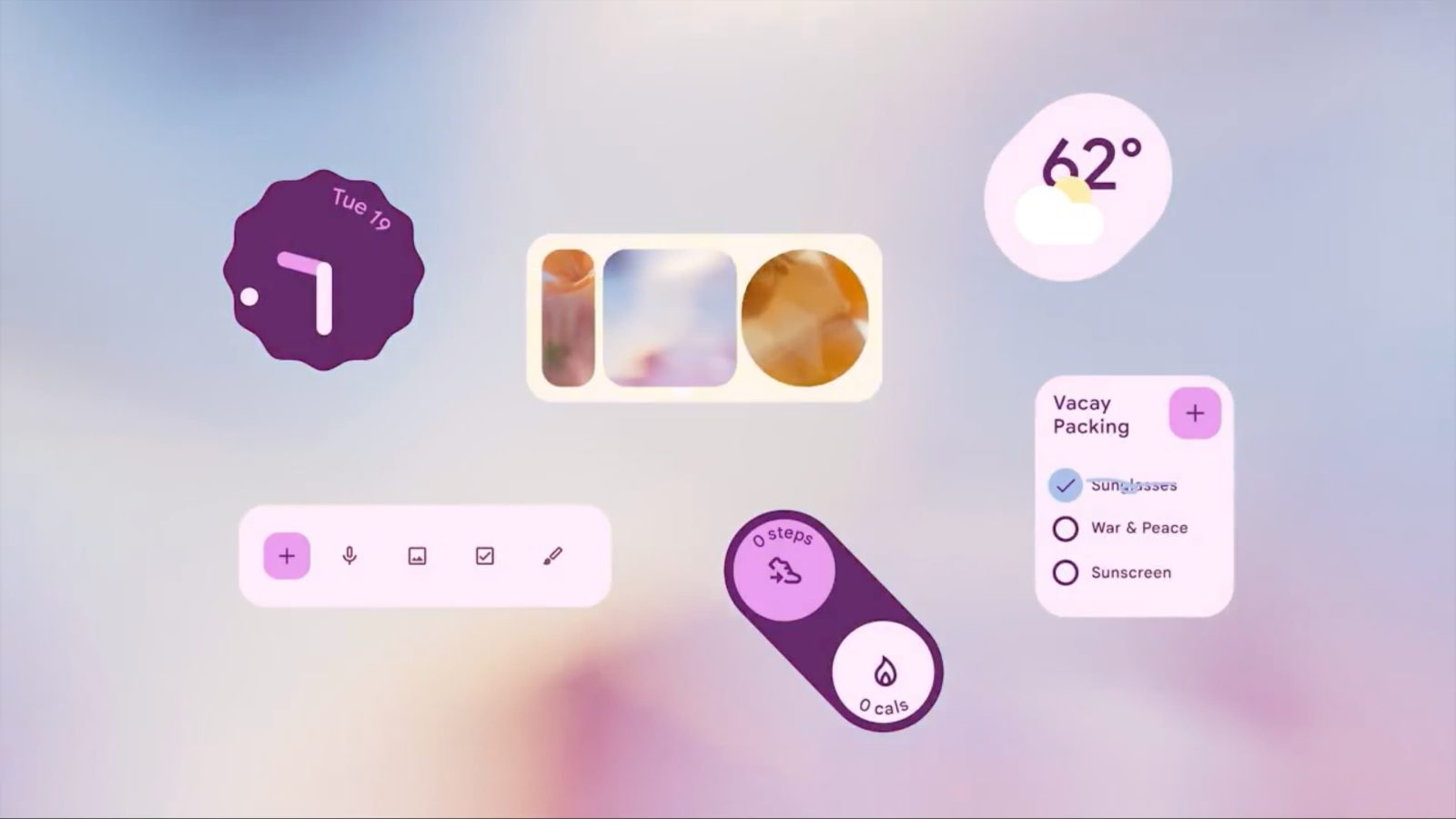
Google Design has been waxing poetically about Material You on Twitter for the past week. A video accompanies today’s entry on how “Color is personal.” We see some widgets adapting to the system color palette with existing examples from Google Keep, Clock, and (Pixel) Weather.
New today are widgets for what’s clearly a fitness app. We see a diagonal pill-shaped container, like Weather’s, with two sections. A circle at the top houses a step count and shoe icon that’s from Google Fit, while the bottom one, which is lighter in hue, is for calories. It looks rather nice and would definitely stand out on a homescreen.
We also see a more standard circular widget for calories burned on another screen. The thick indicator ring is somewhat reminiscent of the Google Fi Wireless data widget.
Fitbit today is stuck with a very old “Primary Goal Widget” and “Quick Access” shortcuts, while Google Fit has yet to be updated from the Material Theme. It’s unlikely that app will see any future updates in light of the Fitbit acquisition.
Elsewhere in the design clip, we see a more Material You Google Calendar widget. The current one only saw some tweaks and the addition of Dynamic Color in 2021. Google previously demoed a newer design, which matches Gmail and Keep, but never launched it.
Overall, this video is just concepts, but it’d be great if they came real for Fitbit. Google Design has also been talking about button surface effects and form following feeling in recent days.
FTC: We use income earning auto affiliate links. More.


Comments