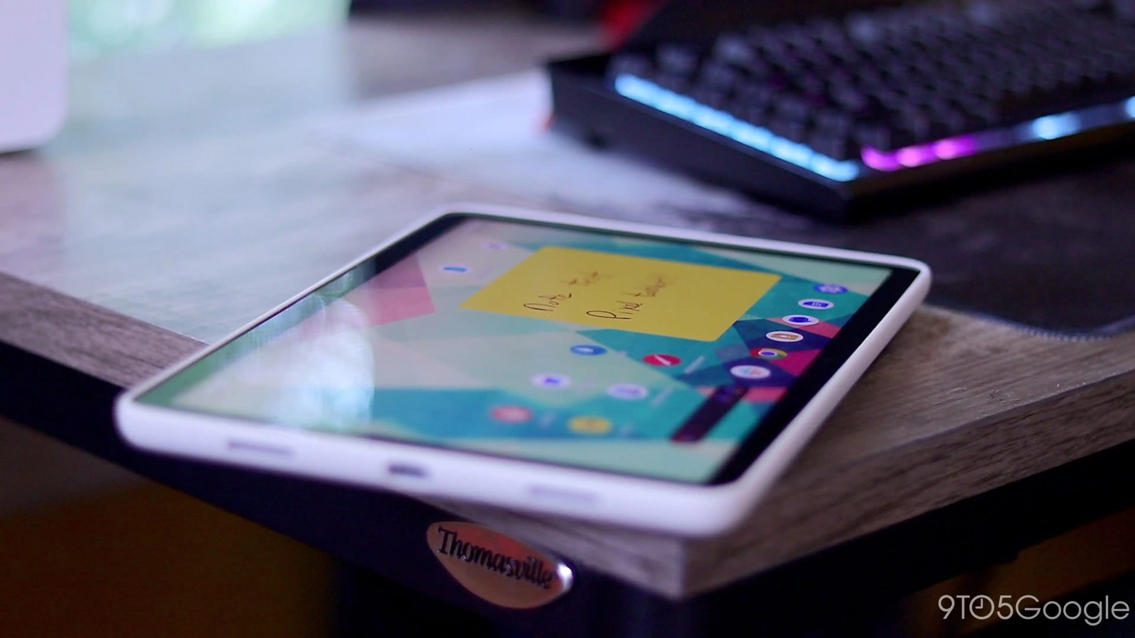
Google’s first-party tablet apps are in a good place right now and meaningfully contribute to the Pixel Tablet experience. Of course, there’s always room for improvement, and here are a few suggestions.
9to5Google has a rebooted newsletter that highlights the biggest Google stories with added commentary and other tidbits. Sign up to get it early in your inbox, or continue reading 9to5Google Log Out below:
Low-hanging fruit
A handful of apps are still stretched-out versions of their phone counterparts. Google Voice and Tasks are more than usable with their tall Material You bottom bars fitting right in, but there are some obvious upgrades for these Workspace apps.
Google Voice would really benefit from a dual-column layout (and navigation rail) for texting. Fortunately, Google Chat and Meet provide good templates on what to do, with voicemail transcripts, call screens, and contact details ideally also opening in a right-hand pane.
Meanwhile, entries in Google Tasks don’t need to span your entire screen. I’m imagining the ability to see multiple lists simultaneously and/or a tap opening the details of a task at the right. Google Calendar and Keep should serve as guides here.
Navigation rails needed
Google Podcasts, which may or may not stick around, should switch to a navigation rail like the main Search app. With the tall bottom bar gone, you could easily squeeze in another row of podcasts.
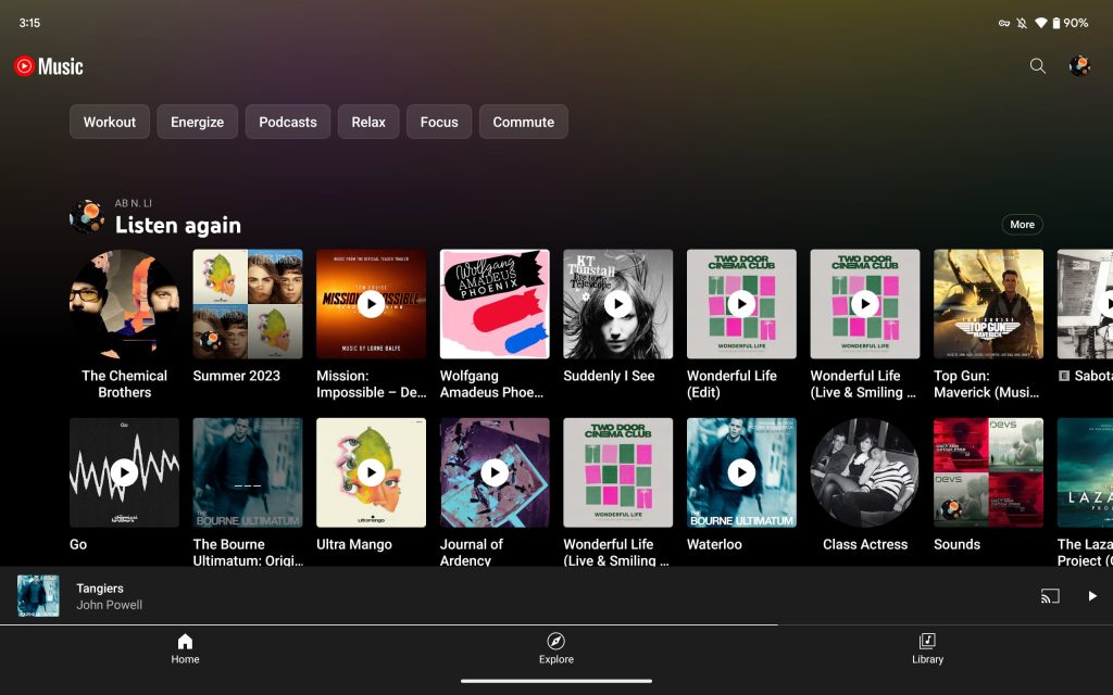
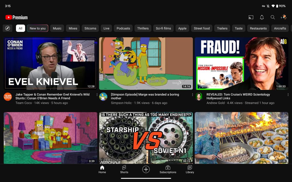
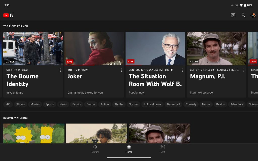
Similarly, I think YouTube Music would benefit from one. Right now, its three tabs are spaced out across the entire screen rather than being centered in the middle. YouTube and YouTube TV take that opposite approach, but I think that comes off as too squished. The ideal solution for all three is a navigation rail.
Not everything has to be fullscreen
My general takeaway is that more apps should leverage columns for content. For example, Google News, which has a rich homescreen, should open articles in a phone-sized (or half-sized) pane. There should absolutely be the option to go fullscreen, but I find that narrow chunks of text are sometimes better for readability than spanning the entire width of the screen. The same design could be applied to Google Discover articles.
A good example of this in action is the Play Store. When you search for an app, selecting one opens the listing in a pane rather than taking up the entire screen by default. A button in the top-right corner lets you expand things, though I’m not a fan of these listings on tablets since columns are primarily used to just show app suggestions/ads.
Misc
Google Clock is nice on large screens, but I’d like to tweak the world clock functionality. Your selected cities appear in a column on the right side that can show four at a time. Meanwhile, the bottom of the left side is empty. A redesign could show much more here. Even the world clock homescreen widget could serve as a template here.
As a reminder, Fitbit has not been updated yet. We presumably have to wait for a broader overhaul of the app before we get tablet optimizations.
From 9to5Google
Here’s everything new in Android 14 Beta 4 [Gallery]
Nothing Phone (2) goes official for $599 in the US – ask us anything
Googler leading XR OS quits, citing ‘Google’s unstable commitment and vision’ for AR
Threads readies handy explainer of Mastodon and the fediverse
Google Messages adds delightful animated emoji responses
Google beta testing new Pixel Call Screen, possibly with conversational AI
Hands-on: OSOM’s USB-C Privacy Cable is a premium ‘juice jacking’ fix, and it’s already discounted
What (else) is happening
YouTube wants to hear your complaints about its Premium subscription
Google Pixel 8 may see slight price increase, rumor claims
You can swipe on Google Search results to save and share
Galaxy Z Flip 5 dummy unit leaks, weirdly still has a hinge gap [Gallery]
From the rest of 9to5
9to5Toys: Best Google Prime Day 2023 deals: Pixel 7a $449, Nest Hub 2nd Gen $55, more
9to5Mac: Apple’s 32-inch iMac not expected until late 2024 at the earliest, but why?
Electrek: Video of new Tesla people-mover vehicle allegedly leaks
FTC: We use income earning auto affiliate links. More.


Comments