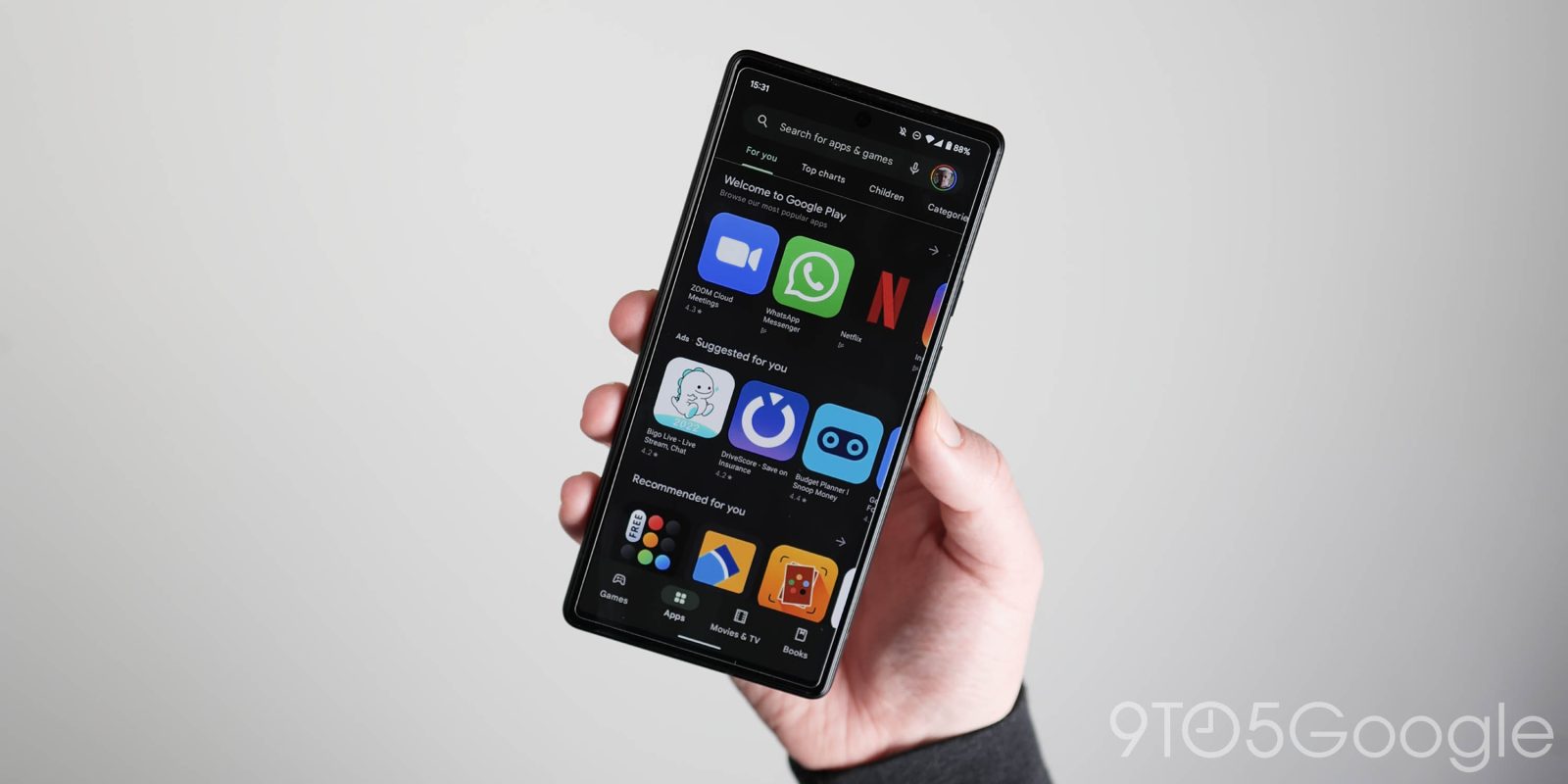
The dark theme across Google’s first-party apps is generally more gray than black. Google Play is now testing a much darker dark theme.
Previously, the gray dark theme used by the Play Store used was identical to that of Google apps without Dynamic Color theming: 1F1F1F. Google Home, News, and TV just use a blue accent color as needed (like in the bottom bar) but otherwise have light gray backgrounds.
It’s still not the AMOLED black that some prefer, but the new dark theme (131314) we’ve spotted in Google Play is a much darker gray than before. We’re seeing this on just one device today with version 37.0.22-29. Something similar happened to the Google app, Chrome, and YouTube in recent years.
The background in every screen has been updated, including the four main tabs, app listings (where this change is most obvious), Manage apps & device, and Settings. Google also made the bottom bar darker, but it’s lighter than the rest of the app for a suitable contrast.
It will be interesting to see whether this darker dark theme will come to other Google apps as part of updated design guidance or if it’s limited to the Play Store. If it’s the former, another question is whether Dynamic Color dark themes will get darker as a result.
Meanwhile, in terms of Play Store design, the app recently abandoned Dynamic Color for a blue accent, which gets more noticeable with the darker background. Originally, I assumed it was in preparation for a wider adoption of DC theming, but that might not be the case as there’s been no move in that direction. The regression for Material You is curious.
More on Google Play:
- August Google System Updates: Play Store ‘Sponsored’ badge, more
- Play Store tests semipermanent bottom bar
- Google details Play Store tablet redesign, says letterbox apps will rank lower
FTC: We use income earning auto affiliate links. More.


Comments