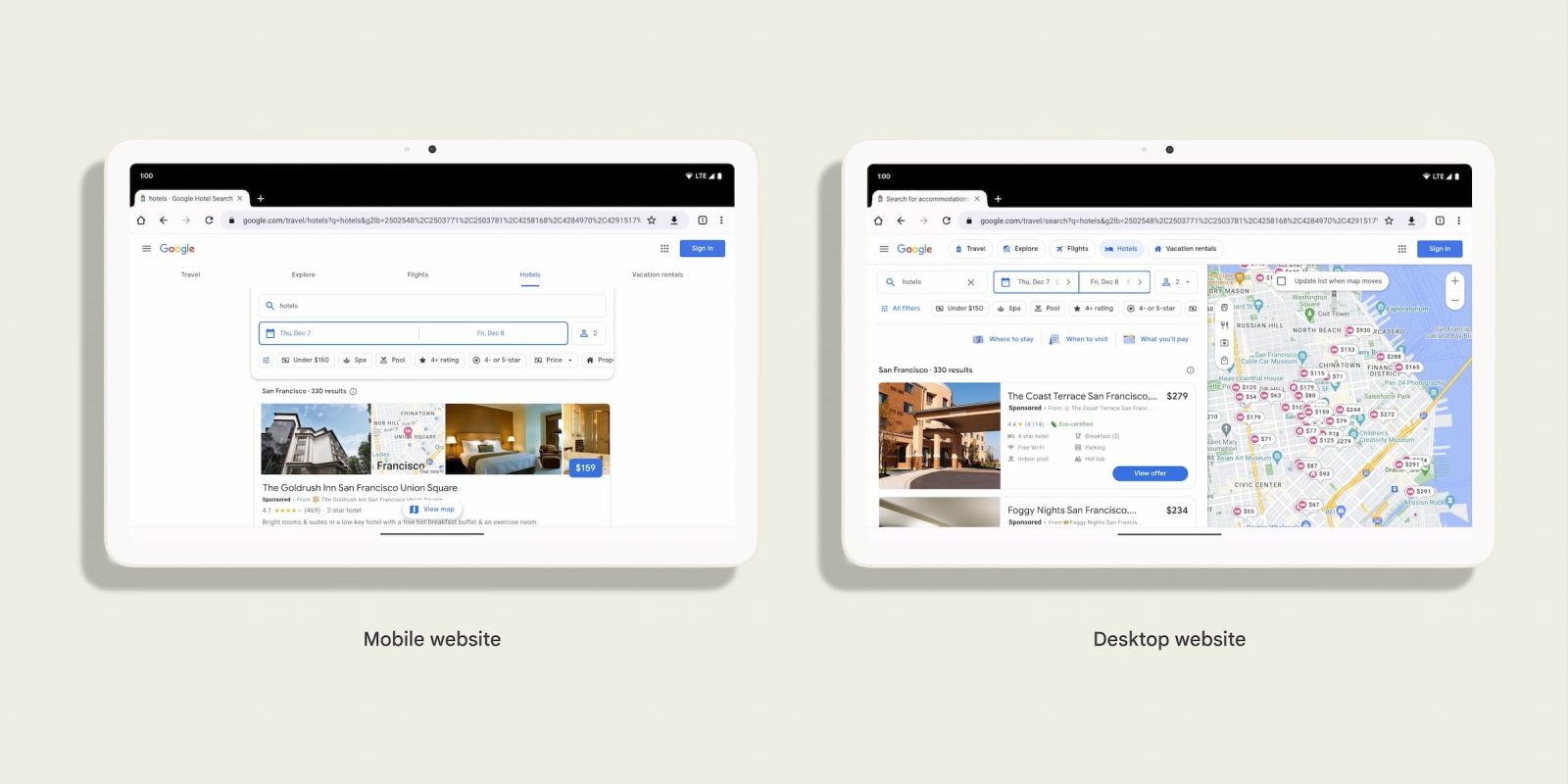
As part of Google’s work to optimize its first-party apps for Android tablets and other large-screen devices, Chrome is defaulting to desktop mode.
This replaces the mobile User-Agent that Chrome for Android otherwise uses. Google notes how “mobile websites that were designed for small screens and low RAM don’t always take advantage of the large screen and other powerful device capabilities.”
As the Android tablet ecosystem has seen more large and powerful devices become readily available, we’ve found that the desktop website can often be a better experience than the mobile site.
Google
Going forward, a desktop User-Agent will be used with a “viewport that matches the window width and not use a default virtual viewport size of 980px.”
Before:
- Mozilla/5.0 (Linux; Android 10; K) AppleWebKit/537.36 (KHTML, like Gecko) Chrome/119.0.0.0 Safari/537.36
After:
- Mozilla/5.0 (X11; Linux x86_64) AppleWebKit/537.36 (KHTML, like Gecko) Chrome/119.0.0.0 Safari/537.36
Google is also making the following change:
In addition, the SEC-CH-UA-MODEL and SEC-CH-UA-PLATFORM HTTP headers will no longer report “Pixel Tablet” and “Android”, and instead will report “” and “Linux” respectively.
For Chrome, Google defines premium tablets as devices with at least 8 GB of RAM and a 10-inch or bigger display. Tablet Chrome for Android users can still leverage the “Desktop site” checkbox at the bottom of the overflow menu, as well as Settings > Site settings > Desktop site, where you can add site exceptions:
In terms of guidance, website developers have to keep in mind that “Desktop Chrome and Chrome on Android don’t share all of the exact same Web Platform APIs.”
More on Chrome:
- Google redesigns bookmarks in Chrome for Android [Gallery]
- ‘Help me write’ AI is coming soon to Chrome for desktop
- Chrome New Tab Page getting more Material You on Android
FTC: We use income earning auto affiliate links. More.


Comments