The Galaxy Z Flip 6 makes a lot of improvements over the previous generation, especially when it comes to hardware. On the cover display, however, I find myself wanting more. A lot more.
Full disclaimer – I’ve been using the Galaxy Z Flip 6 for less than a week. I haven’t formed full opinions about the entire phone, just yet, but I have been able to draw some conclusions in comparison to other devices.
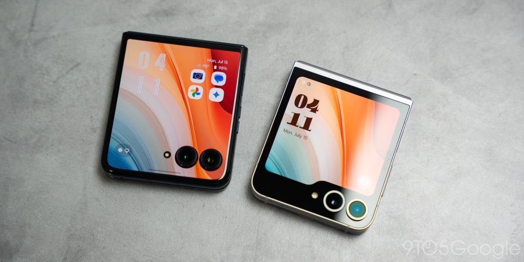
The Galaxy Z Flip 6 is coming hot off the tail of the Motorola Razr+ 2024 release. The latter has been nothing but a joy to use. It doesn’t quite stand up to the Flip 6 in terms of sturdiness and overall build quality, but it holds its own in one particular aspect – the cover display.

Battle of the cover screens
After using the Motorola Razr+ 2024 for a period of time, I became reliant on using the cover display to handle everyday tasks. Motorola’s flip entry handles the cover display phenomenally well through both software and hardware.
In software, Motorola’s Android variant tailors the experience to a smaller screen. Gesture controls are still available, and a simple swipe between pages means you can find apps and widgets easily. By default, Motorola allows the user to open apps through the cover display – every app. On top of that, the screen is plenty big enough to handle normal functions without feeling constrained.
Yes, it’s a smaller screen, but I never once felt burdened to use to the cover display in place of the internal screen. In fact, I found myself interacting with my phone pretty evenly between the cover display and the internal display.
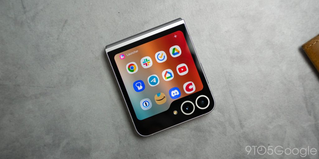
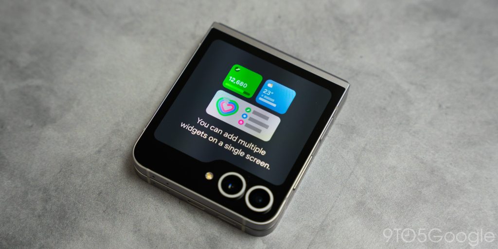
On the Galaxy Z Flip 6, it’s a different story. Third-party apps can’t be used without downloading a Good Lock module called MultiStar. You can use widgets, though the list of available widgets on the cover screen is severely limited.


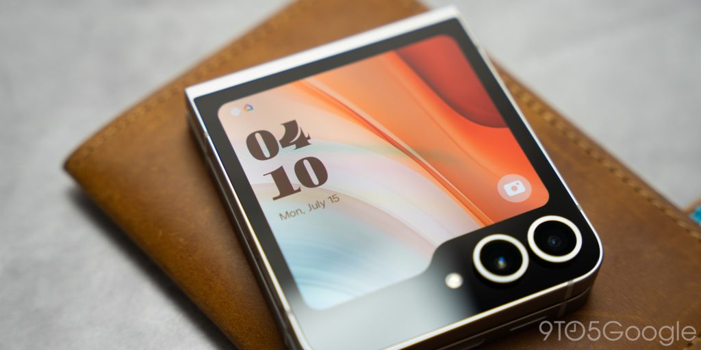
Interestingly enough, I might be able to overlook the front’s functional limitations if the cover display was good enough. The cover resolution is 720 x 748. Even if I wasn’t paying attention, the difference between the internal and external screens is palpable. To top it off, it runs at a refresh rate of 60Hz.

In comparing the two newest Android flip phones on the market, the Razr+ 2024 runs a 1080 x 1272 resolution and 120Hz. There is no discernable difference between the internal and external display, which contributes to a much smoother experience.
As far as durability goes, the Galaxy Z Flip 6 does incorporate Gorilla Glass Victus 2 on the cover display, which will be better in the long run.
In reality, most users will not be overly concerned about the cover display. It will be treated as a quick way to check widgets and notifications or to launch the camera. In that regard, it does its job fine.
For myself and likely some others out there, I would have liked to see a better resolution. At least something that doesn’t make the transition from cover display to internal display feel so disconnected. It would have also been nice to see third-party apps allowed by default, though that’s pretty easy to circumvent.
Beyond that, the Z Flip 6 has a lot to offer. Be on the lookout for our full review in the next few days. Also, be sure to leave a comment with your thoughts on the Galaxy Z Flip 6, whether it addresses the cover display or the device as a whole.
FTC: We use income earning auto affiliate links. More.


Comments