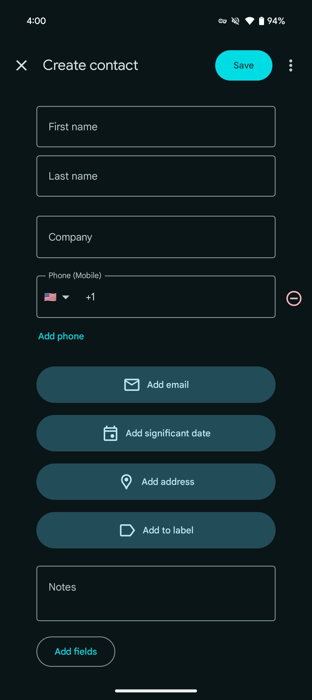
After removing the navigation drawer and the renamed “Organize” tab, the next big change to Google Contacts is a redesign of how you create a new contact.
Like before, the first and last name fields appear after the profile photo. However, Google has removed the dropdown to quickly access prefix, middle name, and suffix. Company is next and unchanged, though all fields lose their accompanying icons and everything has been centered.
Old


Phone (Mobile) is the next field with the country code pre-filled. Google considers that the main piece of information for a contact as email and significant date are now behind a button press. You can remove it using the red button at the right.
In the grand scheme, the difference between tapping a button versus a field is not significant, with the keyboard popping up immediately with both. It’s just a change to muscle memory. Google Contacts also now has prominent shortcuts for “Add address” and “Add to label,” with “Notes” appearing at the bottom.
New


Finally, “Add fields” at the very bottom brings up a sheet to access: Middle name, Phonetic pronunciation, Prefix, Suffix, Nickname, File as, Job title, Department, Related people, Website, and Custom field. In the old design, tapping “More fields” automatically inserted everything into the view for a somewhat cluttered approach. This new take is more focused.
This server-side redesign of the create flow is widely rolling out today (via Mishaal Rahman) with version 4.39 of Google Contacts.
More on Google Contacts:
- Google Contacts removes recently added section
- Google Contacts is working on a ‘Besties Widget’ [APK Insight]
- Google Contacts widget now shows message notifications, shared location
FTC: We use income earning auto affiliate links. More.


Comments