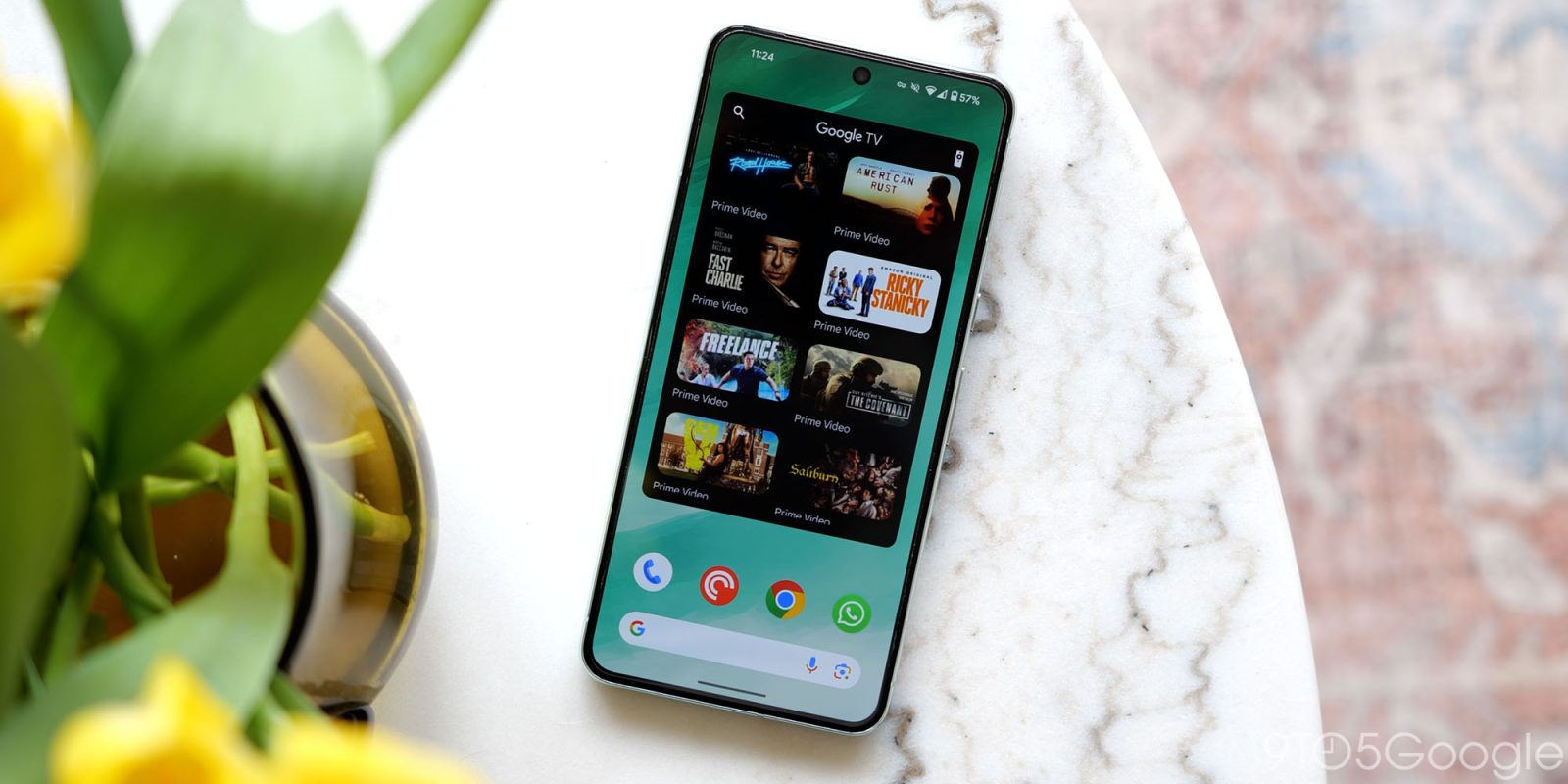
Google TV is redesigning the top portion of its mobile Android app to allow for a more immersive, search field-less UI.
The app has long featured a full-width search bar with “Google TV” branding in the middle. It’s joined by a voice input shortcut and account switcher/menu. In the “For you” tab, artwork is rounded at the top corners.
Current


One of the devices we’re seeing it on is a Pixel Fold. The large screen UI is unchanged at the moment. Not having a large bar is more visually appealing on that form factor.
A redesign replaces the field with just a magnifying glass icon next to your profile avatar. “Google TV” appears in the top-left corner, while artwork goes up to the very top. This has the upside of making the app feel more immersive.
Upcoming


Meanwhile, when you launch search, there’s now an “Explore genres” grid — Action, Animated, Comedy, etc. — that takes you to a dedicated page with various carousels. This does not exist in the previous design.


First-party apps have been trending towards getting rid of full-width search bars. Google Messages and the Play Store (to a lesser extent) are prominent examples of that. The argument against them is that the magnifying glass icon is more than obvious and takes up less space. That said, the search bar presents a very large touch target that is extremely obvious and hard to miss. If search is a big aspect of an app, it does make sense to keep it.
This search redesign for Google TV is a server-side rollout that is not yet widely available. We’re seeing it on some devices with version 4.39.2486.x of the app.
More on Google TV:
- Review: The Hisense U8N with Google TV makes a strong argument to skip OLED
- Google TV Freeplay gets a redesigned app with favorite channels, more [Gallery]
- Google TV can now help you find even more free content from The Roku Channel
- Xgimi launches a slew of Google TV projectors, including the MoGo 3 Pro
FTC: We use income earning auto affiliate links. More.


Comments