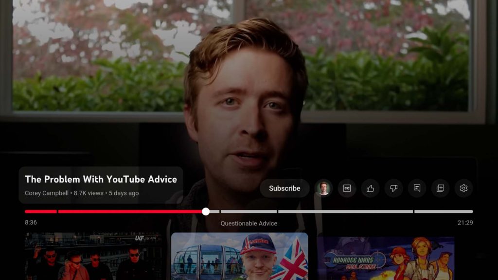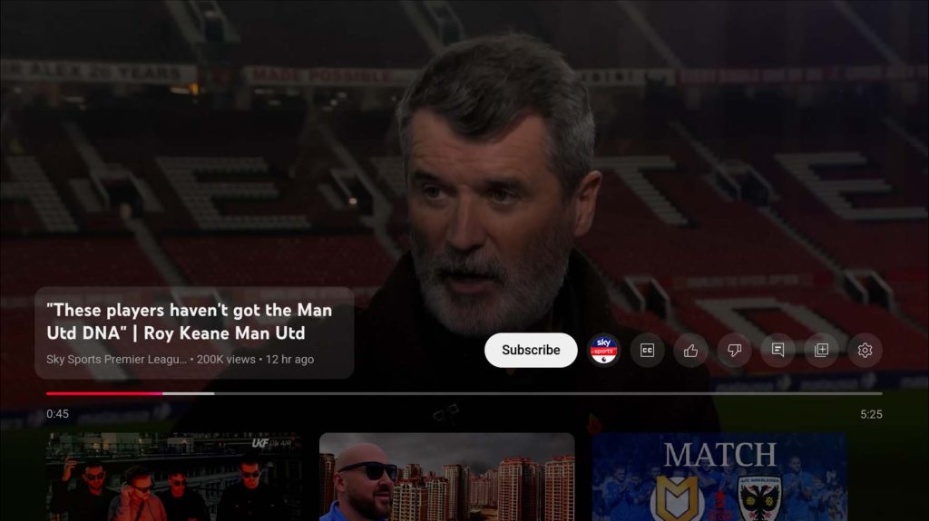
The constant evolution of the YouTube experience on Android TV continues with a more prominent “Subscribe” button when in the main player UI.
YouTube on Android TV has undergone a few visual alterations over the past couple of years to better take advantage of the larger screen and unique control scheme of using a physical remote rather than a touchscreen or mouse. We’ve also seen more elements added to improve immersion, such as the dual-column layout when viewing comments or channel information.
A new change we’ve spotted over the past 48 hours is a more prominent “Subscribe” button for YouTube channels you have not joined or subscribed to within the player UI. This allows you to quickly subscribe to a channel from within the player and skip the steps required to open the channel pane and hit the same button.
Ordinarily, this can take a few taps, and while it does add yet more controls to the player UI, it makes it easier to subscribe to channels when you find content you enjoy or gain some value from. AS you’d expect, if you are already subscribed to a channel, this button disappears. You can see just what this looks like below:


Another notable here is that the previously fused “Like” and “Dislike” buttons appear to have reverted to individual controls – making the UI look more cluttered with the “Subscribe” button also present. While this seems cramped, it could be a great way to encourage more people to subscribe to channels – of all sizes – on the platform while simultaneously removing a few button taps to get people to do so.
More on YouTube:
- YouTube debunks viral homepage layout that hides video view counts and upload date
- YouTube hyperlinked comments starting to appear more widely on mobile
- YouTube for Android rolls out new miniplayer, settings redesign
FTC: We use income earning auto affiliate links. More.


Comments