Mobvoi’s lastest TicWatch Pro 3 is a big deal. With this smartwatch being the first to come with the new Qualcomm Snapdragon Wear 4100 chipset, it could be the biggest leap forward for Wear OS for some time. We’ve spent some time getting to know the TicWatch Pro 3, to better understand whether this is the answer to many of the platform’s woes, or if it’s just another false dawn.
Of course, while Wear OS is a solid if unspectacular wearable operating system, it’s hindered substantially by poorly optimized chipsets, bogged down by performance issues, and just generally not as nice to use as it probably should be.
The bump in the chipset is also a huge deal for Mobvoi, as the firm refrained from adopting the Snapdragon Wear 3100 chipset in previous smartphones in favor of the incredibly old Wear 2100. Considering that some of the hardware prior to the TicWatch Pro 3 was stunning, it was always let down by out-of-date internals.
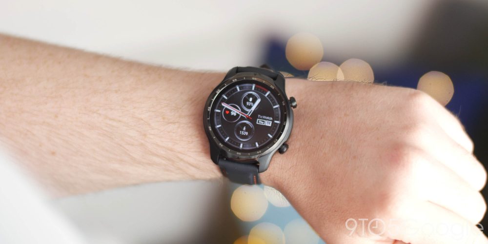
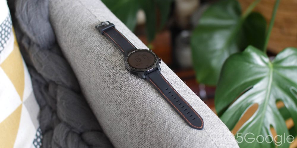
Mobvoi has at least stayed true to its roots with the TicWatch Pro 3 design. If you don’t like chunky watches, then we’re not entirely sure if this is the option for you. I personally can deal with the style, but honestly prefer something a little more “minimal” or “sleek.”
For small wrists, even though the TicWatch Pro 3 has had some bulk shaved off, this is a chunky beast. Although I have found it very comfortable with the included faux-leather style strap, but I understand that this larger footprint means it might not be ideal for all people. If you were already looking at the second-generation TicWatch Pro, though, this is a no-brainer.
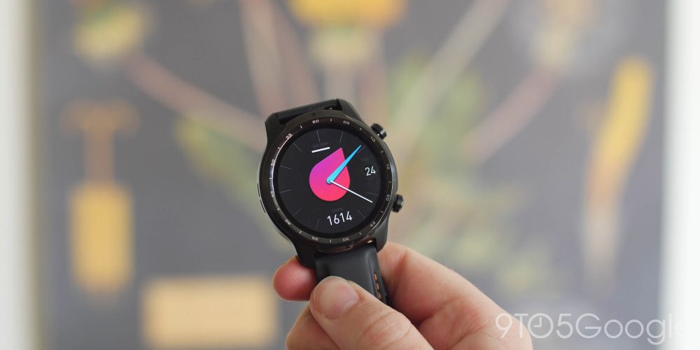
The dual display is a neat feature but one that I don’t think really adds anything to the package on offer. It’s almost as if it “cheapens” the design and hardware. A $300 watch coming with a mainly digital display is a bit weird in hindsight. I say “mainly” because when you set up the device for the first time, it defaults to the digital display unless you enable the Always-on option. I did this almost instantly, as I feel that the digital option does cheapen the look and feel.
The chronometer around the edge bezel is far smaller and the face has some refinements over the early-2020 TicWatch Pro where I have found the most day-to-day improvements. Tapping and swiping in from the edges of the 1.4-inch display is a little easier — not that it was even hard to begin with. The larger side bezel buttons are still large and in charge,
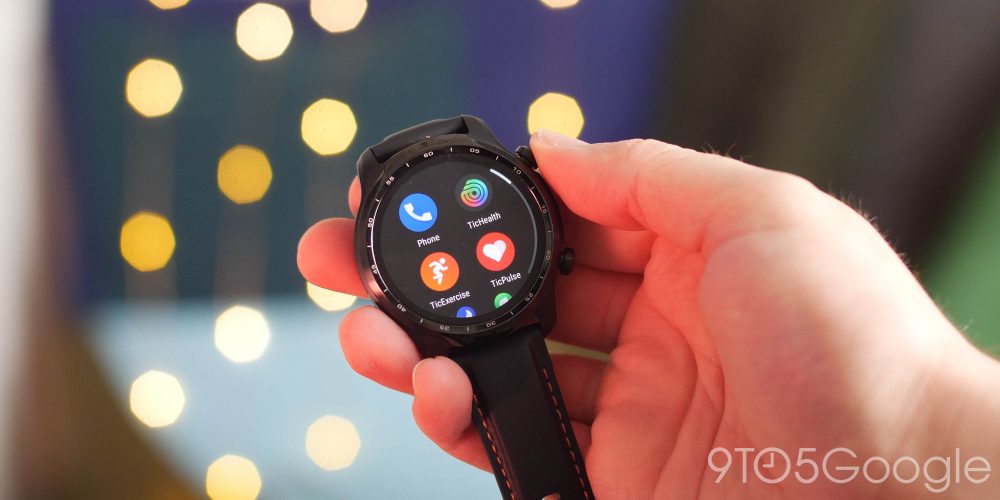
Thankfully the menu system has had a bit of an overhaul here too. Gone is the often infuriating dial-style rolling menu in favor of a double-banked vertically scrolling menu. App icons are larger and easier to press on the smaller display. I’ve found myself more inclined to actually use apps on my watch, as it’s easier to scroll and tap than it ever has been.

A recent software update appears to have upped the performance quite substantially. Lag is not something I’ve noticed all too often. I spotted a few hangs during setup, but compared to previous Mobvoi smartwatches, after a week I am pleased to say that things seem to be very impressive.
Scrolling doesn’t feel bogged down, UI elements now feel much more snappy and responsive. It’s not a quantum leap by any metric, but if you’ve ever used a Wear OS watch you’ll notice right away. I’ll save my full judgement until the review in the coming weeks, but the performance boosts are really promising, given my short time with TicWatch Pro 3.
Mobvoi has given the TicWatch Pro 3 a battery bump to 577mAh. They have stated that this should mean up to 72 hours of battery life on the regular. At this early stage, I haven’t quite seen three days of lifespan, but I can easily make this watch last two days without needing to find the charging cable. I’m sure fans of the “Essential Mode” will love that reported 45-day lifespan, but at that point, I’d rather a wristband than a big digital watch.
The charger has morphed again this time, too. Gone is the cradle in favor of a magnetic clip that is easy to attach but equally easy to detach. I have a feeling I’ll grow annoyed with this over time. I’m not sure why the charger was changed. Charging does seem to be pretty fast and consistent though so far. On the plus side, I’ve only needed to charge around three times in the space of a week.
Overall, I have to say that while the design still feels like an acquired taste, the performance enhancements look like they might make this a promising Android-focused wearable. At around $300, I was worried about the TicWatch Pro 3 might prove to be a tough sell; however, it looks like a decent package so far.
It will be interesting to see if the Snapdragon Wear 4100 chipset really does hold up over time, but for now it’s slick, smooth, and more importantly, it’s actually starting to come in new Wear OS watches. The TicWatch 3 Pro might be the first, but we’re excited to see the next wave adopt the new chipset over the coming months.
We’ll have a full review, video, and all for the TicWatch Pro 3 in the coming days to dive further into battery life, software performance, TicHealth features, and more. Stay tuned for that, and leave a comment below to let us know if you’re planning to pick one up!
FTC: We use income earning auto affiliate links. More.


Comments