
The next major installment of the world’s No. 1 smartphone operating system is here in its earliest guise. This means we’ve been delving deeper into “Android 12 Developer Preview 1” to figure out what might be the top new user-facing features of the 12th OS iteration.
As we saw with the very first wave of Android 11 builds last year, there are some notable and highly requested features being added right off the bat, with preparation already in place for a flurry of upcoming features in potential future builds.
Not all of the new software additions will work with every Pixel phone out there. And because of dropped support, the fan favorite Pixel 2 and 2 XL are not able to install the latest Android developer build. Despite some things that might not be fully compatible with all models, we’ve still done our deep dive into this first preview to give you an indication of some of the very best new features that are likely to come as part of Android 12.
Naturally, some of you might be eager to download this first taste of Android 12 and enjoy some new features. As we always warn, we DO NOT recommend doing so, as this is not really meant as a user-facing build. Like almost every preview before it, it’s also still currently full of bugs and random issues that make it hard to recommend on your main smartphone. Open betas will come later down the line with added stability, and hopefully, a ton of extra features slapped on top.
Summary
- Video — Android 12 Developer Preview 1 hands-on: Top new features!
- New media player UI and enhancements
- Settings app redesign
- Pill-shaped activation toggles
- Tweaked app shortcut menu
- Share WiFi passcodes with Nearby Share
- Enhanced screenshot markup tool
- Notification shade redesign
- More Pixel Launcher grid layout options
- Android 12 Developer Preview 1: What is your favorite new feature?
Video — Android 12 Developer Preview 1 hands-on: Top new features!
Subscribe to 9to5Google on YouTube for more videos
New media player UI and enhancements
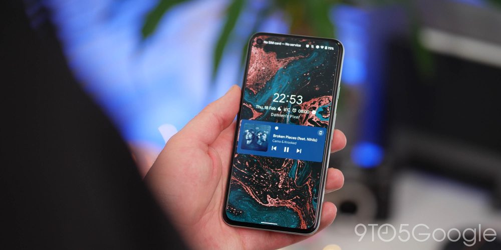
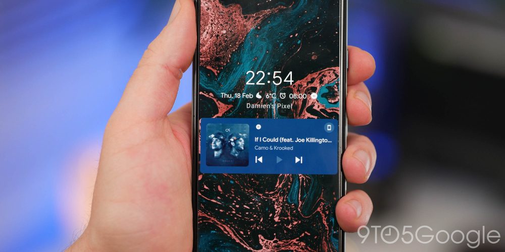
Clearly one of the big areas that Google plans to improve upon with the next Android iteration is in the media department, as this first developer build includes a brand-new UI for the media player with some other associated enhancements. The new-look media player UI is easily one of top new features in the Android 12 Developer Preview 1, as it gives far greater prominence to the controls and associated album art.
The player has changed on both the lockscreen and when using the Quick Settings/Notification panel, with a larger overall size and easier-to-manage controls. When tapping the playback locator, there is also a new pop-up to quickly connect or pair to a new Bluetooth device, therefore, streamlining the process to get a pair of earbuds or speaker connected to your device. The animations and accent color remain the same as the previous version.
You can also now prevent apps from appearing in the notification shade as part of the Media Resumption controls. If you switch apps a ton and only want selected players to be active or resumed after a while, then this is a really neat option to keep things organized.
- Notification shade/lockscreen media player UI tweaks
- You can now enable or disable specific app quick settings media controls
Settings app redesign
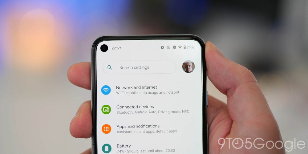
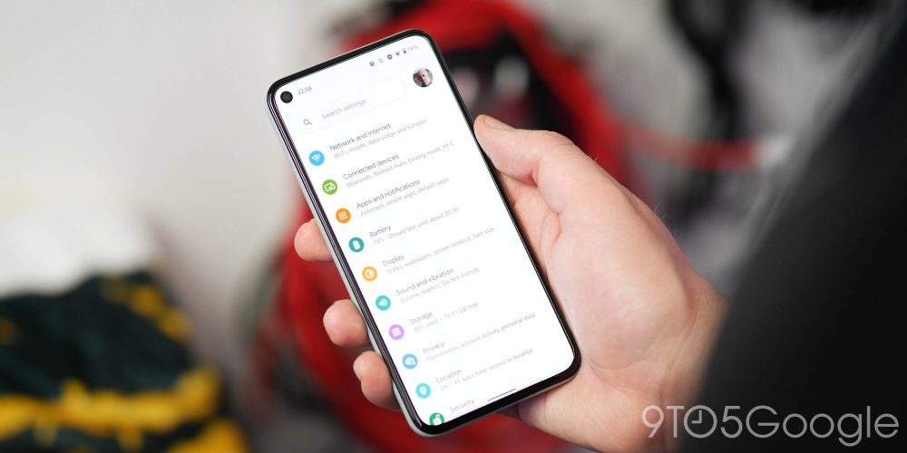
The Settings app has had a few revamps over the years, but it looks like there may be some more tweaks set to arrive over the preview period this year. A new rounded Search bar can be found at the top of the main Settings page, with a far larger profile picture that now lives outside of this shorter search field.
When diving into individual sections, there are early hints of the upcoming in-depth theming system. Each subsection now has a blue hue background that we hope will follow your main device theme color in later Developer Previews.
Pill-shaped activation toggles

A minor but admittedly notable new feature that you’ll notice right away is the new pill-shaped activation toggles for options within the Settings menu. It’s far clearer if an option has been toggled, but there are some vibes of MacOS with each individual switch.
Is this a game-changing feature within Android 12 Developer Preview 1? No. But it likely is evidence of some more changes set to arrive as part of the new Settings UI as more updates arrive in the coming months.
Tweaked app shortcut menu
Another minor change as part of the Android 12 Developer Preview 1 is slightly elongated app shortcut menus. When tapping and holding an app icon, you might notice that the pop-up is ever-so-slightly larger than in previous builds. It’s likely a quality-of-life tweak, as it’s marginally easier to reach or rearrange the shortcuts one-handed.
Share WiFi passcodes with Nearby Share
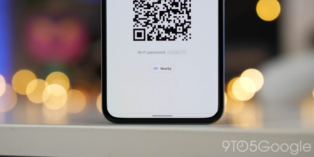
In recent versions of Android, Google has put emphasis on improving the ability to share your saved passcodes for wireless networks. In Android 12, not only are you able to share via QR Code, you can also utilize the neat Nearby Share feature to share any saved WiFi passwords with any nearby devices.
Google has added a Nearby Share toggle to the WiFi password screen. That means if you dig into a network’s settings and tap the “Share” button, you’ll see a dedicated button for Nearby Share which, on tapping, will allow users to quickly share the SSID and password of a network with other Android users in the vicinity with relative ease.
Enhanced screenshot markup tool

Another neat enhancement to an already solid core portion of Android in the Developer Preview 1 is that of some added tools within the screenshot markup utility. The first change to the screenshotting experience sees users no longer being able to tap an “X” to remove the bottom-left corner notification. Instead, users can clear by swiping right to left.
You can add text for the first time, with seven colors to choose from and a simple pinch in-and-out motion changing font size in a similar manner to that of Snapchat. You can also add emoji as stickers, which adds a fun layer to the standard screenshot tool.
Notification shade redesign

It wouldn’t be an Android Developer Preview if Google didn’t make some notification shade tweaks yet again. This time the notification shade is far more transparent, and there are some notable changes to how notifications look and feel.
Google has increased the size of the offending app within the notification shade, with larger font and profile images also bumped where used. There is some spacing between the top of the notification shade and your Quick Settings toggles, which can feel cramped with the time, date and status bar icons it must be said.
A neat little clock icon quickly launches the “snooze” menu, which is far easier than having to half-swipe a notification to activate. The first tap immediately snoozes for an hour, while the expanded menu offers added time limits.
More Pixel Launcher grid layout options
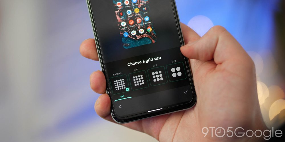
Last year, with the launch of the Pixel 5, Google introduced a new feature to the stock Pixel Launcher, adding the ability to adjust the grid size of your homescreen. At the time, the only available options were symmetrical — or perhaps square — choices: 2×2, 3×3, 4×4, and 5×5 (Default).
For those wanting added customization options, the Android 12 Developer Preview 1 adds another option to the grid choices, 4×5. Specifically, that means four spaces across and five spaces down. This is, in fact, the first nonsymmetrical option for the Pixel Launcher to date, offering a rectangular shape that may be a better fit for taller phones.
Android 12 Developer Preview 1: What is your favorite new feature?
There are more than just suface-level changes in the Android 12 Developer Preview 1, but this small selection happens to be the top user-facing features that we’ve found thus far. Naturally we expect to see more little things that might slip through the cracks over the coming days and weeks. We have a deeper dive into everything that has been added, including some features that require a little work to get fully operational in our full overview.
What is your favorite new feature or features? Let us know down in the comments section below!
FTC: We use income earning auto affiliate links. More.



Comments