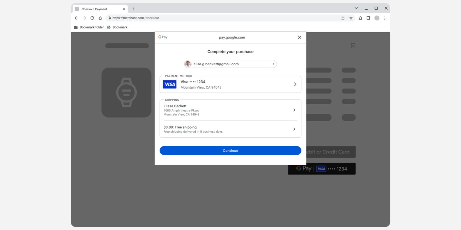
Besides in-store NFC payments, Google Pay exists on the web, as well as in Android apps, and the bottom sheet UI is now getting a Material 3 redesign.
The company says it has spent recent months “working hard to align the Google Pay user experience across Web and Android” and to offer a “more cohesive experience for your users.”
This starts with Material 3 updates to the bottom sheet. You’ll find outline-style containers that better distinguish the account, payment method, and shipping fields. There’s a full-width blue “Pay now” button that’s harder to miss at the bottom.
Meanwhile, Google has made it so that the Pay bottom sheet on the web (Chrome for Android) and Android apps are now identical. This has resulted in a “~2.5% increase in conversion rate and a ~39% reduction in errors for users using Google Pay with Chrome on Android.”
Old vs. new (in-app + web)
This Material 3 layout is also coming to the web (as seen in the cover image above), though it appears from the top, in early 2024 and has led to a “conversion rate increase of ~9%.”
The sheet UI redesign is still rolling out from a quick test of Google Pay this morning on our devices. Developers/retailers don’t need to make any changes to get the updates.
More on Google Pay:
- Google Pay on the web has a Material 3 redesign
- Google Wallet will better support open-loop transit systems
- Google Wallet now lets you share boarding passes, complete with web access
- Google Pay autofill in Chrome will actually name and show saved cards
FTC: We use income earning auto affiliate links. More.


Comments