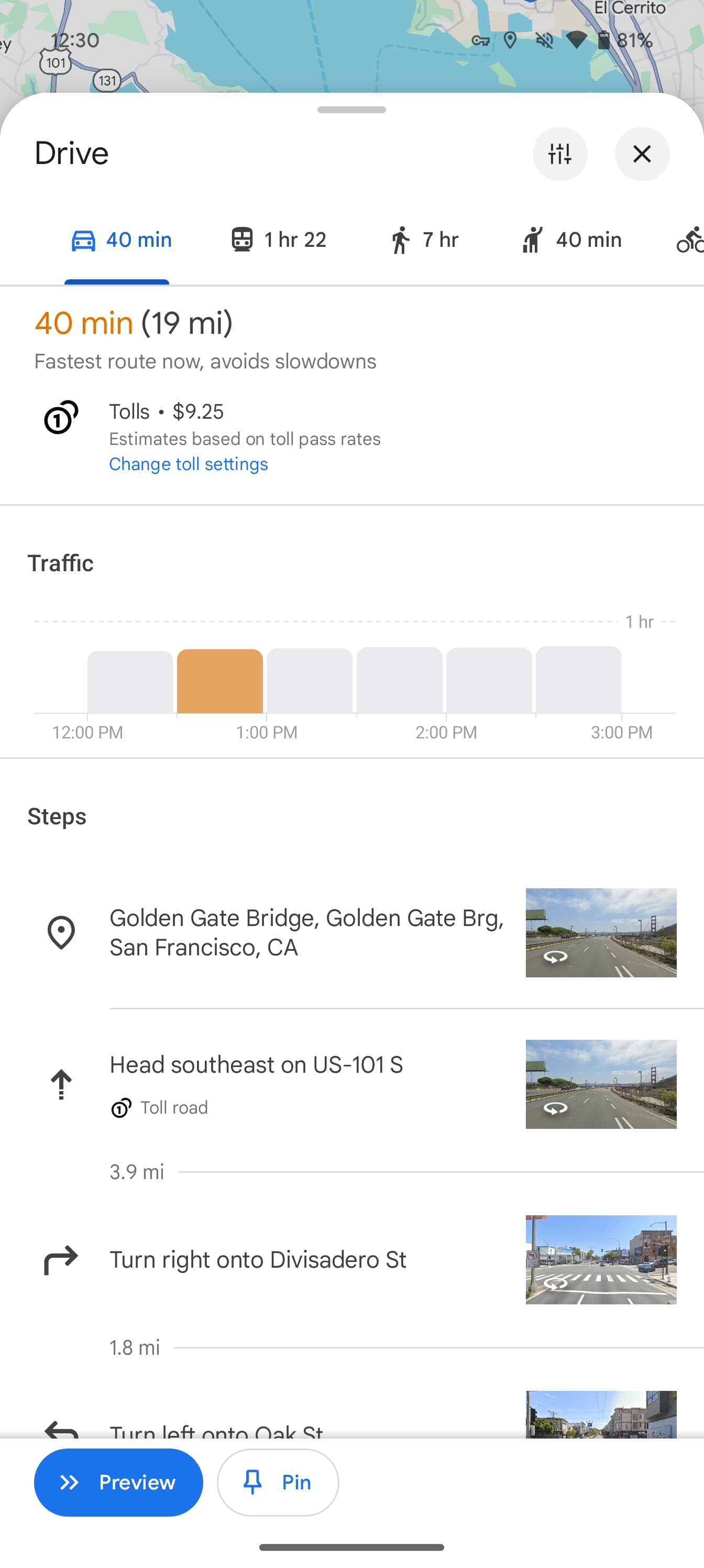
Over the course of 2024, Google Maps for Android has been working on a redesign that drops most fullscreen UIs in favor of sheet-based layouts. This revamp is now more widely rolling out.
These sheets, which feature more rounded corners, show the map in more places, thus emphasizing that background layer. In addition to helping preserve context when moving around the app, Google Maps with this redesign looks lighter.
You close these sheets for place listings with a new ‘x’ button in the top-right, or by swiping back from the left/right edge. With this redesign, you’re no longer able to swipe up on the search bar to just see the map.
Old


New


The other big change is when searching for directions. That initial UI for entering your destination, with the transportation methods switcher and list of recent locations, is unchanged and still a fullscreen page.
However, once entered, the top of the screen just shows the start/end location. How you switch modes has been moved to the bottom for improved reachability. Sheets are leveraged throughout this UI.
Old


New


Google began testing in February but it was rolled back after a few weeks. Some tweaks were made and another round of testing started in May. As of the past few days, we’re seeing the redesign more widely rolled out to the stable channel (version 11.136.x) of Google Maps on Android. It’s not yet available on iOS.
Looking ahead, expect Google Maps to simplify the bottom bar to just three tabs.
More on Google Maps:
- Google Maps adds speedometer and speed limits on iPhone, CarPlay
- Google Maps location history change rolling out, Your Timeline on web going away
- Google Business Messages in Maps and Search shutting down
FTC: We use income earning auto affiliate links. More.


Comments