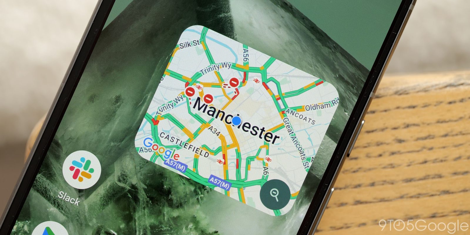
Back in February, Google Maps started testing a big redesign of the Android app. On my devices/account it was pulled after a few weeks, but it’s now rolling back out with some noticeable refinements.
This redesign gets rid of several fullscreen UIs and replaces them with sheets that preserve background context. Ideal for in-app navigation, it takes some cues from Apple Maps in that regard by better emphasizing the map layer throughout the app. You close them by tapping a close button — next to share — in the top-right corner, while the corners are much more rounded.
Current design vs. new redesign
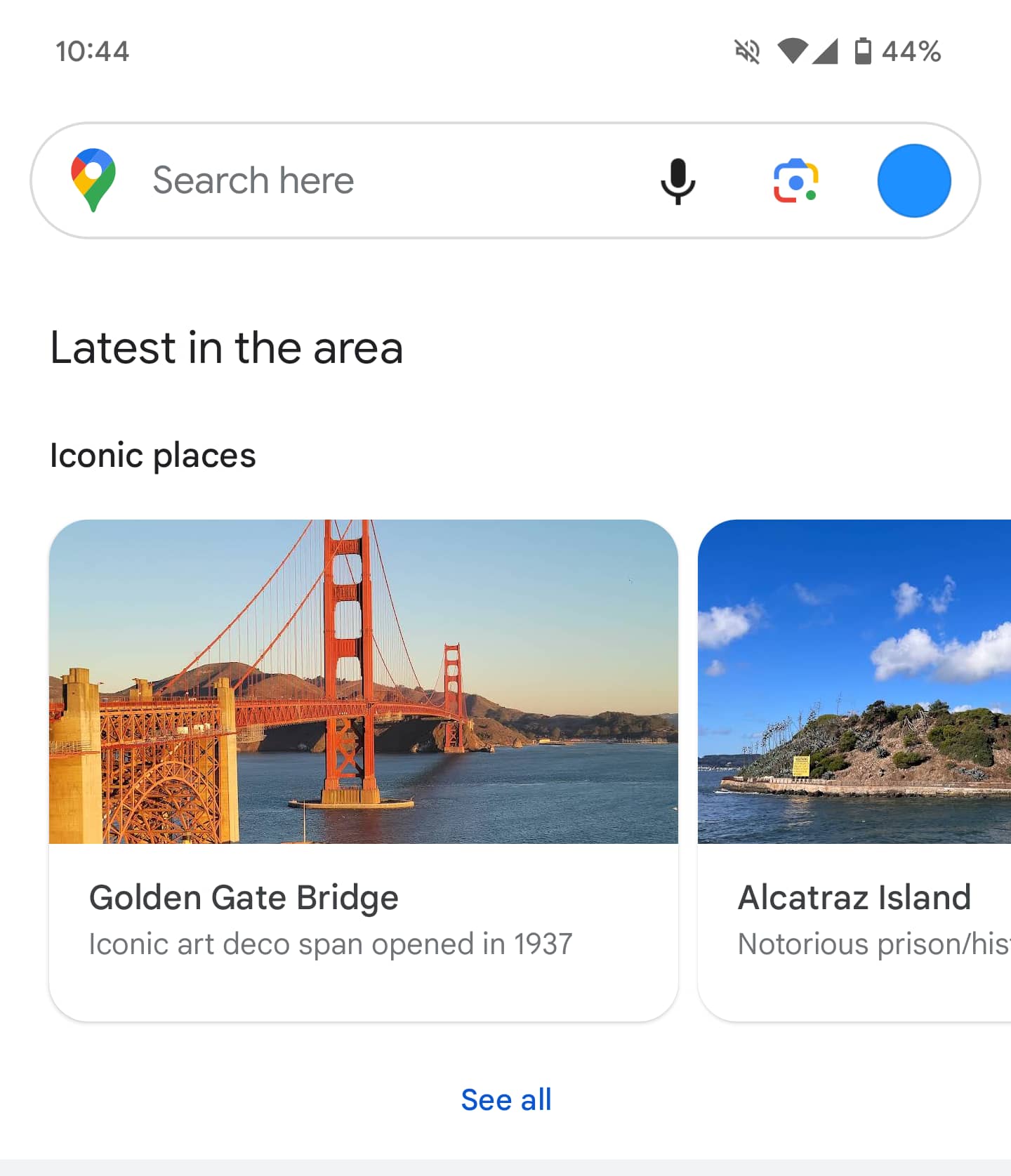


One change Google made from the first take of this redesign is how sheets are no longer double-backed. That was presumably an attempt to create a depth effect with the single sheet approach today much cleaner. Besides being more straightforward, you get to see a little bit more information per screen.
The biggest aspect of this redesign is when searching for directions. At the top, you just get fields for the start location and destination. It’s no longer edge-to-edge, while the driving, public transit, walking, ride hailing, and cycling options have been moved to the bottom for improved reachability.
Previous vs. new redesign
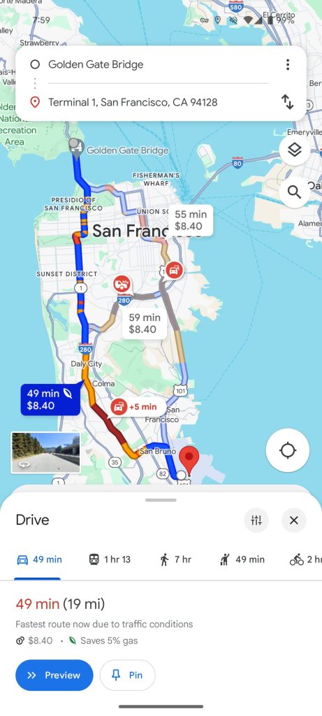
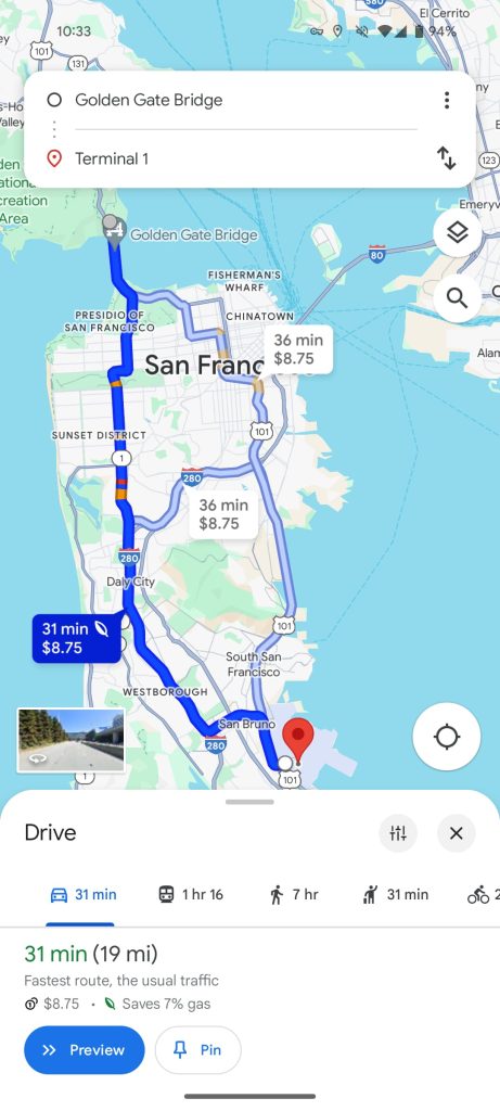
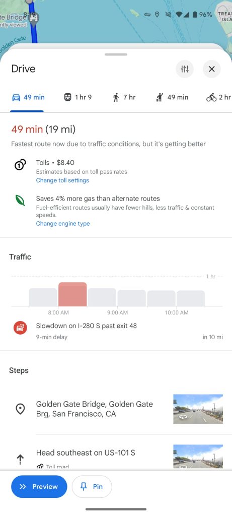
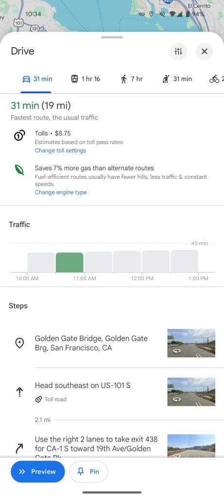
This Google Maps redesign is not yet widely rolled out (version 11.127.x on Android) and may still be in testing. It’s a server-side update and we have only spotted it on one account as of today.


More on Google Maps:
- Google Maps updates Wear OS Tile with direct map shortcut
- Google Maps testing Live Activities on iPhone – here’s what it looks like [Gallery]
- How to turn off Google Maps 3D buildings on Android Auto and CarPlay
- Google Maps will suggest transit, walking alternatives next to driving routes
FTC: We use income earning auto affiliate links. More.


Comments