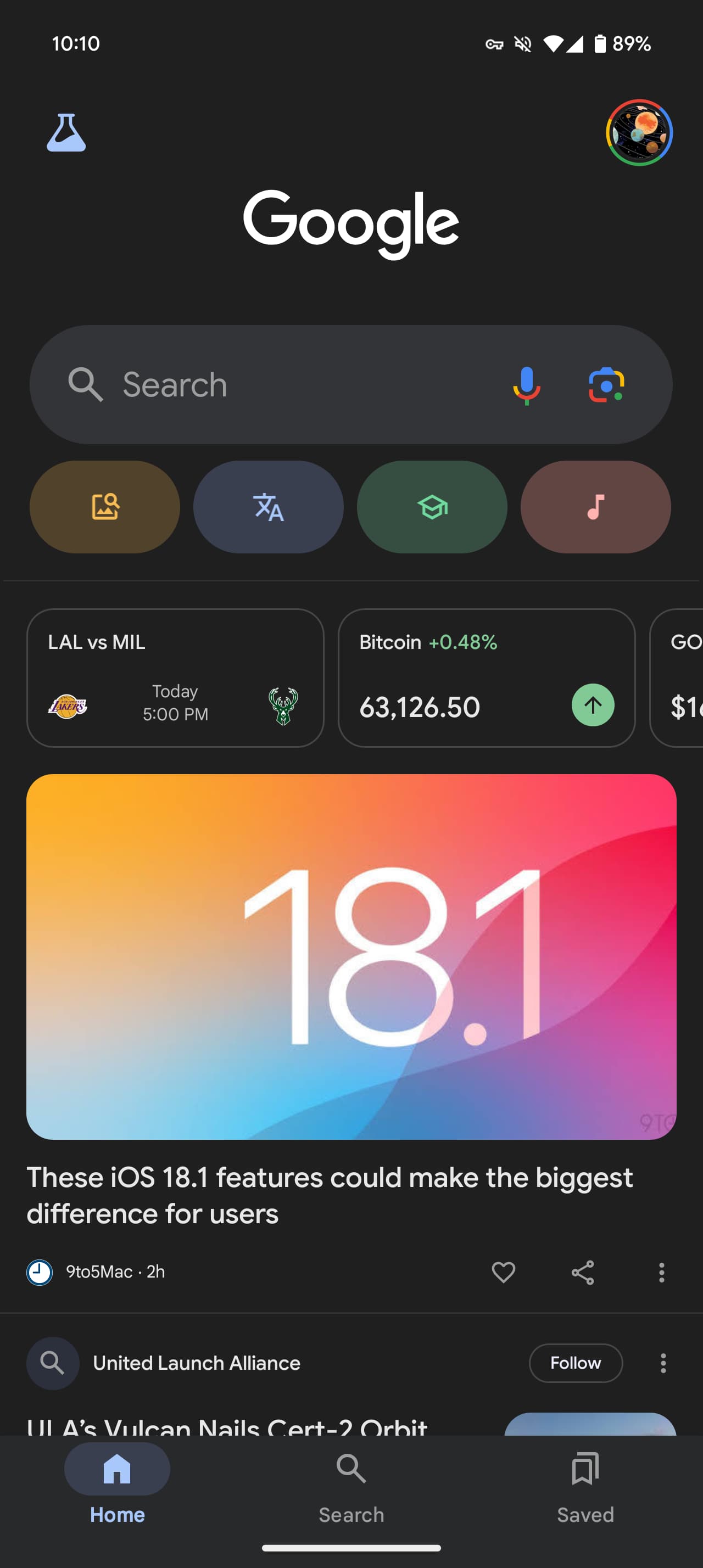
The vast majority of Google apps have updated their bottom bar to the latest Material 3 design. The Google (Search) app did that last year before reverting, and it’s now back.
Update 10/31: We’re now seeing the Material 3 bottom bar in the stable channel with Google app 15.42. On tablets and foldables, the navigation rail has been updated.
Original 10/10: It’s very simple with a pill-shaped indicator being used to note what tab you’re currently viewing. The Google app continues to use a short bottom bar like some other first-party clients, while lacking Dynamic Color theming.
This change follows the updated shortcuts below the Search bar that help make the entire app just a bit more modern.
That particular change and the new bottom bar is not yet rolled out to the stable channel. If you’re on the latest beta (version 15.40), force stop from App info to load the Material 3 bottom bar.


Why this took so long to implement is another question. Presumably, the Android app will eventually look like the iOS version and remove the text labels, while possibly adding other tabs, like notifications.
More on Google app:
- Google app rolls out Song Search Quick Settings Tile on Android
- Google updates Search widget on iPhone with customizable shortcuts, like Gemini
- Google app tests customizable shortcut in Search widget
- Google Search bar widget redesign adds Dynamic Color, limits customization
FTC: We use income earning auto affiliate links. More.


Comments