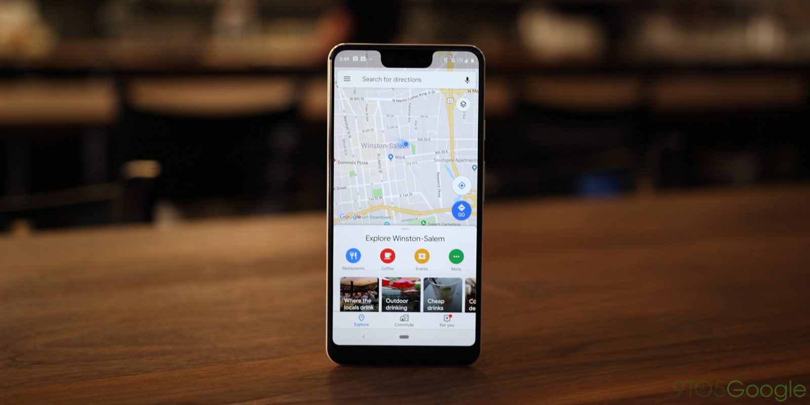
Google Maps in recent months has received a flurry of new features from business messaging to following stores for deals. The latest is a minor tweak to the navigation drawer on Android that adopts the Google Material Theme.
Announced at I/O 2018, the big Material Theme revamp for Google Maps on Android and iOS began widely rolling out in June. This redesign consisted of a new bottom bar geared towards personalized discovery, and of course stark white backgrounds and updated fonts throughout the app.
Until today (as spotted by Android Police), the navigation drawer has not received the same treatment. A server-side update rolling out today applies the Google Material Theme to this important interface element.
Sections remain unchanged, but text is now in Google Sans, while all icons have been revamped to the new Material Theme style of bold outlines and hollow centers. The divider lines between sections do not span the entire width of the drawer.
Meanwhile, Tips and Tricks, Settings, and Help are de-emphasized below, while Privacy Policy and Terms of Service have been removed to the very bottom of the screen. It’s a minor change overall, but makes Google Maps visually consistent.
This small tweak is rolling out to the most recent version of Google Maps via sever-side update and should load when users open the app today.
More about Google Maps:
- Google adds messaging to Google Maps for iOS & Android to communicate with businesses
- Google Maps for Android tests new reporting features for speed traps and crashes
- Google Maps revamps live trip sharing on Android, coming to iOS
- Google Maps adds detailed charging station listings for Tesla, other electric cars
Check out 9to5Google on YouTube for more news:
FTC: We use income earning auto affiliate links. More.


Comments