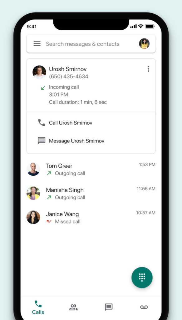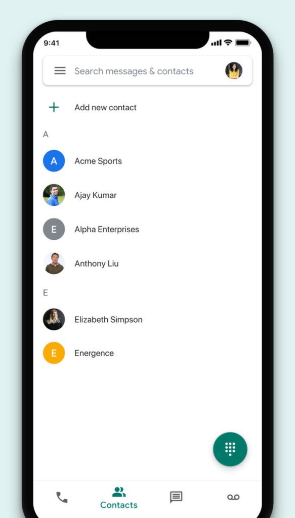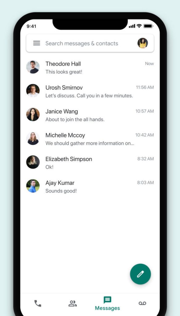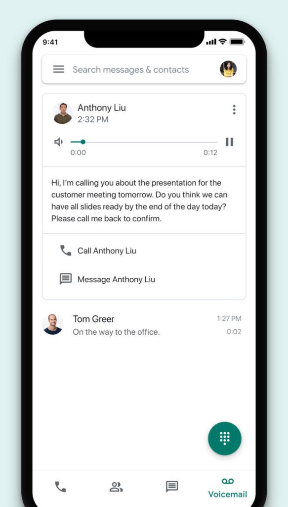
Late last month, Google Voice for Android was updated with the Google Material Theme. The revamp is now beginning to make its way to iOS with many of the latest design stylings.
Like on Android, there is a new animated bottom bar that features Material Theme icons with bold outlines and hollow interiors. Meanwhile, text labels and the dark green accent only appear for the current tab you’re viewing, thus resulting in a cleaner experience.
The top of the app is now a bar to “Search messages & contacts.” To the right is a user’s avatar for faster account switching — a feature not available on Android — while the hamburger icon is at the left to access settings and other options.
Meanwhile, the compose FAB when in the Messages tab is now a pencil instead of a text bubble. Refreshed icons for Gallery and Send are also present in conversation threads, as well as throughout the app. Google also slightly tweaked the calling interface
This “Updated new look and feel” is noted in the official release notes for version 19.07, with the revamp likely still rolling out through a server-side update. Additionally, the App Store listing already features updated graphics detailing the redesign for iPhone and iPad. Google Voice on the web has yet to be updated, though that will likely be a less significant revamp than the mobile counterparts.


More about Google Voice:
- Google Voice for G Suite will be available outside the US, no consumer expansion plans
- Google Voice VoIP calling is rolling out now, available to everyone by next week
- Google Voice for G Suite now supports calls to emergency services
FTC: We use income earning auto affiliate links. More.


Comments