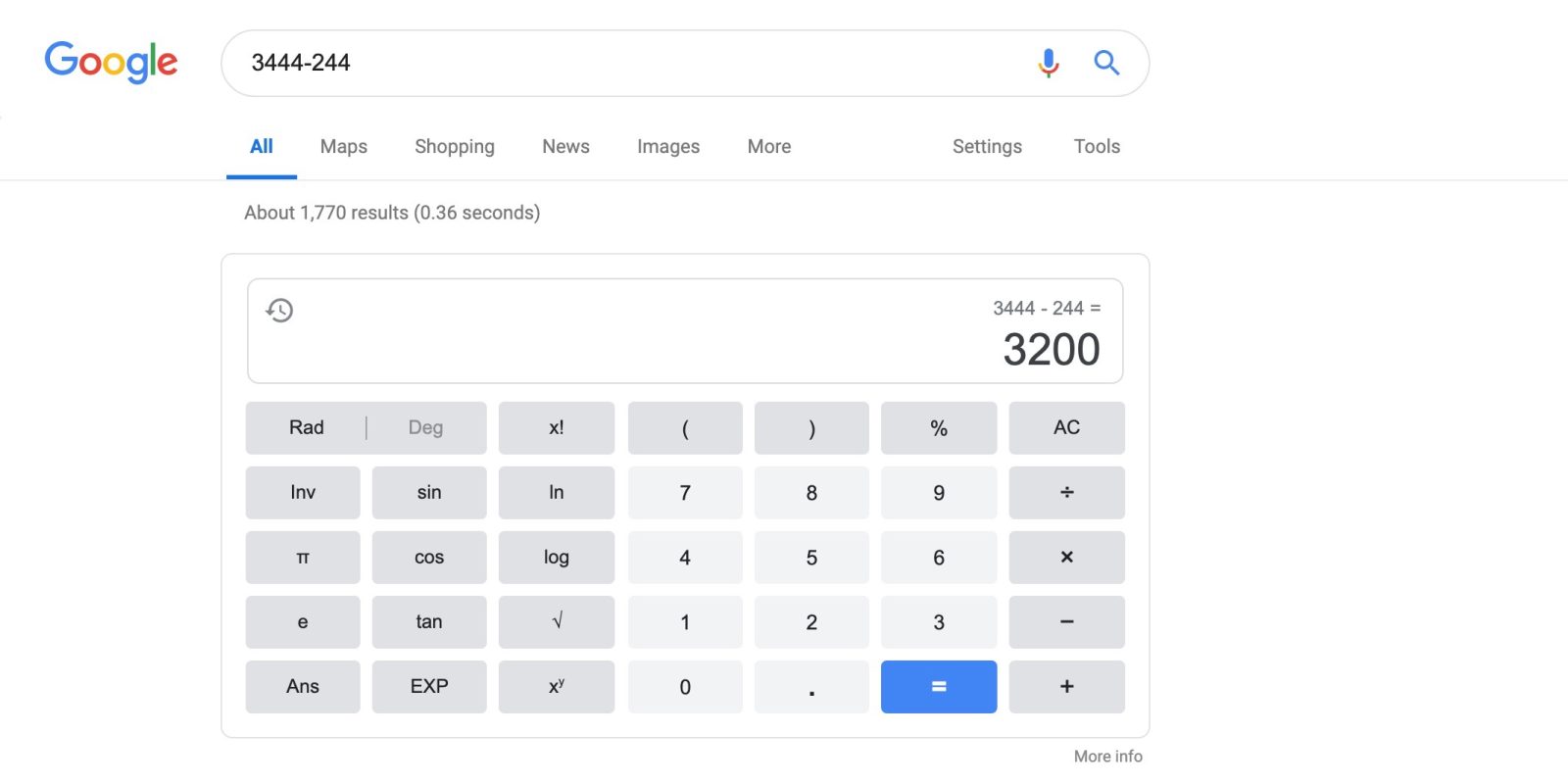
In addition to fun Easter Eggs, Google Search features a number of useful built-in tools. The calculator card was recently updated with various Google Material Theme tweaks and a new history feature.
The full-featured calculator available on Google Search for mobile and desktop web dates back to 2012. Google has now rolled out a revamp of the tool that adopts several Material Theme tweaks.
For starters, the perimeter — along with the calculator’s “display” — features faint gray lines and rounded corners. The same treatment is applied to the keys with lighter colors also leveraged. On mobile, there is a pill at the bottom of the screen to access the function keys. You can also swipe on the keyboard to reach.
There is a more detailed history feature in the top-left that shows past calculations and history. Users can tap on a past equation or answer to calculate new figures. Your most recent answer is also noted in the top-right. History only persists through your current page, and is deleted after closing the tab.
This latest Material Theme update for Search reflects how more and more built-in tools and other elements are being tweaked to conform to Google’s latest design language. As of Thursday evening, the Google calculator Material Theme should be widely rolled out, and comes as Calculator for Android was just updated with a dark theme.
More about Google Search:
- Google Podcasts officially rolling out to desktop, iOS through Google Search
- Google will bring Podcasts and Full Coverage news to Search later this year
- Augmented reality coming to Google Search with real-world 3D models
Thanks tipster
FTC: We use income earning auto affiliate links. More.


Comments