
Yes, it looks the same. The new Android brand identity just iterates on the previous wordmark and whimsical robot head. It comes as Google is readying the world’s largest operating system for the future and — like all symbols — the meaning behind it is what matters.
What comes next for the OS that’s overtaken Windows in market share? The immediate future involves a new version with Android 10.
Not Android Q, just “Android 10.”
Google is using this milestone to make some changes to the Android brand that — while minor — will be noticeable due to the operating system’s scale. You can learn about the versioning shift here, but let’s start with the differences you’ll literally see from now on.
Android — to Google — stands for innovation and openness, with the latter principle going hand-in-hand with accessibility and making sure the operating system is usable for everyone. This year alone, the company released tools like Live Transcribe and Sound Amplifier, with Live Captions coming with Android 10. Meanwhile, Project Euphonia’s personalized speech recognition was detailed at I/O 2019.
Google is now tackling the Android experience even before using a phone with those ML-backed accessibility features. It starts with what you see, and color plays a big role in the revamped brand.
![]()
That being said, the word “android” is now in black as green was a “really difficult color to read when you don’t see very well,” according to Aude Gandon, Android’s Global Brand Director.
The wordmark itself has been tweaked with Google taking inspiration from the robot mascot to curve the corners of individual letters. However, other edges remain sharp, with the contrast evoking a sense of motion. Everything is slightly thinner to help print “Android” on small screens as the old rounder and fatter version was difficult to use in all the places the OS is available.
Android in 2008 started off as a very techy brand that evoked machinery and the future. The first logo was very abstract and something you’d find in science fiction. In 2014, Google toned it down significantly to something rounder and friendlier. This evolution — tied with today’s change — reflects the broader arc of technology becoming something more inviting and easier to use.
To the right of Android’s wordmark — or just above it — the robot head will now always be present. The first implementation is ideal on the side of retail packaging, while the latter works particularly well on device boot screens.
Google wanted to bring the robot into the new Android brand as “they’ve never been together.” It serves as a visual reminder of the whimsy that the company is trying to convey with its operating system. “We love our robot. We think it captures and tells the values of the community, the humanity, and also the fun spirit of the brand,” Aude Gandon said.
The body of the robot remains unchanged, but the head sees a minor tweak to the position of the antennae. This logo also moves the eyes slightly down “to bring more humanity.” According to Gandon, “the robot eye use to be high and did not feel like humans. When you take them down a bit, they actually really have contact with you.” Meanwhile, Google is also having fun animating the features of the face.

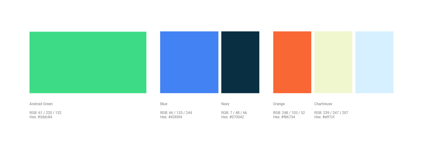
The green that Google is using for the mascot is less yellow and more blue to make it easier to display and read. There is a neon element to the shade that makes it remarkably vibrant and modern when the new and old logo are put side-by-side. In fact, it’s possibly the most eye-catching change Google is making today.
However, the biggest change is the new color palette that replaces the restrictive green and shades of gray that Google and manufacturers previously had to work with. Gandon comments how “only having a kind of green and gray is basically no colors.” One issue was how “it’s very difficult to contrast” and layer with just a pair. Android now works with bright orange and dark blues.
Here’s what Sameer Samat had to say about the colors:
One of the things that you will notice about the color palette selection is that we’ve chosen colors — and validated this with our OEM manufacturer partners — that mesh nicely with the other colors that they’ll be using to describe other parts of the phone that they want to promote.
While Google isn’t mandating any new marketing push for Android with this full visual identity system, the fact that the logo works better in more places might increase the chance that it does appear in advertising and stores.
The mascot will remain part of Creative Commons to allow others in the community to tinker with it. However, Google will be pushing this update and making sure OEMs do the same. “This is our expression of the robot and the one that we’ll work with our partners who build phones and what have you to represent in a consistent way,” said Samat.
The future
Last year’s tenth anniversary of Android sadly did not align with Google’s other big decision today to use version numbers when naming releases. The operating system is just about to enter its next decade, and the new Android brand is literally Google putting its best look forward for the occasion.
In that future, VP of Product Sameer Samat says that Android has “so much left to do.” Appropriately, what comes next is centered around the operating system’s very first form factor.
After a period of iterative smartphones, the next wave of hardware technologies are nearly ready. “If you take a big step back, mobile devices are in the hands of more consumers than ever, Samat said. “On the other hand, we’re seeing this surge of innovation around mobile devices today.”
He added:
We’re just seeing the beginning of new use cases, form factors, and iteration of computing. That’s even before you talk about TVs, watches, IoT devices, and more. We got a long way to go and a lot to do.
While foldable display tech and 5G have yet to prove themselves in the market, the technology will undeniably get a mass-market debut on Android. It’s already underway with 5G variants of this year’s flagships, while the Galaxy Fold is finally coming to market.
The fact that Android is powering these devices speaks to the open nature and flexibility of what Google built. After 11 years, Android is on 2.5 billion active devices including phones, tablets, watches, televisions, and cars with global reach. According to Samat, Google “never dreamt it would get to that point.”
There’s no denying that the new Android brand is iterative, but even little changes help towards modernizing the world’s biggest OS. Google drops the dessert naming convention that — while whimsical — was not universal. Replacing that is the constant presence of the more friendly Android robot every time you restart your phone and hopefully out in the world.
FTC: We use income earning auto affiliate links. More.

Comments