
After the whirlwind launch of Android 12 Developer Preview 1, we have been diving into the first build of the upcoming OS to find some hidden gems and brand new features you might have missed.
While we have already done a deep dive into what we’d formally consider the top user-facing features, the Android 12 Developer Preview 1 also includes a ton of other additions that we didn’t initially spot or were hidden within the OS behind adb shell commands and not quite ready for primetime. It’s not uncommon to see many new features are coming to light. To that end, if you were disappointed by Android 11’s modest upgrades and tweaks, Android 12 sure looks like the biggest overhaul for some time.
And while many of these new features are to be excited by, there are a few that you won’t be able to get working or enable unless you know your way around adb commands and are happy to tinker away. Our disclaimer ahead of time is that we won’t be sharing some of these due to the buggy nature of many of the features that are clearly meant for internal usage. Luckily, evidence and previous years’ previews indicate that some may arrive in a future Developer Preview ahead of the full Android 12 release.
Video — Hands-on with more features in Android 12 Developer Preview 1
Subscribe to 9to5Google on YouTube for more videos
Android 12 Developer Preview 1: Things to come…
Not everything that arrived in the first Android 12 preview is intended to be user-facing. Much of the new additions are under-the-hood. Some are outright unavailable and in various states of development. We dug into the first preview, though, and have enabled some features that look likely to arrive in either a future preview of beta build.
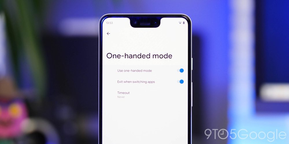
One-handed mode
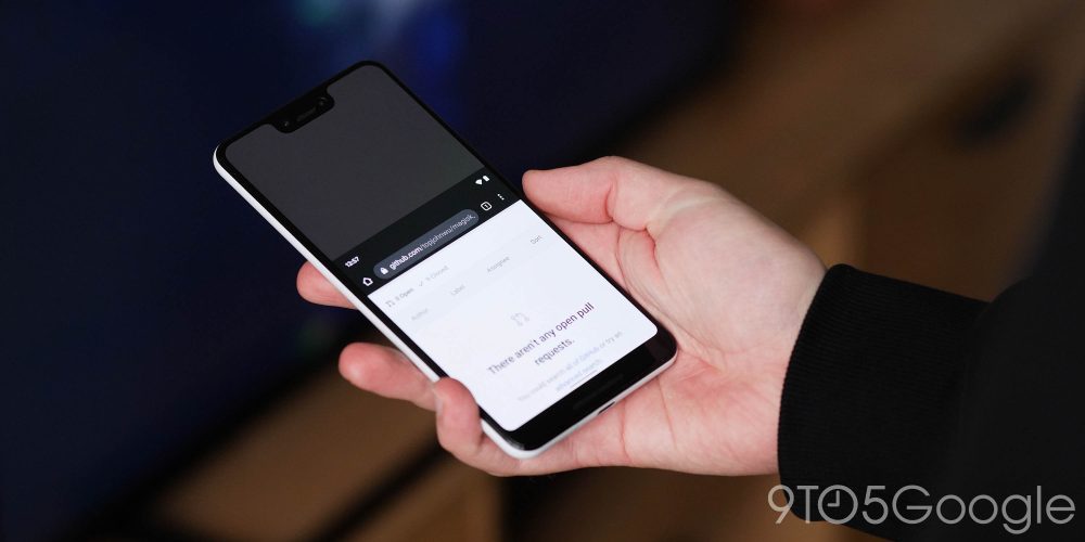
Android 12 Developer Preview 1 has added some neat new tricks, but the promise of a one-handed mode is something that should really excite long-time Android fans. It’s something that has been a notable absentee for what feels like an age. Many Android OEMs have offered their own take on a one-handed mode, but Google’s implementation looks like it will follow Apple’s lead.
When activated, the option will let you swipe down on the gesture navigation bar. This will shift your entire device UI downwards, allowing you to reach the upper portions of your display. There’s no denying that this mode has been lifted directly out of iOS, but it makes sense given that people who switch between the two biggest mobile OSes will know exactly how to invoke the mode.
To go back to a normal fullscreen view, it’s as easy as swiping down or tapping in the gap to return everything back to normal. Now it isn’t quite as good as the Sony implementation in our book, but it’s a solid start, especially with smartphones still getting bigger with each passing year.
Scrolling screenshots
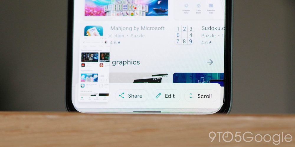
Yes, another feature that is so overdue that it feels like Google has been actively avoiding adding to the “core” Android build just to annoy us. However, like a few “important” features within Android 12 Developer Preview 1, this is also not user-facing. It has to be enabled, and it’s a little lacking in Google’s usual polish.
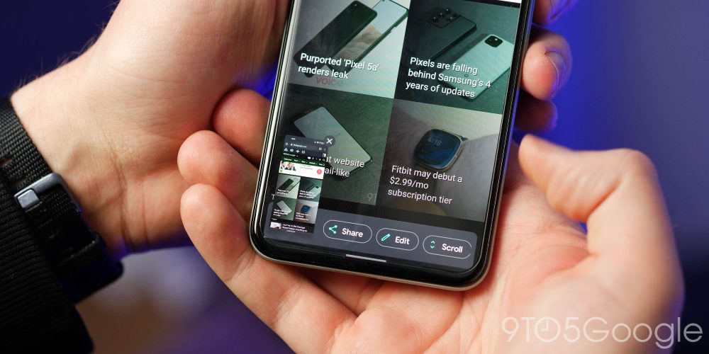
Effectively, when you take a screenshot within an app or on a website that extends beyond the standard viewport, you’ll get an option in the floating window to “Scroll.” Everything is then stitched together into one seamless image, except there are a few little issues here and there that clearly need to be ironed out.
The animation is almost non-existent, with a “snap” to the bottom causing some issues with places like the Google Play Store. Sometimes it just cuts off and ends an expanded screenshot unless you have fully expanded out as far as you want to capture. It’s buggy, to say the least, but it does look like we might finally get the option in Android 12.
Lock screen redesign
It looks like Google is set to shake things up on the lockscreen of Pixel devices with some tweaks likely to arrive with the full build later this year. We’ve found some changes can be enabled — but with sometimes no end result.
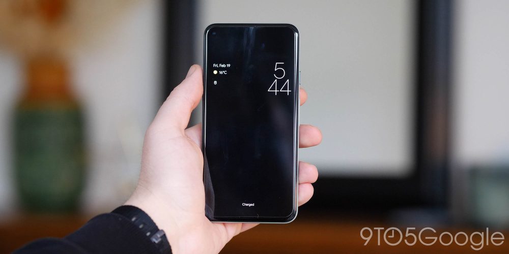
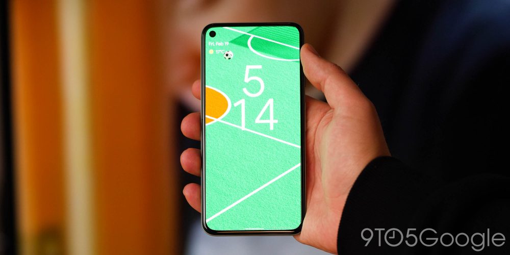
The most obvious change for which is that the clock is significantly larger, using two separate lines with the hour above the minutes. When notifications are visible, the clock moves off to the upper right just above your notifications.
Meanwhile, the date and weather have also gotten a tweak, with the date appearing as a separate line above the current weather. Instead of sitting in the center below the time, these two now appear in the upper left, opposite the clock. Google hasn’t made this change publicly visible, so it’s clearly very much in the “work in progress” phase. That said, it could be a sign of a big shift in how we soon get introduced to Android’s UI.
Wallpaper-based themes
Another huge component in the new theming system that we first uncovered ahead of the Android 12 Developer Preview 1 is that of automated themes based upon your wallpaper. We haven’t been able to manually activate this ourselves as yet, but Android developer Kdrag0n was able to showcase the feature in action in Developer Preview 1.
The theming tool has the codename “monet,” but it’s not totally clear when Google will release the Android 12 “monet” theming tool to users, but based on years past, a release during the Android 12 Beta makes the most sense. This year’s schedule puts that release sometime in May.
It might offer up a way to keep your smartphone theme fresh without you having to delve deeply into settings menus or tweak colors yourself. Android 12 could do all of the heavy lifting by adding accents whenever you change wallpaper — something that would be a nice ease-of-use touch.
Android 12 Developer Preview 1: Features you may have missed
Floating magnification windows
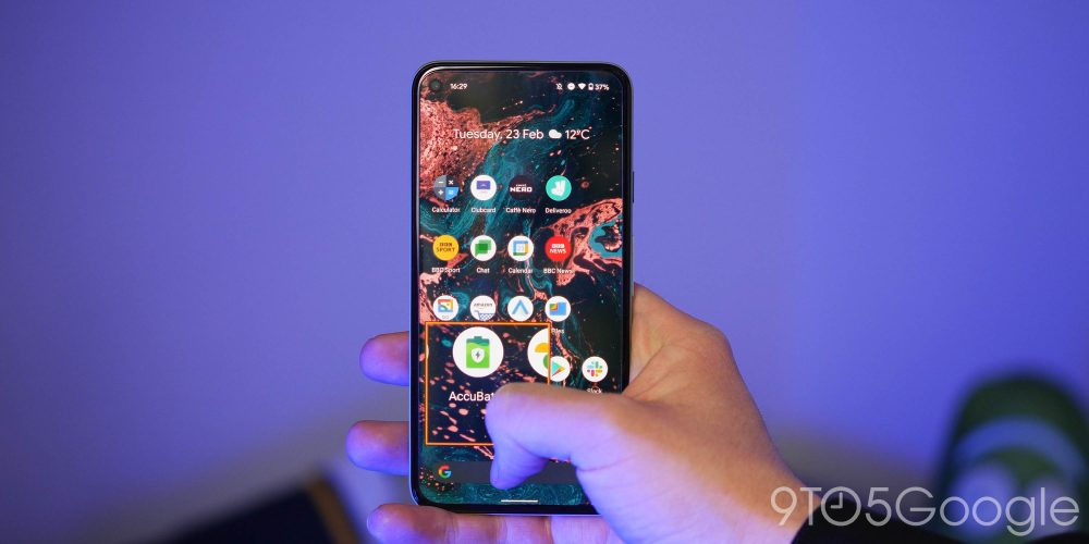
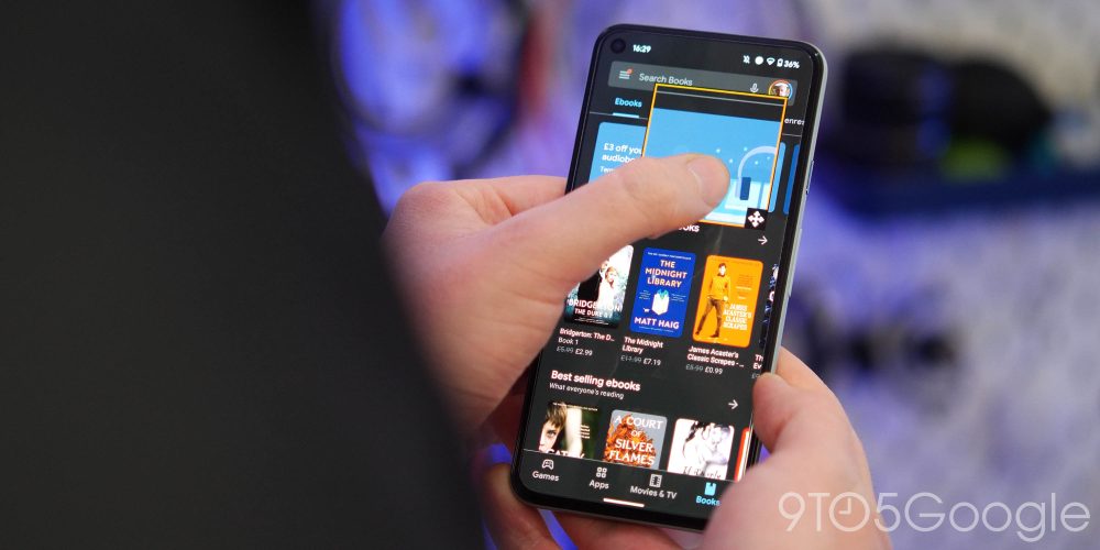
Accessibility is clearly another (sensible) tentpole within future Android builds. As starting in Android 12, you will be able to use magnification on either the entire display — as it has been for a while — or just a small section of it. To help this, a floating window can be added and moved around your display to magnify a selected area. The feature can be a little finicky to get properly set up, but in practice, it’s very well implemented once you figure it out.
The floating magnification window in Android 12 is just a small square that can be moved to zoom-in on specific parts of your screen, and it works in every section of the OS. As you reach the corners and sides, you can continue to slide your finger to focus on the edges of the display. One of the best aspects of this new method is the interchangeability between full screen and sectional magnification.
Reduce Bright Colors
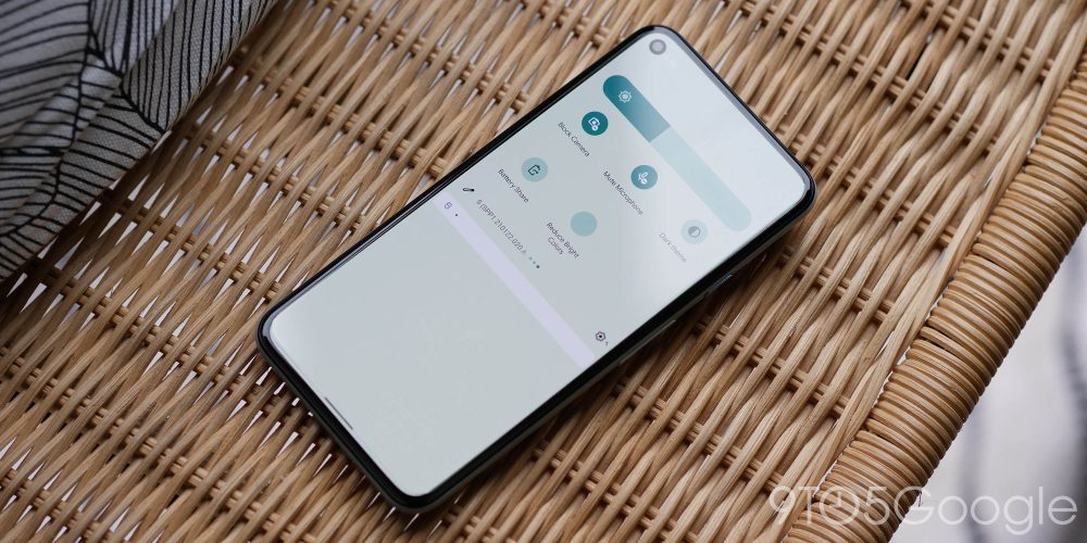
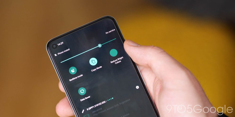
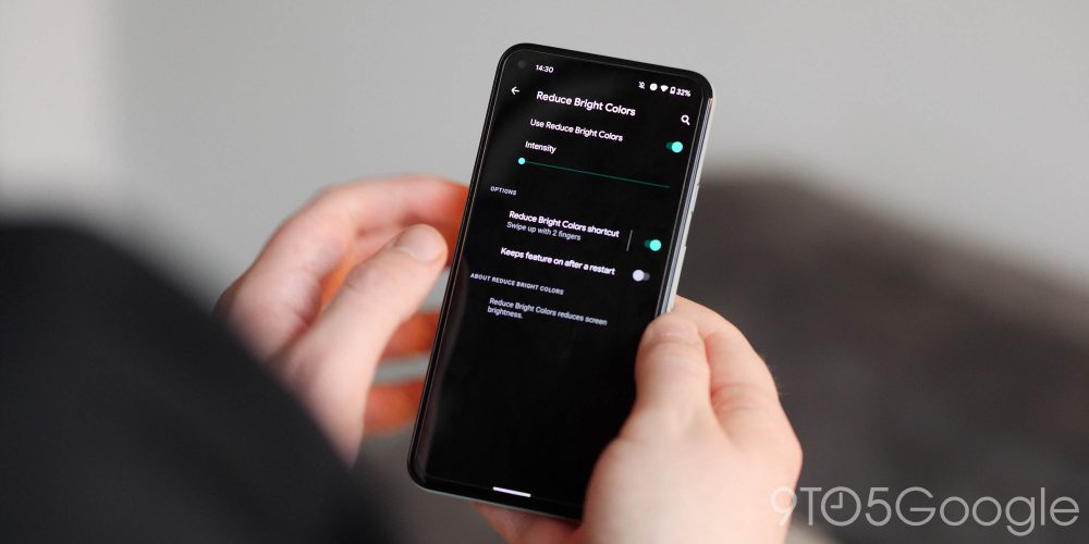
Live but unfinished in the first Android 12 Developer Preview, a new “Reduce Bright Colors” toggle appears in the quick settings options with a menu of further options on a long press. Think of this feature as a way to quickly lower your screen brightness by a specific amount or percentage. You can select anything from 0 to 100%, and it is another accessibility tweak designed with the visually impaired in mind.
As with many other accessibility options, you can quickly activate Reduce Bright Colors with a pre-assigned two-finger swipe up on the gesture navigation bar or by pressing the up-and-down volume buttons simultaneously — which can also be used for magnification
Display cutout
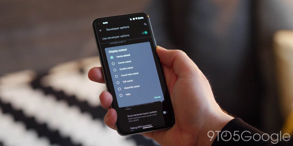
Only Made by Google device so far — the Pixel 3 XL — has had a notch, but the Pixel 4a, 4a 5G, and Pixel 5 include an upper-left punch-hole. If you hate having a portion of the display “missing” and have any device from the late-2020 Pixel cohort, then with the Android 12 Developer Preview 1 you can hide the punch-hole.
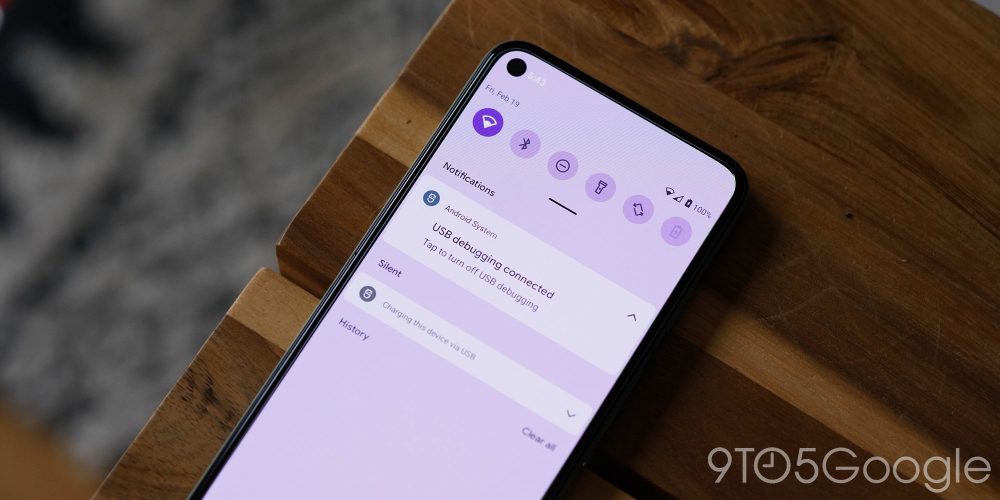
A new “Hide” option to the “Display cutout” menu available under “Drawing” — just a little over halfway down the screen — in “Developer options.” Enabling this simply adds a black bar to the status bar that attempts to hide the Pixel 4a, 4a 5G, and 5’s hole punch. The time, notifications, and other system icons remain in place with the new darker background.
It’s not without issue, though. Not many apps support the shifted status bar, and it can be a little jarring even in first-party apps like the Play Store. If the punch-hole annoys you that much, at least Android 12 looks like it will allow you to at least hide it in software.
Double-tap gesture
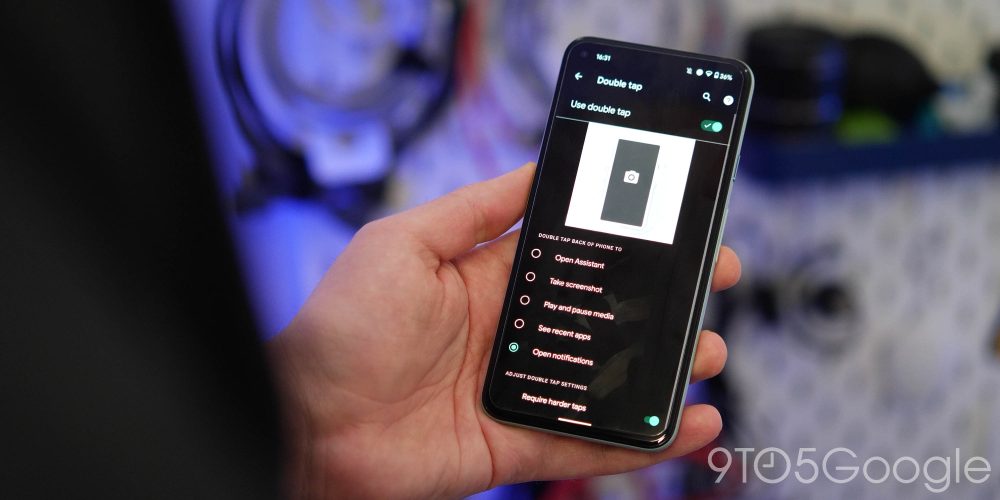
Can you remember the Columbus double-tap gesture that we unearthed over 18 months ago? Well, it looks like it is coming in Android 12 as the option to add the gesture is present in the Developer Preview 1. The downside? It doesn’t actually work just yet.
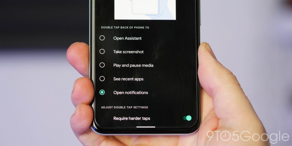
Provided you the Pixel 5, you can turn on the “Double tap” gesture within Settings > System > Gestures. While it doesn’t work just yet, you should be able to double tap the back of your device to do things like open the Google Assistant, take a screenshot, play and pause media, open the recent apps menu, and even fully expand your notification drawer.
At the moment, the option only looks as though it is available on the Pixel 5. This could be the replacement for the popular Active Edge gesture, which was removed starting on the Pixel 4a. That said, we do hope it does get activated in a future Developer Preview.
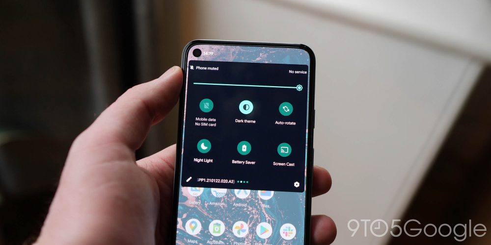
Dark theme tweaks
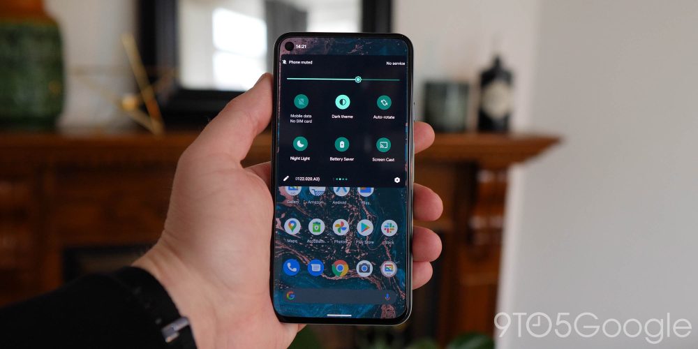
File this under “things Google removes or tweaks that annoy/frustrate the core fan or userbase.” For some strange reason, the Android 12 Developer Preview 1 build tweaks the AMOLED black dark theme to a deep blue-gray shade that, albeit fairly nice looking, isn’t exactly going to be a popular change.
If in a future build you’re able to make adjustments to the darker theme or select whether you want AMOLED black or a darker gray, that would be fine. The problem is that certain menus still haven’t been updated or changed, meaning that you might dive into the Settings menu and be greeted with an AMOLED-friendly color scheme, while at your homescreen, things have a slightly lighter tone. It’s a change that we’d wager nobody asked for, but Google appears to be bringing it anyway — shock.
Android 12 Developer Preview 1: What is your favorite new feature?
There are more than just surface-level changes in the Android 12 Developer Preview 1, but extended selection includes some features that might be developed further over the coming weeks and months. Naturally, we expect to see more little things that are hidden and slip through the cracks over the coming days and weeks.
What is your favorite new feature or features? Let us know down in the comments section below!
FTC: We use income earning auto affiliate links. More.



Comments