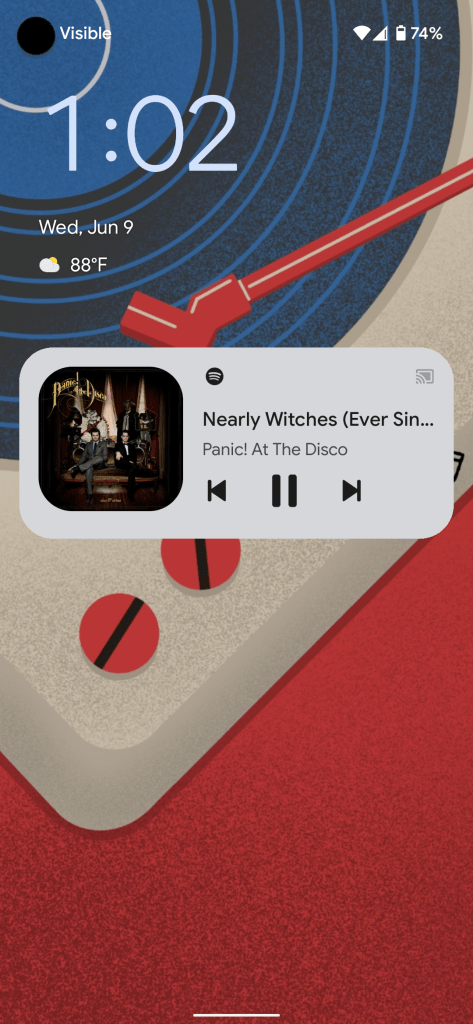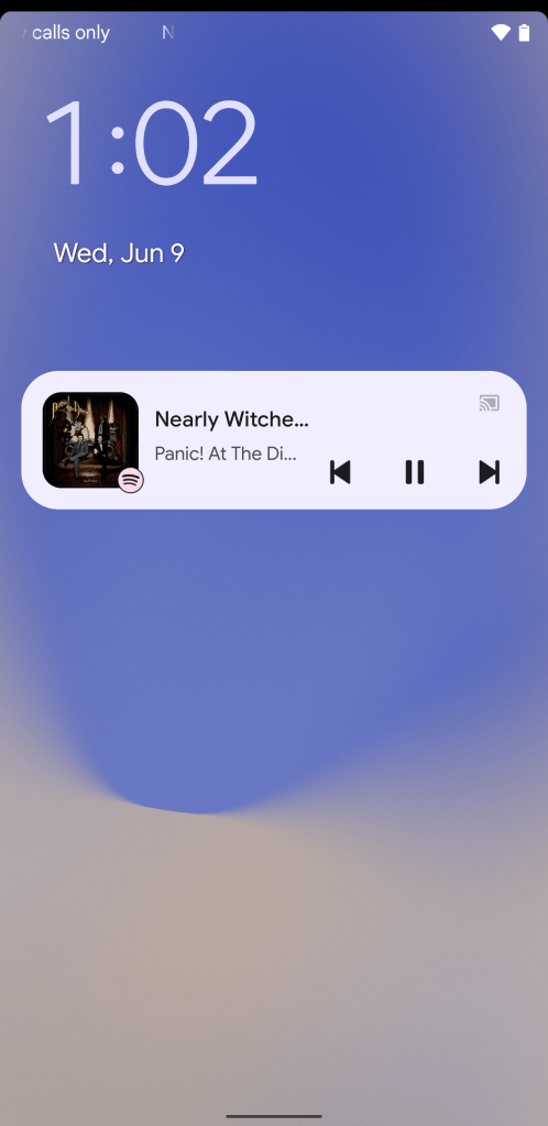
Android 12 Beta 2 has tweaked the media controls design, giving it a streamlined design that takes up less space on screen vertically and uses Material You colors.
With Android 11, Google moved the notification-based media controls out of the list of notifications and into its own separate area above that. This was part of a broader revamp for notifications to help make your notification shade easier to sift through to find what’s most important.
With today’s Android 12 Beta 2 update, the media player has been ever so slightly rearranged to help it take up less room. First, your music app’s logo is moved from its own line to being set in the corner of the album art. To help better distinguish the app’s logo, the usually black logo is now colored using your Material You color scheme, based on your wallpaper.
Next, the media controls themselves — previous, play/pause, skip — have been moved to the bottom-right corner instead of being on their own line. Between that move, and the shrinking of the album art, the media controls now take up a smaller amount of space, vertically.

Beta 1 
Beta 2
Unfortunately, this change isn’t without consequences, as there is now less horizontal room to display the song title and artist name, despite the fact that there’s now a blank space above the controls for at least the full song title to appear.
On expanding the Quick Settings area, you’ll see that the redesign carries through here, too, moving the app icon and shrinking the album art, allowing for it to also take up a smaller space.
FTC: We use income earning auto affiliate links. More.


Comments