
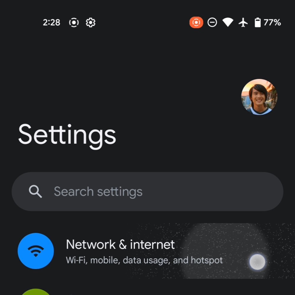
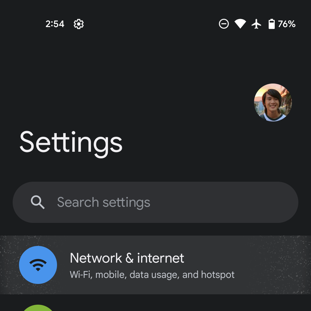
Following the first beta, Android 12 users immediately complained about how the ripple effect looked like a graphical bug. Google responded and promised updates, with Beta 3 today delivering a more subtle sparkle.
In Android 12 Beta 3, the ripple effect is still available but not as visible as before. The individual dots/sparkles are smaller and, therefore, less noticeable. It greatly reduces the scratchy nature that many assumed to be a visual bug and/or noise artifacts.
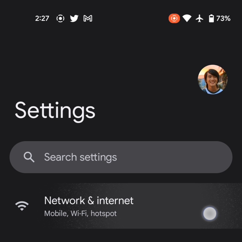
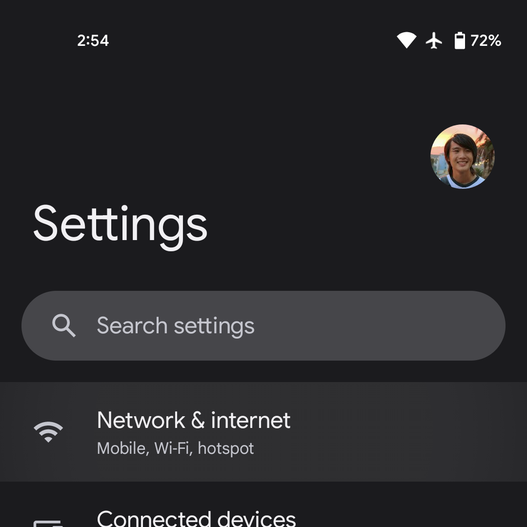
To really notice the reduced intensity, go to the Settings and hold down on a menu item. On Beta 2 and earlier, you still see sparkling at the left and right edges. This effect is completely gone in Beta 3, and you’re left with just a highlighted area.
At the start of June, Google promised that it would “make the ripple more subtle and less distracting/glitch-feeling.” This has been more or less accomplished with Beta 3, and Google was still able to (initially) retain the new visual language of Android 12 and Material You.
Following this Beta 3 change, what are your thoughts on the Android 12 ripple effect. Is it still too prominent and you’d like further reductions, or is it just right? What do you think compared to the Android 11 approach?
More about Android 12:
- Here’s everything new in Android 12 Beta 3 [Gallery]
- Android 12 Beta 3: Google may add a more obvious location indicator to match camera/mic
- Chrome gets a slick new link-sharing option from multi-tasking page
- You can now disable Google Assistant corner swipe activation
FTC: We use income earning auto affiliate links. More.


Comments