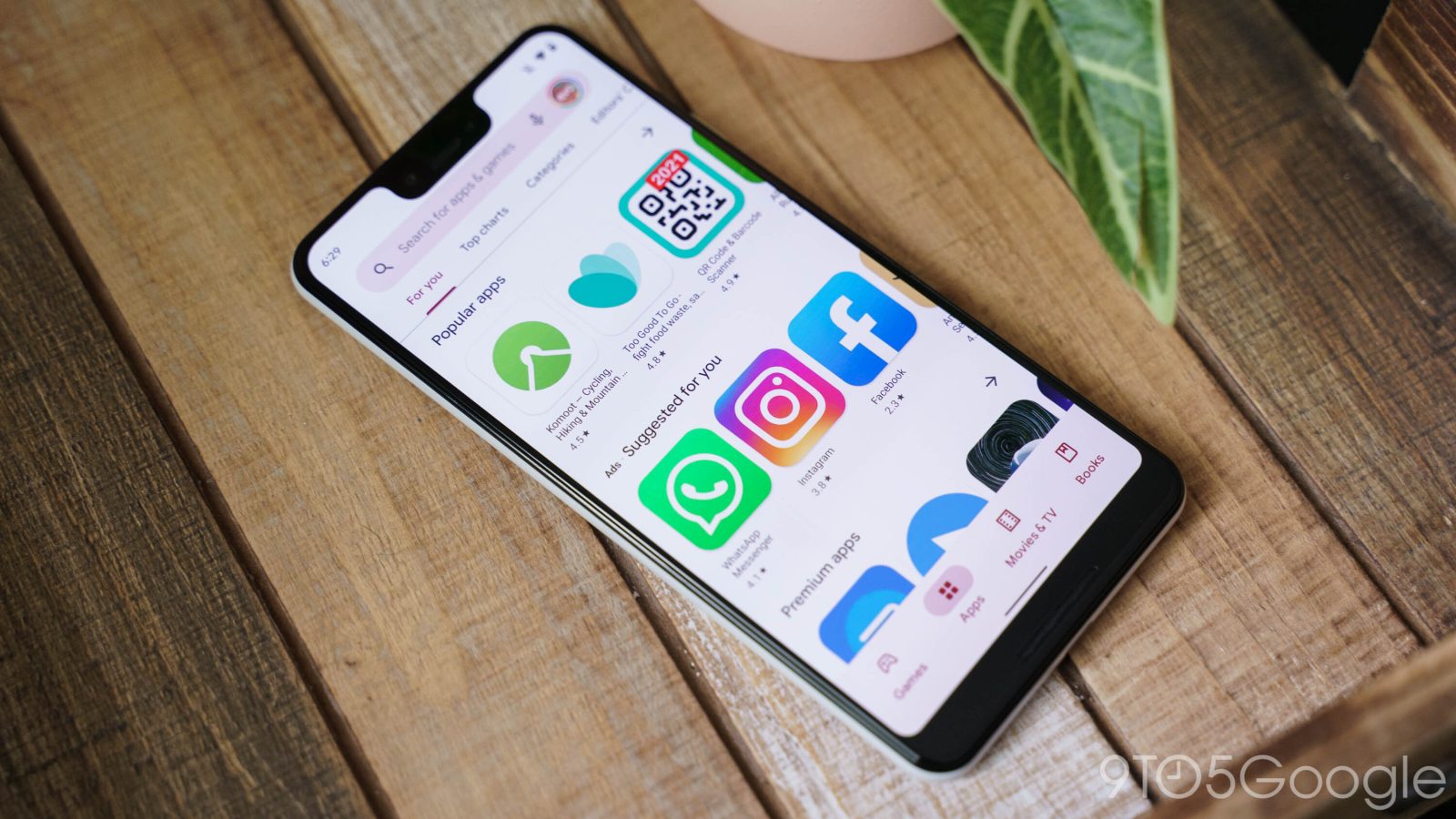
Google officially announced the Play Store’s Material Theme in August 2019, while a dark mode came that October. Since then, pages like “Manage apps & devices,” settings, and navigation have been significantly revamped. A Material You redesign with Dynamic Color is what’s next for the Google Play Store, and here’s an early look.
About APK Insight: In this “APK Insight” post, we’ve decompiled the latest version of an application that Google uploaded to the Play Store. When we decompile these files (called APKs, in the case of Android apps), we’re able to see various lines of code within that hint at possible future features. Keep in mind that Google may or may not ever ship these features, and our interpretation of what they are may be imperfect. We’ll try to enable those that are closer to being finished, however, to show you how they’ll look in case that they do ship. With that in mind, read on.
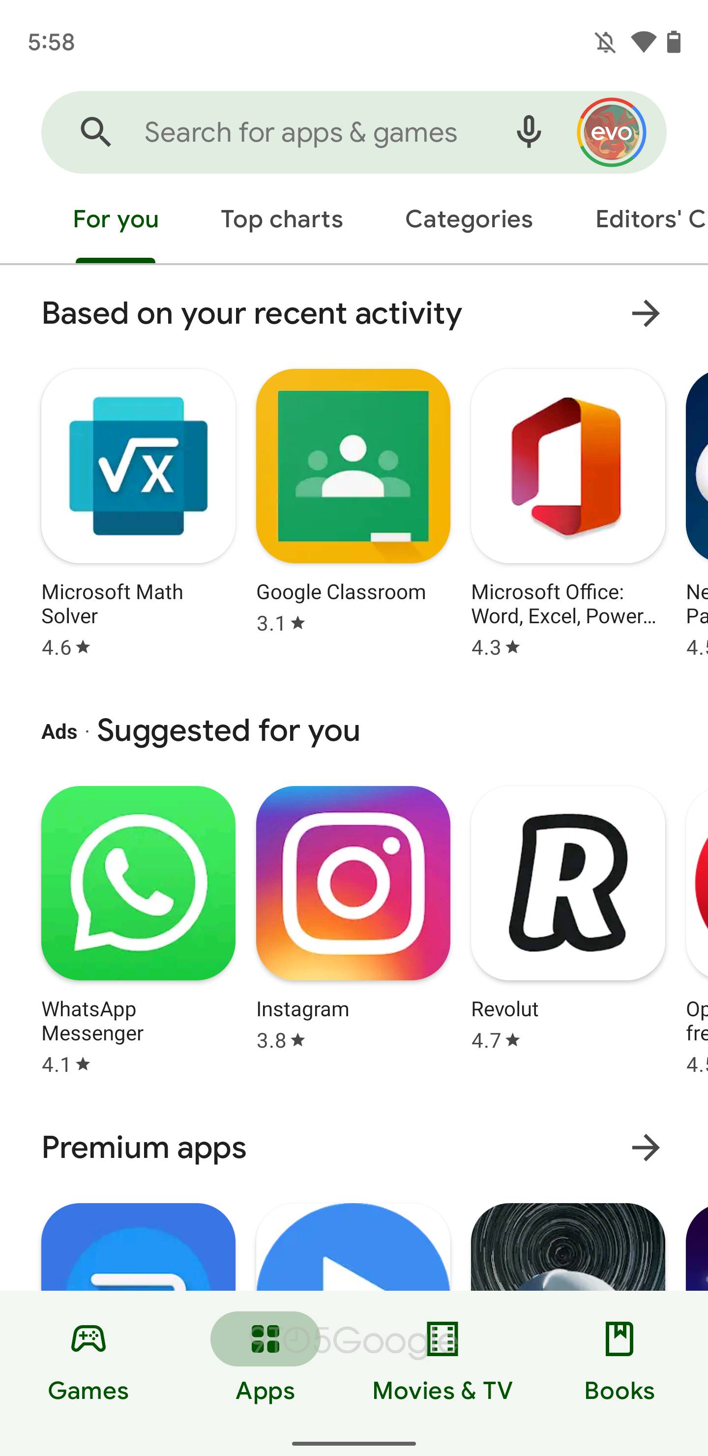
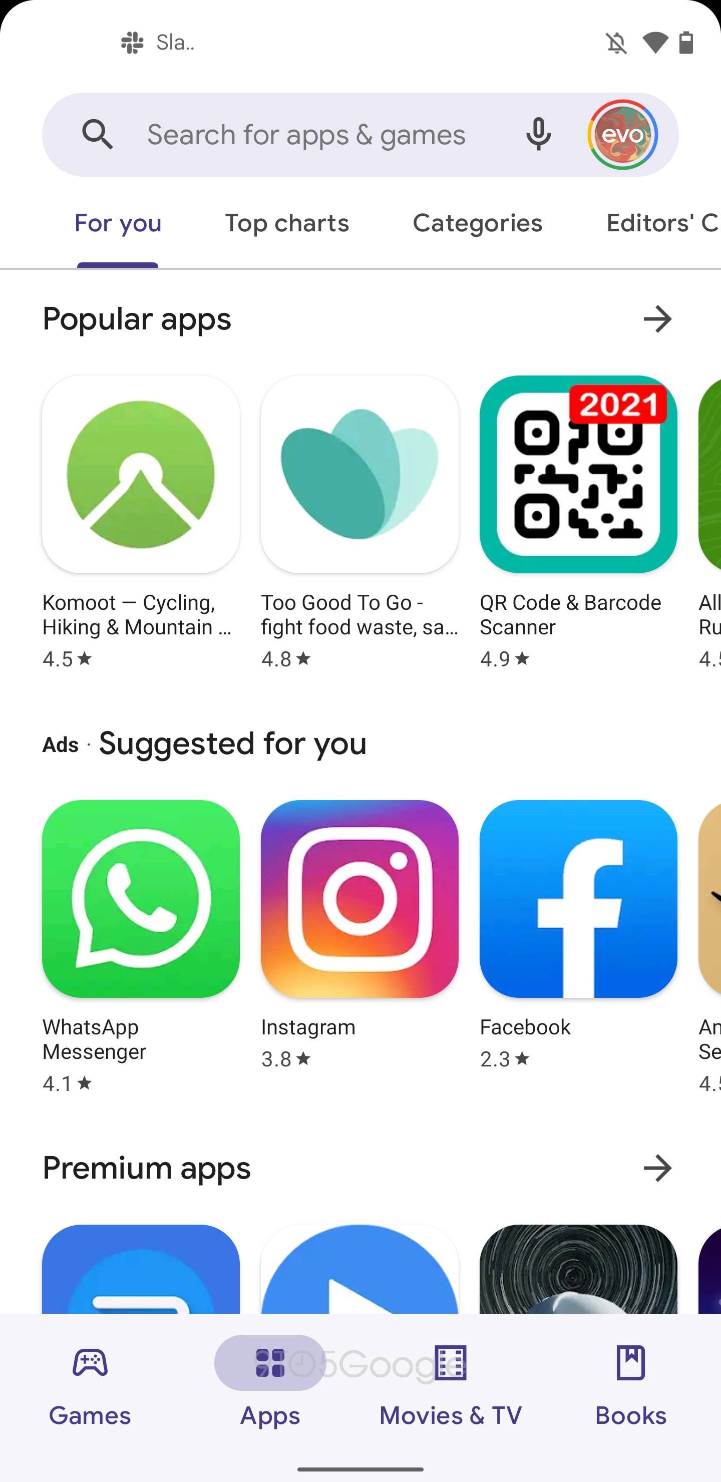
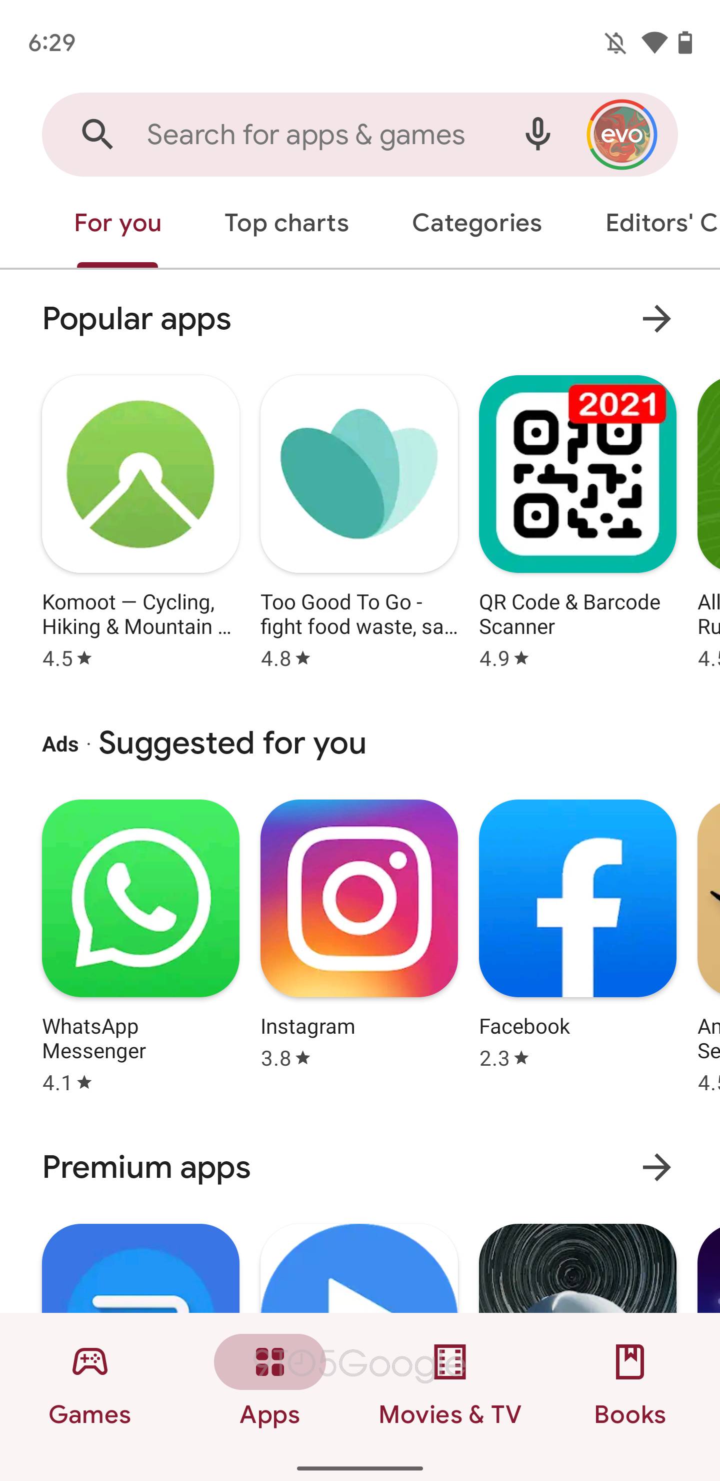
At the top, we see a pill-shaped search bar replacing the previous rectangle with slightly rounded corners. The circular profile avatar at the right fits much better this way. The bigger change, of course, is how the Play Store leverages Dynamic Color to tint that field.
That hue extends to the bottom bar, which is now much taller. Pills are leveraged to highlight — the icon, specifically — what tab you’re currently viewing. This appears to be a common convention in MY, as seen with the Files app. It’s all very tappable and touch-friendly, but the added size makes it seem slightly out of place.
At the moment, this is the extent of the Material You redesign, but we fully expect it to extend to every part of the Play Store. That said, this will raise interesting questions about how to theme app listings and the balance between MY’s Dynamic Color and allowing developers to customize their pages.
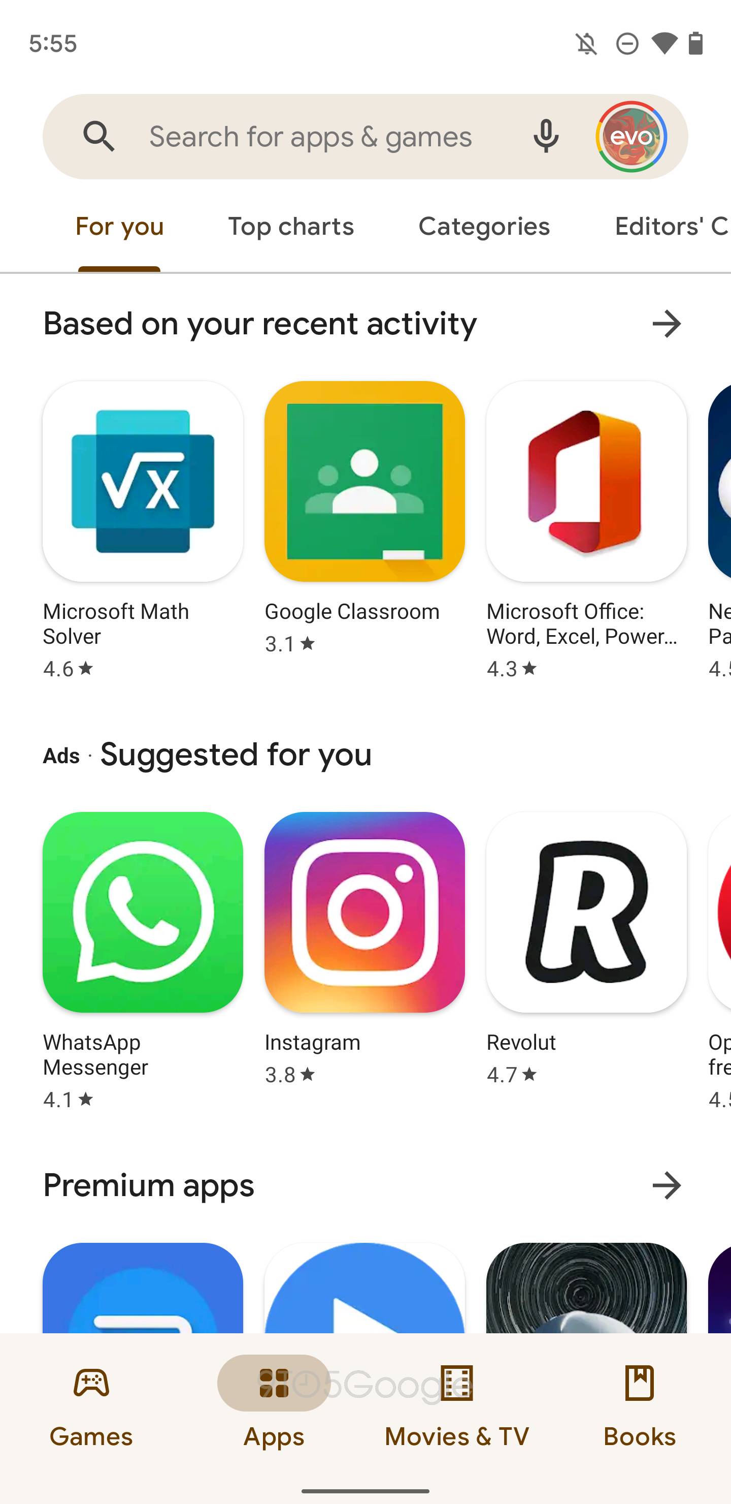
Another small feature we enabled is a “Google Play Store Feedback” menu in Settings. You’ll be able to “Periodically respond to surveys to help improve the Play Store experience.”
Meanwhile, the “Manage” tab adds a high-level tick box to select everything in a list for quick deletion and/or updates, as well as to get a storage total. It’s unclear when these trio of changes will go live, as the redesign still requires work.

More Material You:
- Gboard on Android 12 gets circular keypress ‘popups’ as latest Material You addition
- Pixel Live Wallpaper update enables Material You Dynamic Color theming on Android 12
- Pixel Launcher’s Google Discover feed now makes use of Material You Dynamic Color
- Google Contacts is the first big Material You redesign with Dynamic Color, UI tweaks [Updated]
Dylan Roussel contributed to this article
FTC: We use income earning auto affiliate links. More.

Comments