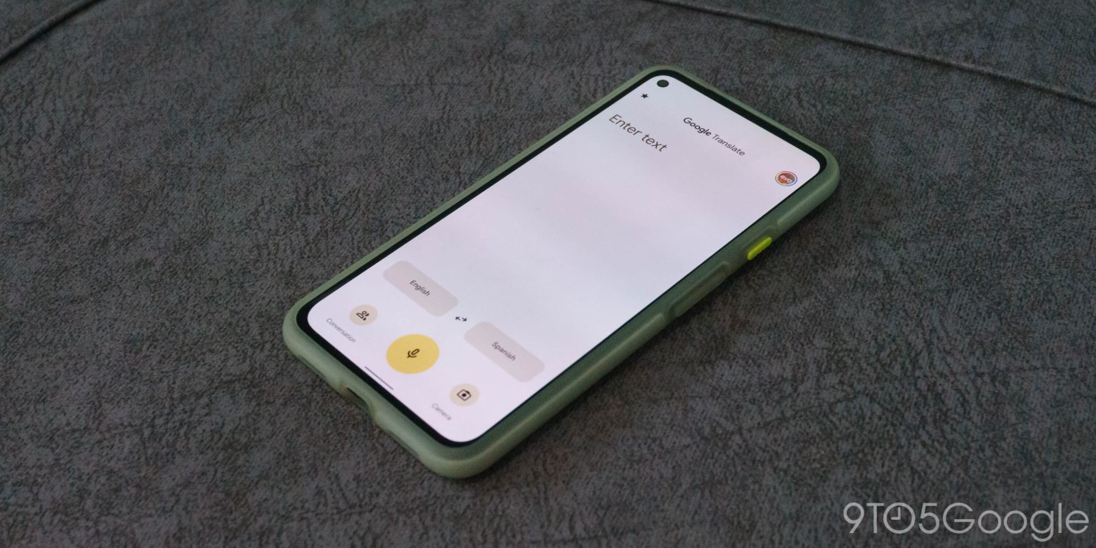
Ahead of Android 12’s launch later this year, our team has discovered that Google Translate has a Material You revamp in the works, it’s first major redesign in over five years — here’s an early look.
About APK Insight: In this “APK Insight” post, we’ve decompiled the latest version of an application that Google uploaded to the Play Store. When we decompile these files (called APKs, in the case of Android apps), we’re able to see various lines of code within that hint at possible future features. Keep in mind that Google may or may not ever ship these features, and our interpretation of what they are may be imperfect. We’ll try to enable those that are closer to being finished, however, to show you how they’ll look in the case that they do ship. With that in mind, read on.
Material You redesign preview
For years now, the Google Translate app on Android has been relatively stagnant in its design, favoring the older design patterns of the original Material Design, rather than the newer Google Material Theme. The most significant changes the app has seen in recent years are the addition of dark mode last year, and a few menu tweaks in 2018.
Even looking back as far as 2016, it’s easy to see that Google Translate has been relatively stagnant on Android for the last five years. By comparison, Google Translate’s web app got a proper Material Theme redesign back in 2018.
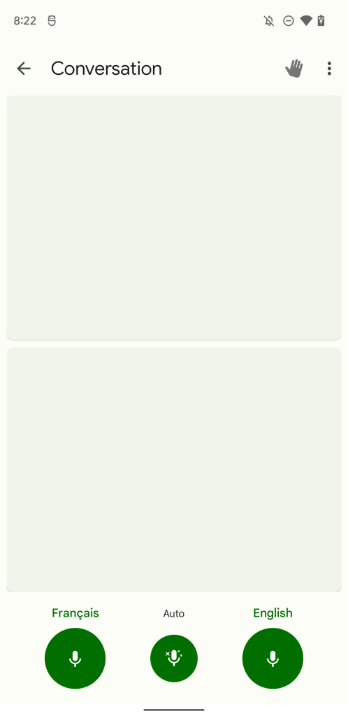
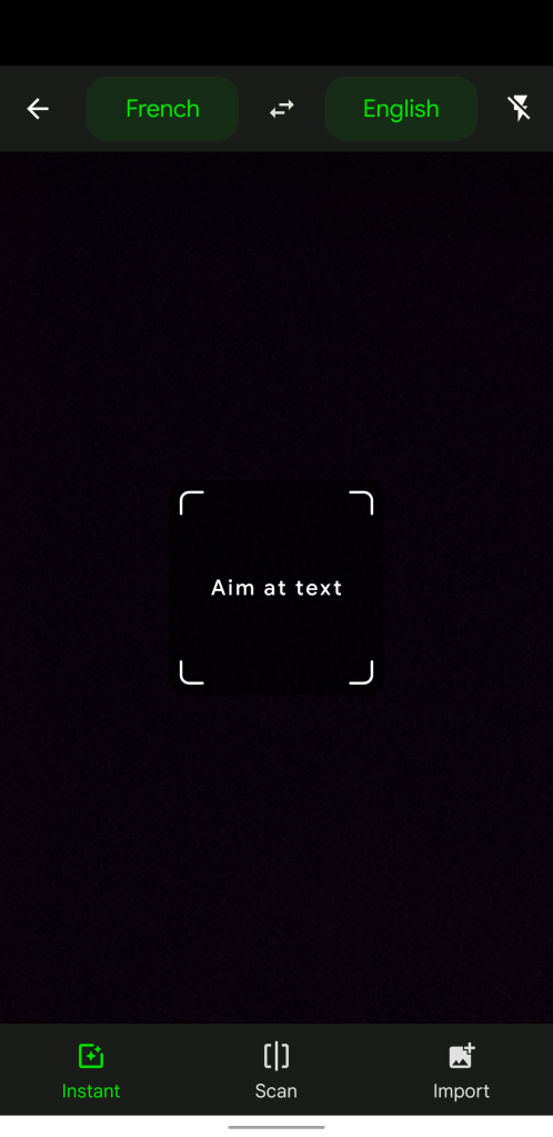
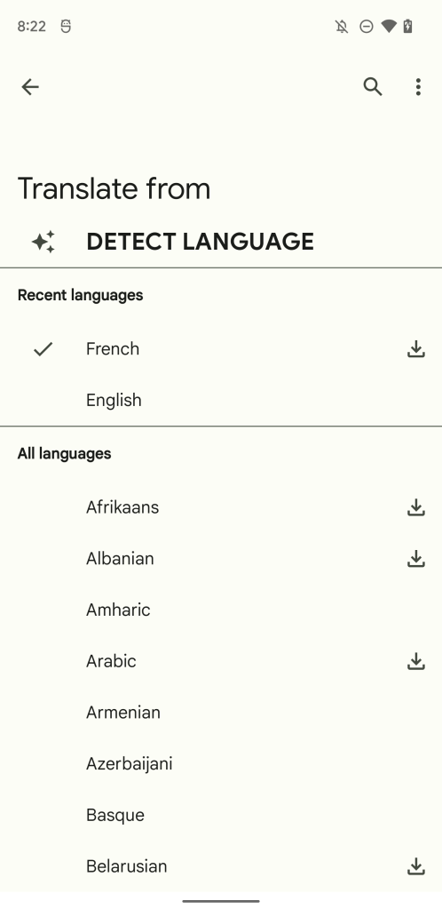
Inside of Google Translate version 6.23, rolling out now via the Play Store, our team noticed that work was being done to prepare the app for Material You, which Google often internally refers to as “GM3.” Our Dylan Roussel managed to enable the work-in-progress effort, revealing a major overhaul of Google Translate for Android.
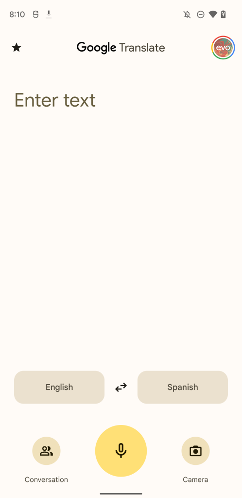
Most noticeably, the app has ditched its top-heavy, drawer-focused structure which has become gradually harder to navigate as phones have gotten taller. In the Material You redesign, things are now more bottom-aligned, putting more of Google Translate’s features within natural reach of your thumb.
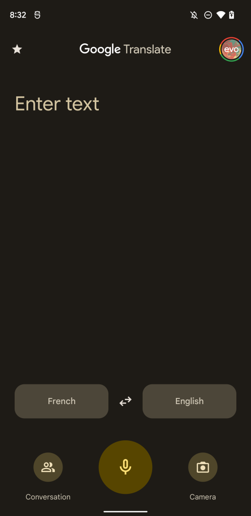
The three alternatives to simple textual translation — Camera, Conversation, and Transcribe — have moved to the bottom, with the app now putting larger emphasis on the microphone button for its transcription feature.
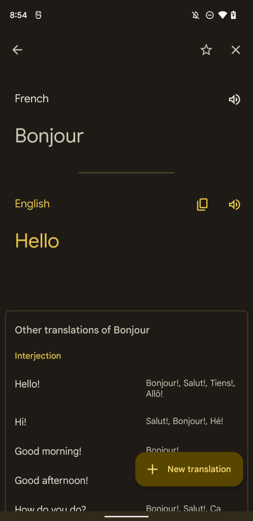
Additionally, as a whole, the app now respects your wallpaper’s colors, a hallmark of most of Google’s Material You apps. This dynamic theming continues into the language list and parts of the app’s settings.
As it’s still a work in progress, some aspects of the app are still untouched, such as the phrasebook and some settings and setup pages. Similarly, some parts of the app appear to currently be missing altogether, like the recent translation history. It’s possible we may be waiting for these to get properly redesigned before Google Translate’s take on Material You will release publicly. In the meantime, let us know what you think of the redesign down in the comments!
Thanks to JEB Decompiler, from which some APK Insight teardowns benefit.
Dylan Roussel contributed to this article.
More on Material You:
- Google Phone rolls out Material You redesign in beta
- Google rolling out Material You for Calendar, Drive, Docs, and other Workspace apps [Gallery]
- Google Calculator 8.0 brings Material You redesign [Gallery]
FTC: We use income earning auto affiliate links. More.


Comments