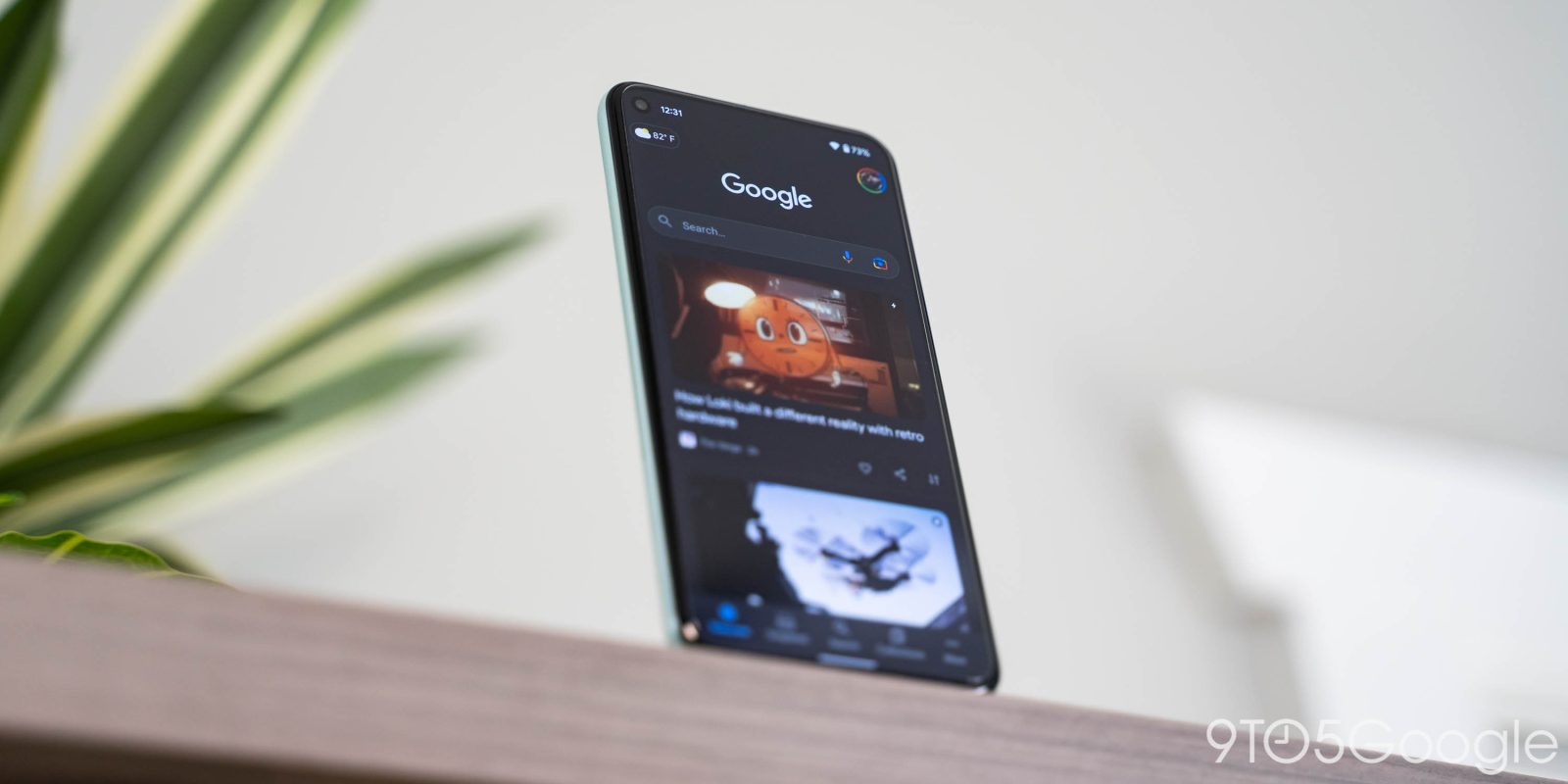
The Google app recently lost its “More” tab for a unified panel when opening the account switcher. That new settings menu can now be accessed in the Google Discover feed to the left of the Pixel Launcher.
The Pixel Launcher Discover feed, which was recently updated with a Dynamic Color “Google” logo, features an Assistant Snapshot shortcut and very large profile picture that notes whether you’re a Google One subscriber. Previously, tapping opened the aforementioned More tab, but that removal now results in a niftier shortcut.
You now get the exact same account switcher where menu items from “More” were moved. This includes Search history, Recent, and — very conveniently — “Reminders.” This is followed by Your data in Search, Settings, and Help & feedback.
With access to preferences and reminders here, there are fewer reasons for people to open the full Google app. Search can be done via the widget, and Snapshot (on Pixel) can be quickly accessed via the new Google Assistant design, though there’s still the revamped Collections tool.


It’s a small tweak that Google is highlighting with a blue pop-up message. We’re seeing this change rolled out with Google app 12.38, and it follows the More tab removal widely taking place this week on Android 12 devices.
More about Pixel Launcher:
- Android 12 Beta 5: ‘Device search’ now live in Pixel Launcher app drawer
- Google Lens gets a touch of Material You, Search widget & Pixel Launcher shortcut [U]
- Android 12 Beta 3: ‘Material You’ color options, themed icons arrive on Pixel Launcher
- Google Assistant ‘Live Space’ is a major ‘At a Glance’ upgrade for Android 12 and Material You
Dylan Roussel contributed to this article
FTC: We use income earning auto affiliate links. More.


Comments