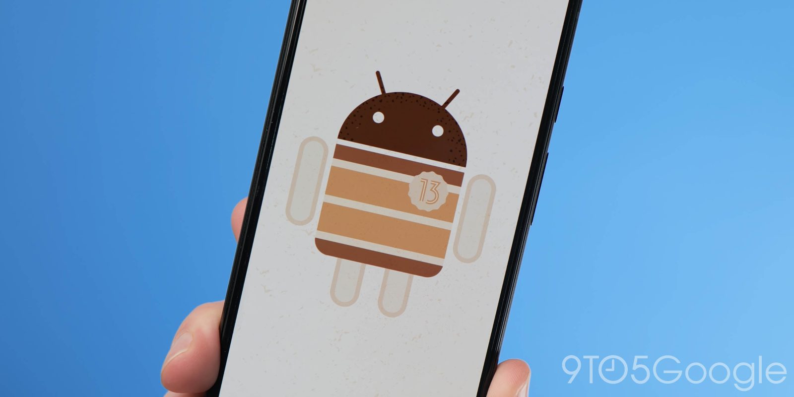
After the whirlwind launch of Android 13 Developer Preview 1, we have been diving even further into the first build of the upcoming OS to find some hidden gems and brand new features you might have missed.
While we have already done a deep dive into what we’d formally consider the top user-facing features, the Android 13 Developer Preview 1 also includes a ton of other additions that we didn’t initially spot, or were hidden within the OS behind and shell commands and not quite ready for primetime. It’s not uncommon to see many new features are coming to light — some of which could be game-changers.
And while many of these new features are to be excited by, there are a few that you won’t be able to get working or enable unless you know your way around adb commands and are happy to tinker away. Our disclaimer ahead of time is that we won’t be sharing some of these due to the buggy nature of many of the features that are clearly meant for internal usage. Luckily, evidence and previous years’ previews indicate that some may arrive in a future Developer Preview ahead of the full Android 13 release.
Table of contents
Video — Hands-on with more features in Android 13 Developer Preview 1
Subscribe to 9to5Google on YouTube for more videos
Lockscreen profile switcher
Android 13 is bolstering the multi-user experience with more tools to quickly create and manage more than one profile on your device. This could be due Google’s increased focus Android tablets, but it could be especially useful to parents or those wanting work and personal profiles on their devices. In Android 13, we’ve seen early work on a new UI that has an updated lockscreen profile switcher.
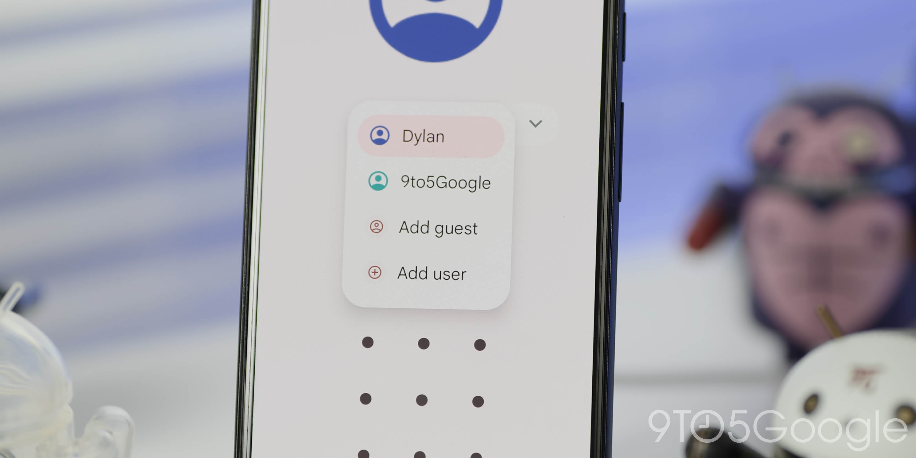
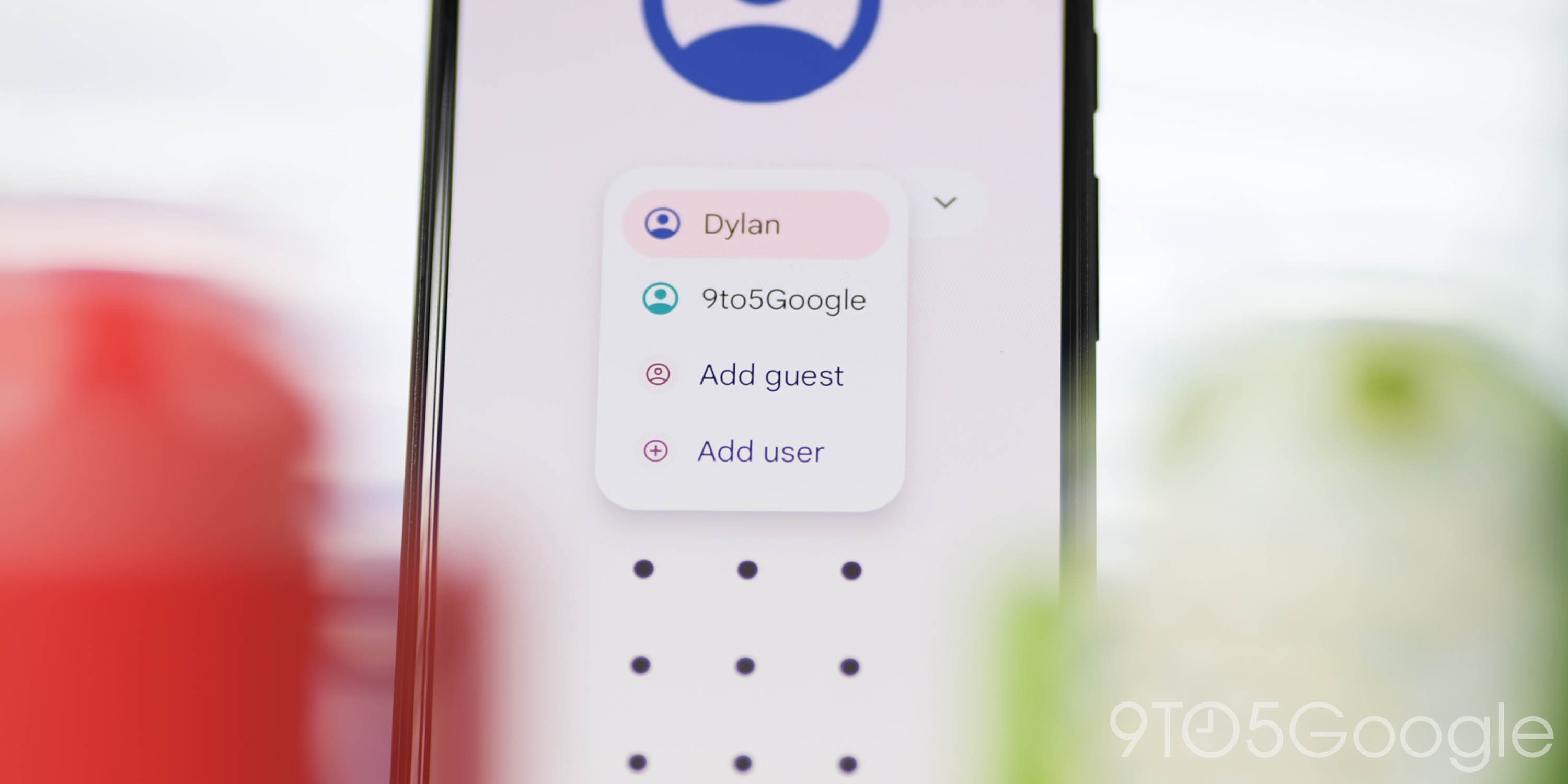
If you happen to have multiple profiles on a device and begin the unlock process, you’ll see a profile picture at the top of the screen with a name underneath. Clicking on the name will reveal a drop-down list with all other profiles you’ve created or exist on your device. This looks like it could streamline the process of quickly switching between accounts, but it’s easy to see that this feature is currently unfinished, with the arrow indicating the drop-down list sometimes not appearing correctly and not actually expanding the user list in some other cases.
Despite being buggy, this is certainly a welcome improvement as it’s far more prominent and obvious that you are able to switch profiles. By default, Android’s profile switcher on the lockscreen only shows a small icon at the top corner of the display, without any obvious indicator to show that the profile can be switched.
‘Tap to Transfer’
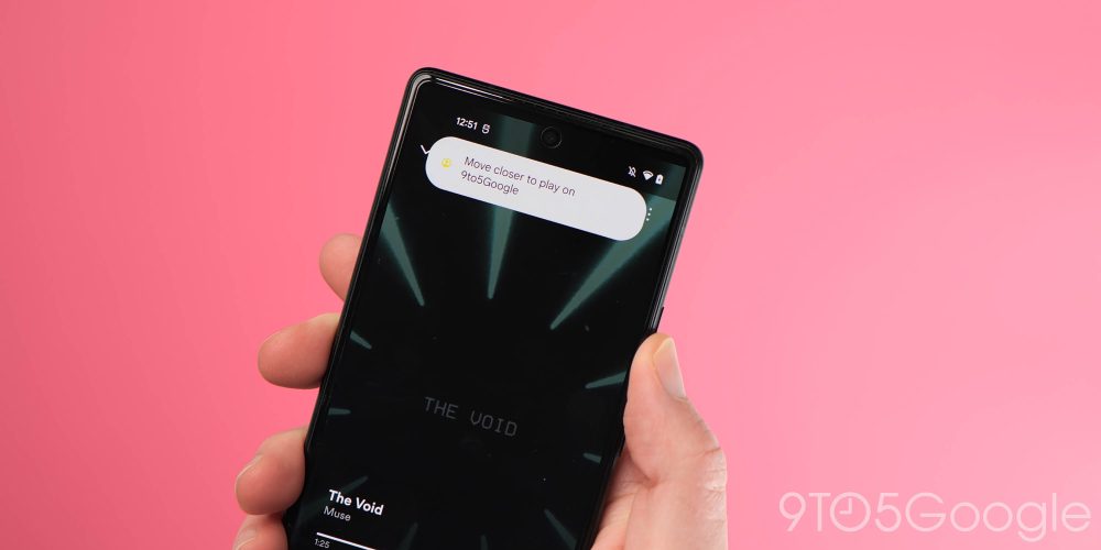
Another new addition it seems that we’ll see in Android 13 is called “Tap to Transfer.” This will allow you to switch playback or move audio between any compatible devices just by moving your phone or tablet closer. This mimics a feature that exists on iOS devices and allows you to quickly move playback to a HomePod speaker. It works seamlessly over on iOS and we’re interested to see how this feature works in practice within Android 13.
At this stage, we haven’t been able to test this feature out, but it could be an incredible way to quickly move audio and continue playback elsewhere. The “tap” naming implies it may rely on something like NFC to talk to speakers, while Apple uses UWB to accomplish this task. What’s even more interesting here is that Google’s current-generation speakers – such as the Nest Audio and Nest Mini – do not actually support either of those technologies.
App-by-app language selection
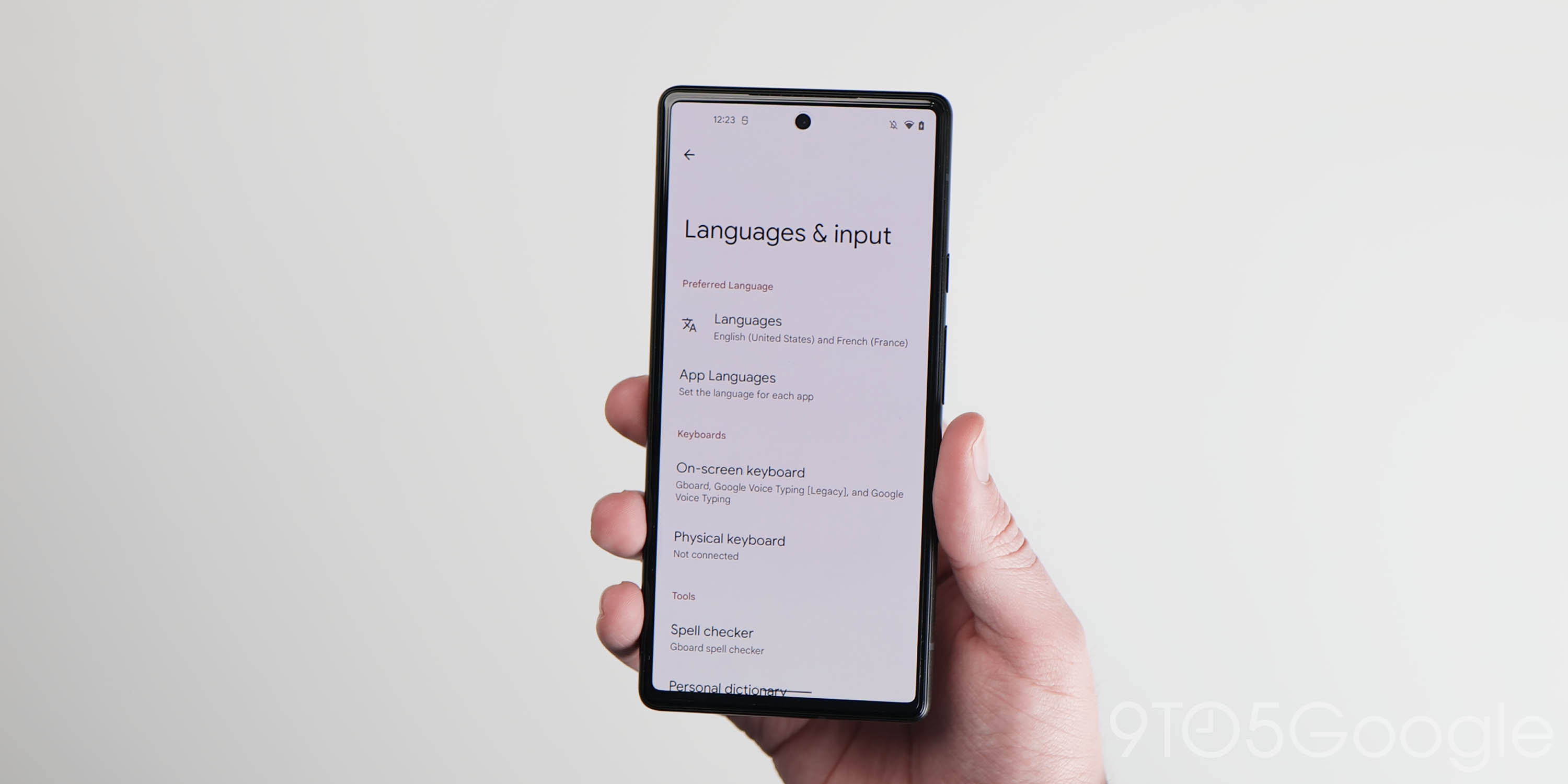
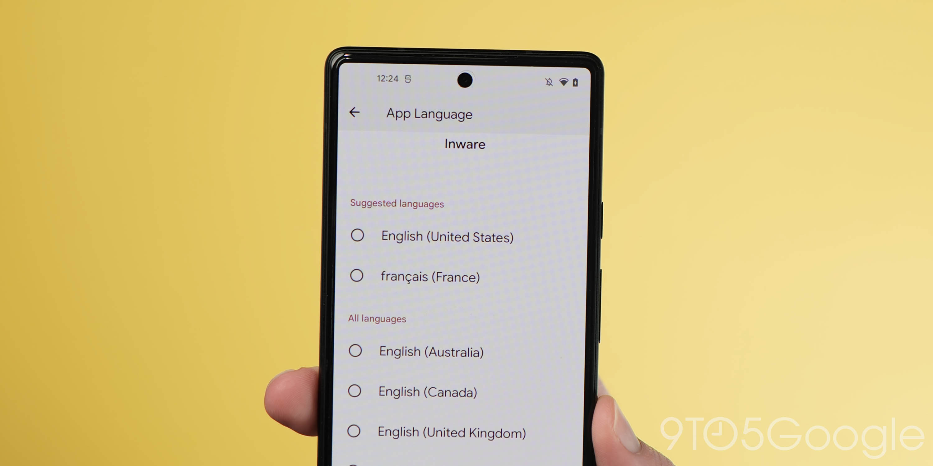
Another feature not yet live or even functional in Android 13 Developer Preview 1 is the app-by-app language control option. In an upcoming build, alongside your system language, you’ll be able to set the language of each app installed on your phone.
Of course, this is clearly designed for those that speak multiple languages or specific dialects in mind. While some apps may work best in English or another language, other apps may feel more native or prove to work better in a different language. At the moment, in Android 12 and older, almost all apps are forced the system-wide language selection, and so this new setting would make it easier on everyone – developers included – to support more than one language at a time.
More tablet and foldable-focused tweaks
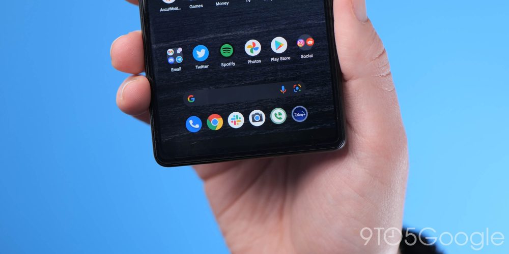
Android 12L is providing some noted and needed improvements for larger Android displays, but Android 13 is set to add a few more here to the default Pixel Launcher. Firstly, there is the new ability to have multiple homescreen layouts. This is likely to be added for foldable devices, which have an inner and outer display.
We can see this in action by changing the DPI on your own device from its default state to one that triggers the big-screen features introduced in 12L including the taskbar. When the detected screen DPI is smaller, your original Pixel Launcher layout sticks around; when the DPI is adjusted or increased, a new layout kicks in and appears. That would make sense given that most outer displays and smaller than inner, unfolded panels.
What’s more important here is that when removing an app or folder from the big-screen version it will still remain in place when we switch back to the original DPI and then back to the big-screen version, showing the layouts are remembered. It’s not perfect as there are bugs that see some apps return or randomly restore, but it’s a feature that mimics the Z Fold 3 and One UI’s current two layout implementation.
That’s not the only change we are expecting for larger displays in the upcoming build. It seems that the taskbar introduced in Android 12L is going to support six slots as of Android 13, which is an increase of one from the five slots available in the current Android 12L Beta release.
Google has made it so that you are forced to six app slots within the taskbar, and any removals will initiate an “app suggestion” from your recent app, or one that Android thinks you’ll use or like. You can turn off suggestions in the Pixel Launcher’s settings, which will leave those slots empty, but at present, the row itself shifted over. It looks as weird as it sounds, but it’s a new Android 13 feature that will likely get more attention as the previews progress.
Chrome OS streaming
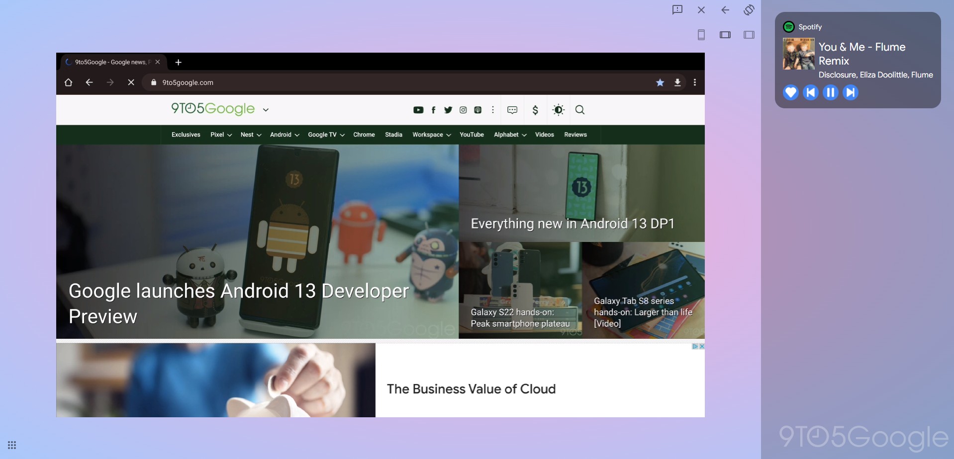
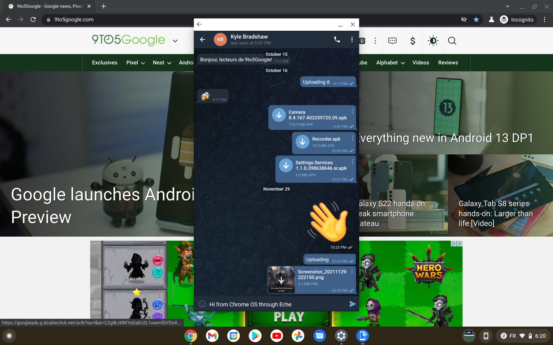
Directly tied to Android 13, a new “Cross Device” service will let you effectively stream your phone to a Chrome OS device. What we didn’t expect is exactly how it works.
Rather than simply mirroring your Pixel’s current screen, it seems Eche creates a second, virtual display for your phone. This second display is where your messaging apps will appear. This means you can have an app open on your Chromebook without disrupting any apps running on your phone’s main screen.
Within Android 13, it seems that this feature will be tailored more towards messaging apps rather than being aimed directly at “general” applications. Your Pixel generates an entirely separate virtual display, which is streamed to your laptop or desktop, rather than simply mirroring your phone’s portrait screen. This second display is where your messaging apps will appear. This means you can have an app open on your laptop/desktop without disrupting any apps running on your phone’s main screen.
Running Windows 11 on Android 13
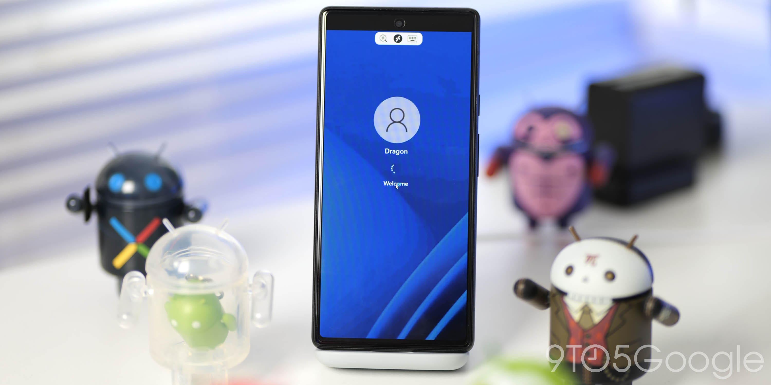
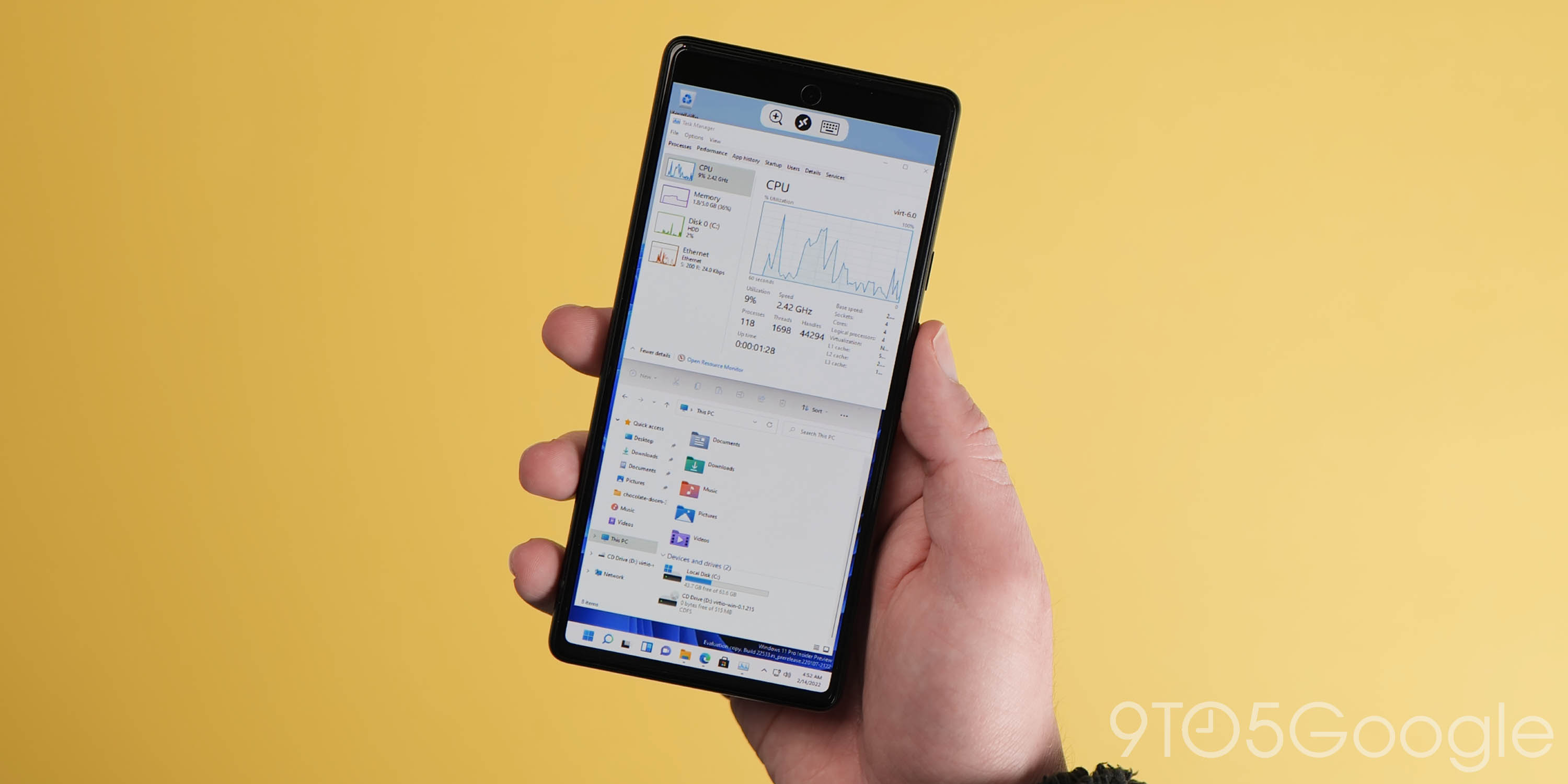
Yes, it appears that it’s actually possible to run Windows 11 on Pixel 6 using a virtual machine. Incredible, right? But how is this even possible? Well, Android 13 features better handling of virtualization and that is one of the core reasons that this is possible. The latest OS supports a common hypervisor in the form of KVM — a kernel-based virtual machine.
The short version is that this means more consistent experiences when creating virtual machines, more so than was possible in previous Android builds. Therefore, we’re at at this stage where Windows 11 virtual machines can run on Pixel 6 with impressive results. Danny Lin, the developer behind this impressive feat, even had Doom running on his Pixel 6 via the phone Windows VM, and it’s pretty glorious.
Android 13 Developer Preview 1: What is your favorite new feature?
There are more than just surface-level changes in the Android 13 Developer Preview 1, but the extended selection includes some features that might be developed further over the coming weeks and months. Naturally, we expect to see more little things that are hidden and slip through the cracks over the coming days and weeks.
What is your favorite new feature, or are you just happy to see things develop? Let us know down in the comments section below!
FTC: We use income earning auto affiliate links. More.


Comments