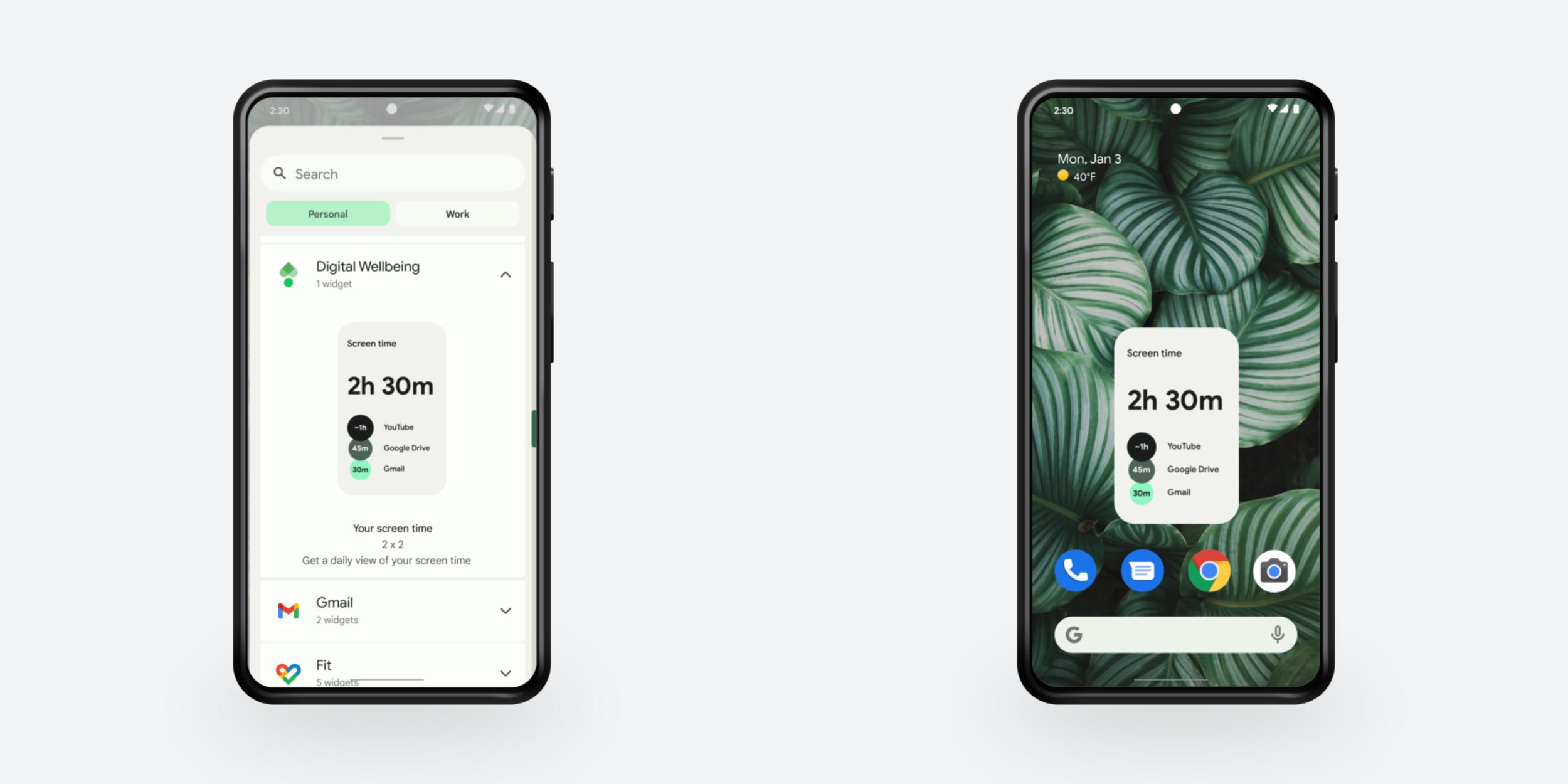
After years of stagnation, Android 12 brought renewed attention to widgets on the OS. Google introduced a number of new tools for developers and revamped its first-party offerings. With all these changes, are you using widgets more?
Looking at the landscape, iOS 14 a year earlier totally revamped widgets and that led to early calls for Google to do the same, especially since Android was first to introduce the concept in the early days of modern operating systems. For its part, many of Google’s iOS apps introduced widgets over the past year: YouTube Music, Google Photos, Fit, Calendar, Voice, Maps, Gmail, Search, Translate, and Drive.
With Android 12, Google set out to “improve the user and developer experience in the platform and launchers.” At a high-level, all widgets received rounded corners on the new OS version, while dynamic color is a common trait. Google also made it easier for users to edit/configure them, redesigned the widget picker with dynamic previews and descriptions, and introduced smooth launch/close transitions.
Redesigned Google widgets
Like how all major Google apps were redesigned with Material You, many first-party widgets were also revamped to fit the new design language:
| Material You | Status | |
| Calendar | Tweaks | Existing |
| Clock | Redesign | Existing + New |
| Digital Wellbeing | New | |
| Drive | Redesign | Existing + New |
| Gmail | Redesign | Existing |
| Fi | Tweaks | Existing |
| Play Books | Redesign | Existing |
| Keep | Redesign | Existing |
| Maps | New | |
| Battery | New | |
| Google Weather | New | |
| YouTube Music | Existing + New |
A handful of first-party apps/experiences received new widgets, but they weren’t really in the Material You redesign language. Chrome received a new “Shortcuts” bar and one that provides quick access to the offline “Chromium dino” game. There’s also the system Conversations widget and of course Google Photos.
Widgets in action
The visual consistency introduced by Material You and Android 12 of course does a great deal to modernize widgets and make them a coherent experience. Some were really quite old and had not been touched in years. That said, there are some complaints with Material You in general making everything larger and impacting information density.
Another factor is third-party adoption of widgets and whether developers heeded Google’s call to modernize. In that regard, there hasn’t really been a major widget push by other apps over the past few months that seem specific to Android 12. Some devs want more underlying widget functionality. Google itself has not updated everything. Some stragglers include Google Fit, News, Tasks, and Voice.
Of course, the real sign of the successful (or unsuccessful) push is whether you’re using more Android widgets:
FTC: We use income earning auto affiliate links. More.


Comments