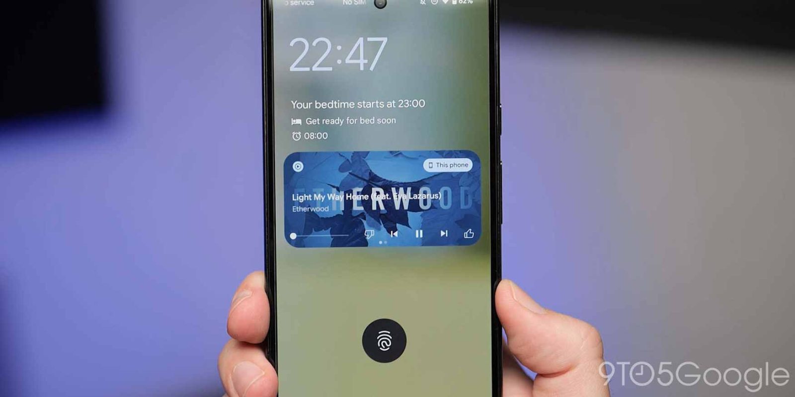
In recent days, YouTube Music has more widely rolled out support for Android 12’s media recommendations feature that prominently surfaces recent albums and playlists to start immediate playback.
Update 8/6: Media recommendations for YouTube Music and Spotify have been redesigned on Android 13 to reflect how the player is only available in one size.
Music services now get a color icon in the top-left corner, but there’s no app name. The biggest change is how you’re just offered three suggestions that are quite large given that the space for it is now taller. In terms of functionality, this is a step backwards and having six items was much better for variety.
Meanwhile, media recommendations are not widely rolled out on Android 13 compared to Android 12. It does not consistently appear and in one case only worked when paired to a car, but not headphones. This will presumably change when the OS hits stable.


Original 6/18: These media recommendations automatically appear after connecting an audio device, like headphones or other speaker systems, over Bluetooth. The app icon and name are in the top-left corner as you get three recently played works from YouTube Music toward the right. Opening Quick Settings gives you six in total, while the compact card can also show up on the lock screen.
A tap immediately starts playback in the background by switching you to Now Playing controls and keeping you in Quick Settings. These media recommendations will remain for a few minutes, and you can swipe to access them again, though they now appear after playback controls, and start a different track.
It’s visually reminiscent of the redesigned “Listen again” shelf and Material You widget. The recommendations can be disabled from Settings app > Sound & vibration > Media and toggling off “Show media recommendations.”


As of today, these YouTube Music recommendations are appearing pretty consistently after connecting headphones on Android 12 (Pixel 6 Pro on June security patch). They are showing up much more widely for Google’s streaming service than in the past, while some Spotify users have also seen them. The card will presumably appear in full height on Android 13, where we haven’t gotten it to work yet.
Update 6/23: In addition to specific works, media recommendations can also show a shuffle button — readability/visibility is pretty bad — and a shortcut to start your Offline mixtape (if downloaded).

More on YouTube Music:
- YouTube Music adds personalized ‘Recommended radios’ influenced by multiple artists]
- YouTube Music rolling out Spring Recap ’22 with playlist, shareable stats
- Comment: YouTube Music needs a more consistent UI, and carousel pinning is the answer
FTC: We use income earning auto affiliate links. More.


Comments