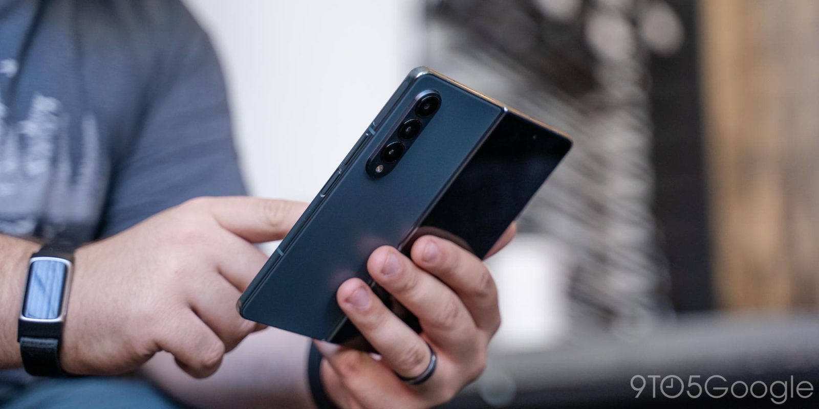
Foldables clearly have a big role in the future of smartphones, but to date, every model has come with compromises – whether those be on hardware or software. With the Galaxy Z Fold 4, Samsung has brought its hardware to a strong point, but it might just be the boost from Google’s Android 12L release that really makes this model shine.
Hardware & display
The butterfly effect
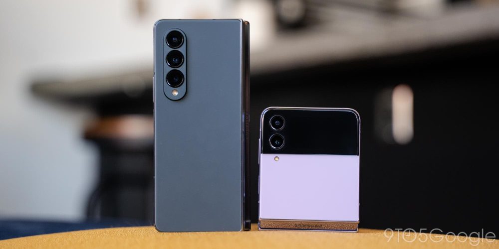
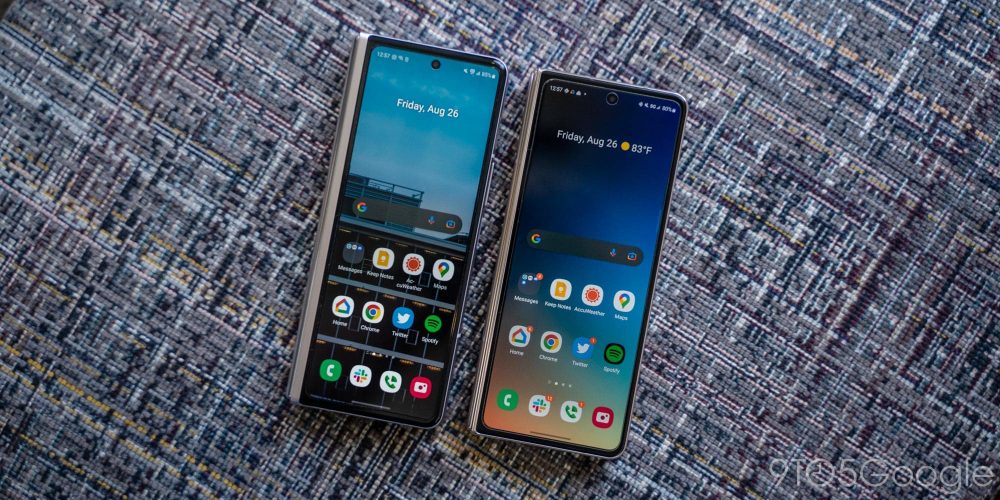
The Galaxy Z Fold 4 is a device that is incredibly similar to what came before it. At a glance, most people would be hard-pressed to tell the difference between the Galaxy Z Fold 3 and the Galaxy Z Fold 4. The two phones look virtually identical, but a bunch of small changes snowball into a much better experience on the whole.
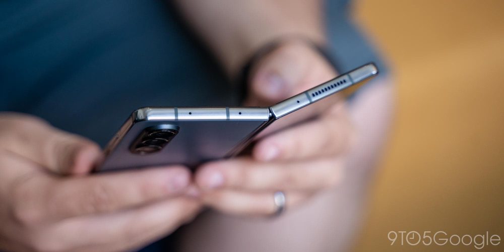
Perhaps the most important change here is in physical specs. The Galaxy Z Fold 4 is slightly thinner when it’s closed, slightly shorter, and noticeably lighter. After carrying the Galaxy Z Fold 3 and Galaxy Z Fold 2 over the last two years, I immediately noticed the difference in weight. The shorter design also helped the Fold 4 fit better in my pockets, and the thinner design when closed only further boosted that benefit.
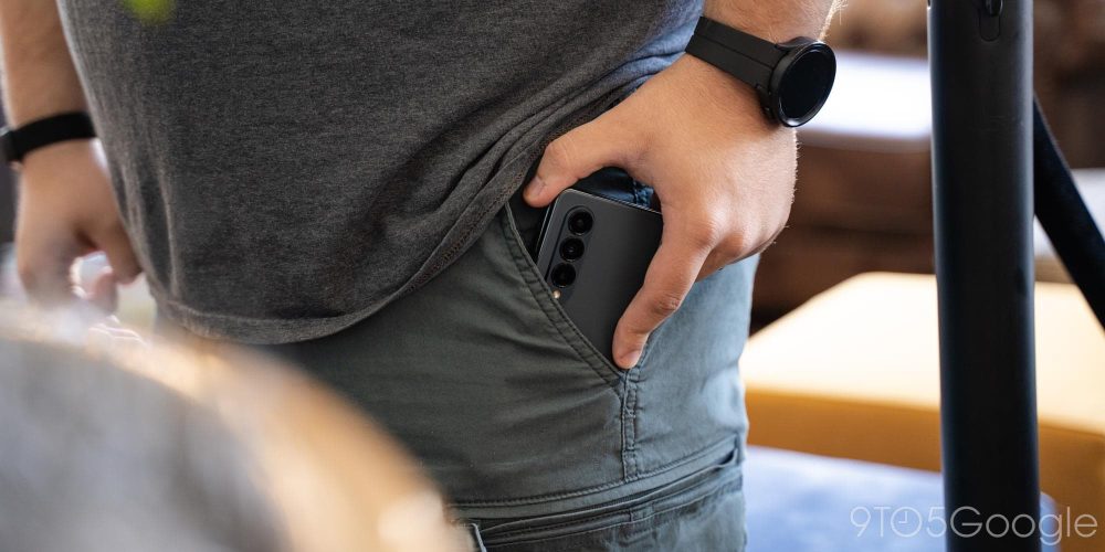
What might be even more important, though, are the changes to the displays. The Fold 4 slims down the side of its hinge, which in turn allows the outer display to take up more space on the front of the foldable when it’s closed. Combined with the purposeful change in aspect ratio, this leads to a display that’s wider and more comfortable to use on the whole. It’s not a drastic difference, as this phone is still much narrower than the average smartphone, but it’s certainly a big improvement.
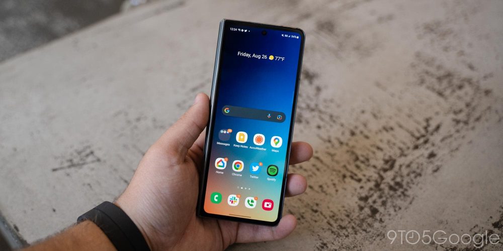
Personally, the narrow design of the Fold 3 and prior didn’t particularly bother me, and I actually rather liked it for one-handed usability. Nonetheless, it’s clear this is what most folks prefer, and it’s a welcome change in my book, especially because it improves app compatibility on the outer display and the typing experience.
The benefits of that also translate to the inner display, which is also now a little bit wider and better for multitasking.
The Fold 4 also adopts flatter edges along the metal chassis, which looks great, but hurts usability slightly. The Fold 3 was slightly curved along the edges, which made it easier to open when caseless, but the Fold 4 is just slightly more difficult to open up. It’s a marginal difference, but one of which I quickly felt the impact. The Fold 4 is just harder to open, because it has less to grip onto.
The way the hinge feels is also a contributing factor. It’s largely similar to past models but feels like it has even more resistance this time around. Part of that is surely that the device hasn’t fully worn in yet, but thinking back to a brand-new Fold 3, there’s a distinct “snap” to opening the Fold 4 that I don’t recall from the prior model. Still, that’s a minor change at best, and it’s the loss of weight and bulk of the hinge that matters considerably more.

Can we get some more exciting colors?
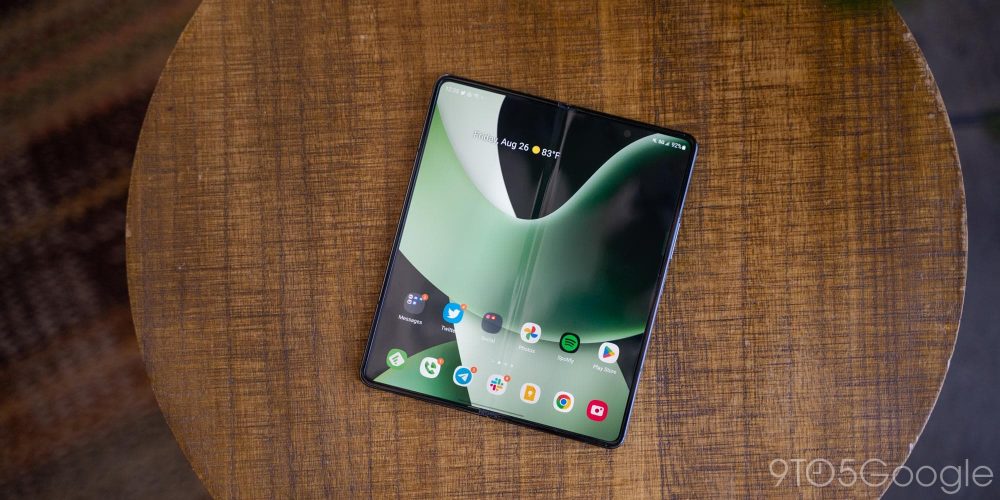
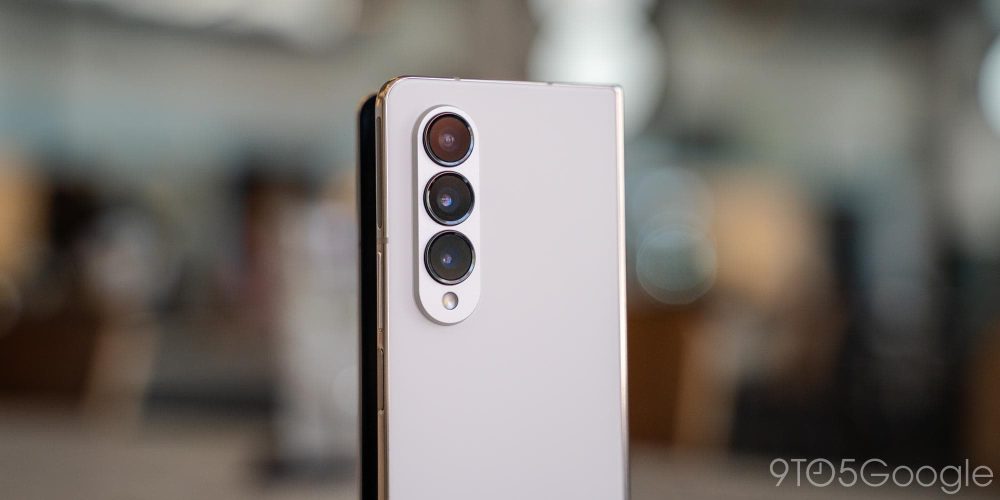
The Fold 4’s hardware is incredibly iterative overall, but one thing I couldn’t stop thinking about was just how boring it is on the whole. This is a super-expensive, super-futuristic folding phone, but until you open it up, it doesn’t stand out at all. The Fold 4 is available in four colors – black, gray/green (pictured throughout this review), beige/gold, and “burgundy.”
They all look good in person, and I stand by saying that the beige/gold model is the best one, but this is really a phone that falls on the same sword as a lot of flagship phones. It just isn’t very visually impressive.
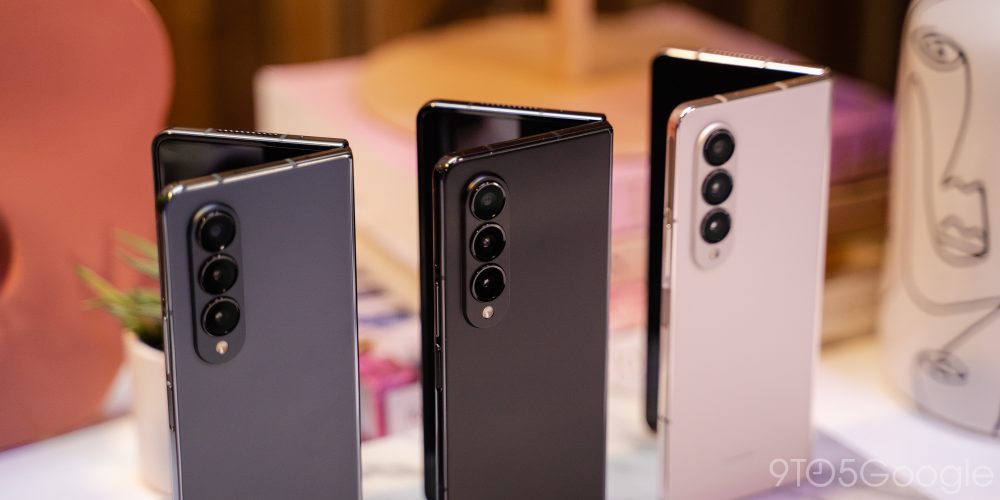
On one hand, that’s understandable. The vast majority of people will be using a case on their phones, but the Galaxy Fold line is an exception to some extent. Cases are still a tremendous challenge to get right on foldables, and personally I’ve always only used them when I go out. At home, the Fold is left naked because it’s just better to use that way.
As such, I just wish Samsung would take the opportunity to offer this phone in some actually nice colors. Bora Purple on the Galaxy Z Flip 4 and Galaxy S22 is wonderful, and the Flip even has a full “Bespoke” edition that includes fully customizable colors. But the Galaxy Z Fold 4 is just left with four good-looking but boring color options.
Same great display, less noticeable crease
Back on the inside of the Fold, though, let’s talk about the display. The 7.6-inch panel feels much bigger this year thanks to its wider aspect ratio, but otherwise it’s essentially the same screen throughout. There’s a slight boost to brightness at up to 1,200 nits, and sure enough I never once felt like the Fold was struggling to keep up with ambient lighting, indoors or out.
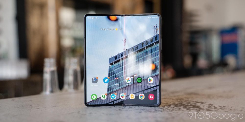
The bigger improvement that I felt was with the crease, which is much less noticeable this time around. The display crease is the effect of Samsung’s hinge design, which leaves the ultra-thin glass at a pretty tight radius. The radius hasn’t changed this year, but Samsung has made some changes, somehow, to make the crease less noticeable. It’s much less drastic this time around and I’ve noticed that I’m not constantly seeing reflections from overhead lighting as much as I was with the Fold 3.
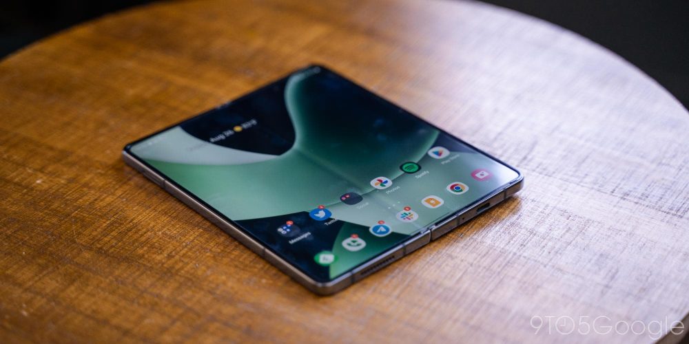
Now, that’s not to say Samsung has solved the crease. It’s still there, you’ll still see it, and you’ll still feel it under your finger or the S Pen. But as we’ve said in years past, in day-to-day usage, the crease just isn’t a big deal. It pretty much fades away when you’re looking straight at the display, and most of the time you won’t notice it unless you want to.
I will be very curious to see how the crease ages this year. Samsung is at a much better starting point, but will this look like the Fold 3’s crease a year from now? We’ll have to wait and see.
The inner display also has a better under-display camera setup this year. Where last year it took a few weeks of use to fully fade into the background for me, this year’s version is mostly invisible. You’ll see it if you look for it, but most of the time it’s just something you don’t think about at all.
Flex Mode is not as useful as it should be
Like the Galaxy Z Fold 2 and 3, the Fold 4 features “Flex Mode,” which is to say the hinge can “sit” at a specific angle of your choosing. This is a trick I’ve found tremendously useful on the Galaxy Z Flip line, but one that I’ve always thought is much less useful on the Fold.
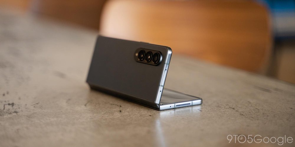
Why? It really just boils down to screen size. The Galaxy Z Fold 4 has a much bigger display than the Flip, but cutting it in half across the vertical axis makes each half less useful. Movies don’t very good on a narrow half of a display, and apps are still too big to make this particularly useful as a tiny “laptop” with the keyboard on the bottom half. With the Fold 3 and now the Fold 4, I’ve yet to find a genuinely useful way to use Flex Mode in my daily life beyond just having a tripod on hand at all times for the camera.
Flex Mode is a brilliant idea, but I think it depends heavily on the hardware. With the Fold, that hardware doesn’t serve it quite as nicely – if you’re a Fold owner, how do you use Flex Mode? Let us know in the comments!
No meaningful durability improvements
The Galaxy Z Fold 4 is Samsung’s fourth generation of foldable design, but it’s effectively still at the same level of durability as the prior generation. There’s water resistance, which offers great peace of mind, and Gorilla Glass Victus+ on the outer display and back panel, which should provide better scratch and shatter protection. And the “Armor Aluminum” frame is supposedly just as strong as Samsung’s traditional phones. But really, Samsung didn’t make any changes where it counts.
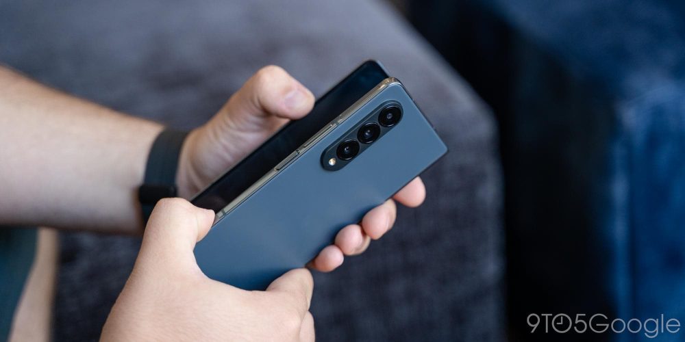
The biggest glaring flaw I personally still have with durability on the Galaxy Z Fold 4 is with dust resistance – there just isn’t any. There are brushes in the hinge that are supposed to keep dust out, but on my Fold 3, that didn’t work out particularly well. Dust slipped through during my first couple of months of use, and remained wedged in the hinge throughout the rest of the year, and is still there to this day, causing a little bump in the display itself.
But even more important than that is the durability of the ultra-thin glass over the display. Samsung has said it’s stronger this year, but hasn’t really explained the changes. And even now, just days after Fold 4s have arrived on doorsteps, the crease-crack problem has already surfaced. A crack along the crease certainly isn’t the norm for these phones, and defects definitely happen, but Samsung has yet to really address that problem in a big way. Surely, this can’t be the final form, right?
Plus, Samsung’s repair process is still one that’s very uneven. Let’s say your foldable cracks. Unless you live in a major city (i.e., NYC), you’ll probably have to ship the phone off for a few days for any repair, and that repair will be expensive if you don’t have Care+. While Samsung stripped the free year promo from Fold 4 and Flip 4 buyers in the US, I still can’t advocate enough for having some form of insurance on your foldable.
Software
Android 12L’s taskbar redefines the foldable experience
Samsung was once ridiculed for its software, but the past few years have changed the story entirely. And in 2022, I’m not sure anyone, even Google, could better create a software experience for foldables. But Google is the reason that the Fold 4’s software experience is so good.
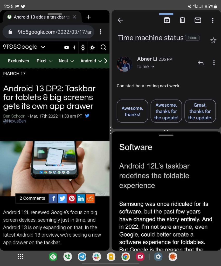
Looking first at One UI in general, Samsung’s Android skin does a lot to make foldables great. Multitasking allows for up to three apps on screen at once, and even more if you take advantage of pop-up floating windows. You can get an insane amount of work done on this screen, and it does genuinely come in handy. Plus, Samsung’s skin can force apps to use split-screen, and things usually don’t break.
Throughout my review period I’ve been able to use the multitasking features and the boosted screen real estate to join a call while also taking notes, and to have research up on one half while inputting data into another app. These are things I could technically do on other Android phones – it’s not like split-screen multitasking isn’t on every other smartphone on the planet, oh except for the ones from that fruit company – but with the Fold, it’s like holding two phones side by side. Apps don’t break just because I have two (or three) on screen at the same time.
But much of this has been true for the past three generations of the Fold.
What’s new this year is support for Android 12L, Google’s initiative to bolster the Android operating system on larger screens. On the Galaxy Z Fold 4, that’s felt with the taskbar, a bottom-mounted row of apps that you can quickly switch between, or drag into split-screen multitasking. It works wonderfully, and can easily be minimized by just long-pressing on the gesture bar. Samsung even slightly boosts Google’s implementation by adding an app drawer, something Google only natively supports on Android 13.
This one change made me completely rethink how I use my Fold, because it actively lets me get things done faster. Perhaps the only downside is how apps are fed into the taskbar. The bottom “dock” of the homescreen is the same list of apps that shows up in the taskbar, and there’s no way to change that currently. Personally, I wish there was a way to set a separate layout for this taskbar, or even a way to expand the number of recently used apps that show up – currently, there are only two recent apps on the bar.
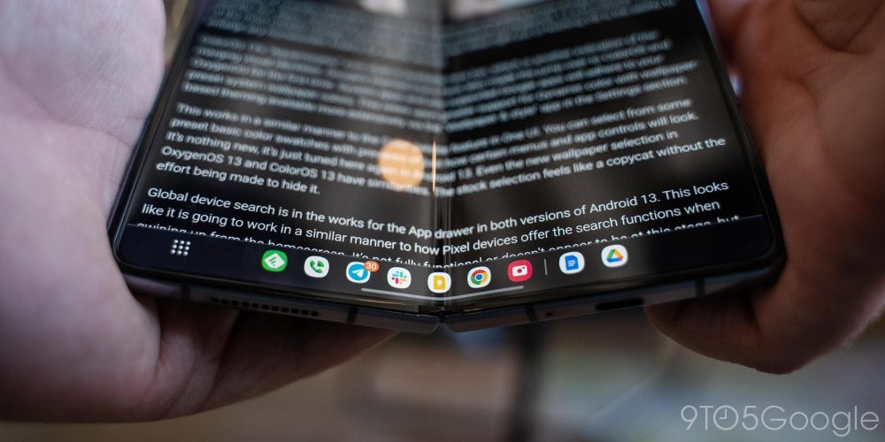
Now, to Samsung’s credit, last year’s Fold 3 also had a taskbar, but it was very much inferior to this version. It had to be toggled on from deep in the settings menu, screwed up other parts of the UI, and didn’t feel nearly as native as this. But it did allow for a fully custom list of apps. The new offering is clearly the better one, but there’s surely a balance to be found. Perhaps Google or Samsung will improve on that in future updates.
Notably, the taskbar on the Fold 4 will also be coming to at least the Fold 3, as we previously reported, and it’s probably a safe bet that the Fold 2 and Samsung’s tablets will also get it in the future.
Snapdragon 8+ Gen 1 absolutely flies
In terms of performance, the Galaxy Z Fold 4 is an absolute champ. Not once did the phone get caught up with apps, even if I threw games or multiple apps at it at once. The stutters I found in my review of the Fold 3 and continued to experience throughout my time with that phone are simply gone, and I know exactly why.
The Snapdragon 8+ Gen 1 under the hood of the Fold 4 (and the Galaxy Z Flip 4) is a huge boost compared to even phones running Qualcomm’s earlier Snapdragon 8 Gen 1 chip. It flies, it’s efficient, and it stays very cool. Even during North Carolina’s warm August weather, the Fold 4 was never especially warm, except for when it was running a hotspot while in my pocket for an extended period of time.
S Pen
Still mostly an afterthought
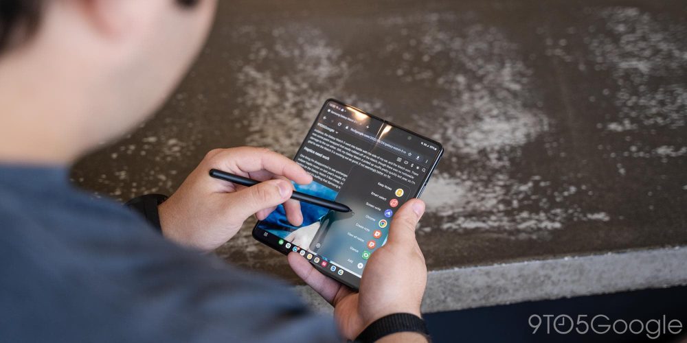
Last year, with the Galaxy Z Fold 3, we said that the S Pen was something useful, but not a core part of the device. That remains true this year, because nothing has really changed.
The S Pen still has all of the same great features, the same non-existent latency, and the ergonomic shape that comes from not having to squeeze it into the body of the phone. But it just isn’t all that central to the experience. I used the S Pen all of two or three times on the Galaxy Z Fold 4, and I have a feeling I’ll use it just as frequently over the next year. Don’t get me wrong, it comes in handy. The Fold 4 is always the device I pick up to sign digital documents or play Jackbox because I have the S Pen support, and it’s useful for some apps too. But because I don’t have it on hand 24/7, I only use it on those rare occasions.
Speaking of, let’s talk cases.
S Pen storage was a core problem with the Fold 3 experience, and it didn’t get much better throughout the year. This time around, Samsung has a new solution for an S Pen case, and it’s definitely an improvement! The “Standing Cover with Pen” is a dual-purpose case that has an S Pen storage slot on the back of the phone.
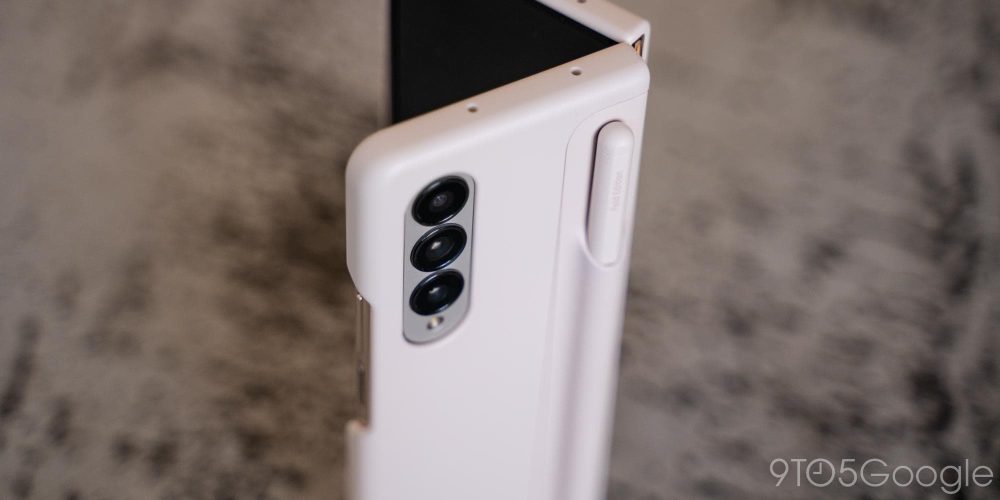
You can then detach the S Pen for easier access, or to insert another attachment that adds a kickstand. Removing them both also ensures wireless charging actually works It’s better! But at $90, it’s a high price to pay. Those who pre-ordered got it for free, but I’m not sure it’s worth that price tag on its own. Then again, an S Pen on its own is $50, and the one that comes with the case is color-matched to your device.
Battery life
Same capacity, far better endurance
The Galaxy Z Fold 3 had a 4,400 mAh battery, and the Fold 4 has the exact same capacity in its dual-battery setup. Yet, endurance on this phone is considerably better.
My use of the Fold 4 was generally around 60/40 with the inner display and the outer display, respectively, and consisted of mainly a lot of social media, email management, and messaging. Camera use was minimal during my week and a half of testing, just due to weather and my own schedule, and I did use the Fold for both cloud and local gaming.
Most days, I had zero problems getting the Fold through my entire day. 3.5-4.5 hours of screen time was my average over the course of the day, and I usually went to bed before the phone even hit 20% remaining capacity. That’s a huge improvement over the Fold 3, which often needed a boost around 7 p.m. to get through the rest of the evening.
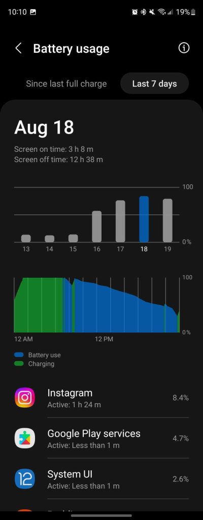
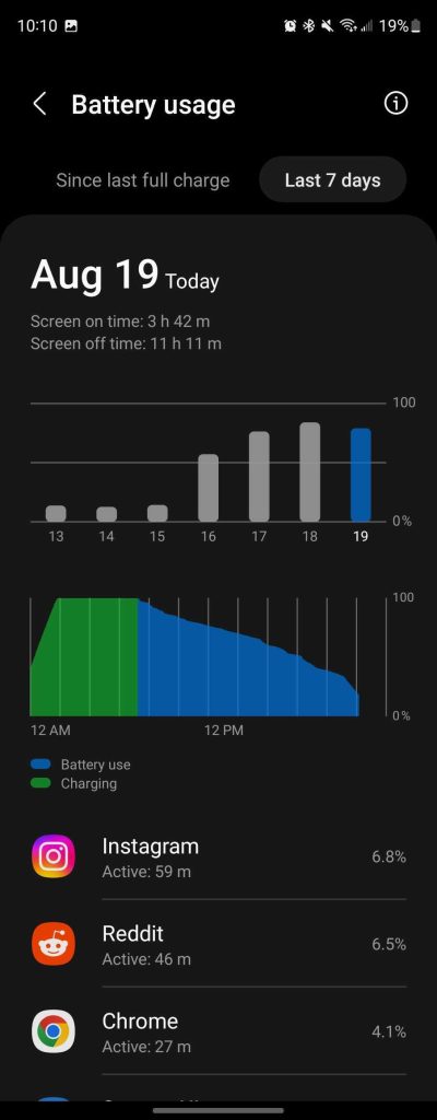
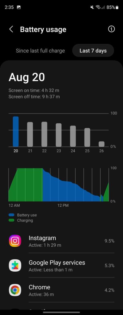
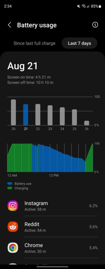
Is this a phone you can kill in a day? Absolutely, and it wouldn’t even be particularly hard. But under a reasonable workload, this phone should last all day. Some of the endurance gains come from a more efficient display, and just Samsung’s own tuning, but the boost I’ve seen is clearly coming primarily from the Snapdragon 8+ Gen 1. With the capacity unchanged, there’s just nowhere else most of these gains could be coming from. The Fold 4 is perhaps the best testament to date to just how good that chip is.
On the note of charging, not much has changed. The Fold 4 charges at 25W wired and 15W wirelessly. The Galaxy S22 Ultra technically tops Samsung’s list with 45W charging, but in actual use, they aren’t all that different. Faster charging would be appreciated, definitely, but the current state is absolutely good enough.
Cameras
Not quite flagship, but in the ballpark
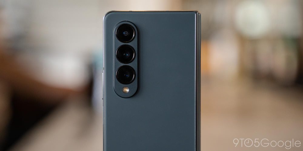
The Galaxy Z Fold 4, and foldables in general, still struggle to hold up to traditional smartphones when it comes to cameras. But Samsung is definitely giving it a big effort with the Galaxy Z Fold 4’s array.
At the helm is a 50MP primary camera, the same sensor from the Galaxy S22 and Galaxy S22+. And hey, it’s very good! Details are sharper compared to the Fold 3, and you can get some stunning shots with this camera.


But it also has the same problems as any Samsung camera. Processing is inconsistent, especially in low light, and any motion in the shot will generally turn into a blurry mess. My usual test subjects are my two dogs, Rey and Finn, who are tricky ones to get a good shot of, to say the least. Their black fur really puts contrast to the test, and Finn’s hyperactive nature makes shutter lag crucial. I’ve never been fully happy with shots of my pups taken with Samsung phones, and the Fold 4 doesn’t really break that streak. That said, in other conditions, the Fold 4 can take excellent pictures, and it’s a huge improvement over prior generations.
The two secondary cameras only bolster that already decent primary sensor. The 12MP ultrawide is unchanged from other Samsung phones, and takes decent shots with minimal distortion, but certainly suffers in low light. The 10MP telephoto lens is a better offering, boosting the Fold 4 up to 3x optical zoom and up to 30x digital “Space Zoom.” Both cameras are very capable most of the time, and the telephoto shooter is actually useful at 3x, where the 2x one last year was arguably not even worth including.


But there are two other cameras on this device. There’s a 10MP selfie camera on the outer display, and a 4MP under-display camera for the inner display. The outer selfie camera is fine, but genuinely nothing impressive. It takes pictures, and they’re often just fine. But nine times out of 10, it’s going to be better to unfold the display and use the rear cameras instead. Samsung even lets you preview your shot on the outer display.
The 4MP under-display camera remains mostly pointless, in my book. There’s some utility in the camera being there, definitely, and it actually makes a good case for Flex Mode, acting as a tripod for video calls. But the quality suffers considerably, and it’s a camera worth avoiding if you can help it. Samsung did improve the layer of display covering up that camera too, as mentioned previously.
Final thoughts
An excellent foldable that needs competition
The Galaxy Z Fold 4 is the peak of Samsung’s foldable success to date, without a doubt. It’s a device that builds on the successes and failures of everything that came before it. And frankly, there’s just no one that currently does it better. If you want a “book” foldable, the Galaxy Z Fold 4 is a great choice in every way. It’s fast, well built, and has excellent software to back up its solid hardware.
But it’s also a device that could really do with some actual competition.
The foldable market isn’t “new” anymore, but no one has really stood up to Samsung’s success. Most foldables that could compete with the Fold have been released exclusively in China, which means customers in the US probably won’t want them even if they find a way to buy them – Android phones specific to China tend to ship with drastically different software experiences than ones for Western markets, making them difficult to use even if you manage to get Google apps installed.
The Oppo Find N is the device I think best embodies Samsung’s competition. Compared to the Fold 3 it was up against at the time, it had a better outer display, no crease on the inner display, a better overall build, and much better cameras, too. Perhaps its only major downside, aside from not launching in global markets, was a complete lack of water and dust resistance.
If Samsung had to compete with the Find N, or options from the likes of Xiaomi and Vivo in a meaningful way, we wouldn’t be seeing such iterative changes in each generation of Samsung’s foldables. Right now, Samsung isn’t responding to the efforts of its competition, it’s solely acting on the bare minimum that makes these phones a viable option, not the actual progression of the market and form factor.
Plus, that means Samsung can keep charging an arm and a leg for these devices. The Galaxy Z Fold 4 has the same $1,799 price tag as its predecessor, but as the economies of scale pick up, it certainly feels like it’s time for the “early adopter tax” to start lessening, especially as “competing” devices are selling for considerably less.
Is it worth the upgrade?
But let’s say you’re already using a prior Galaxy Fold device. Is it worth paying up to get the Galaxy Z Fold 4? If you’re using a Galaxy Z Fold 3, it probably isn’t worth spending $800 or more to upgrade. Changes are iterative as mentioned, and the only big boosts are with battery life and the primary camera. Personally, I went ahead with my own trade-in with the hopes that the camera would mean the Fold could be my daily driver more often, but it was just barely worthwhile for me.
If you have an earlier generation, though, it’s hard not to recommend making the jump! During pre-orders, Samsung was still offering $1,000 for a Galaxy Z Fold 2 to move up to the Fold 4, and up to $925 for an original Fold. At those values, it’s definitely worth the jump if you can afford it. The Fold 4 is just a significant jump forward from either device. Trade-in values are sure to drop a bit following the formal launch, but if you can shave $800 or more off the cost of a Fold 4, I’d say go for it.
Where to buy Galaxy Z Fold 4
FTC: We use income earning auto affiliate links. More.


Comments