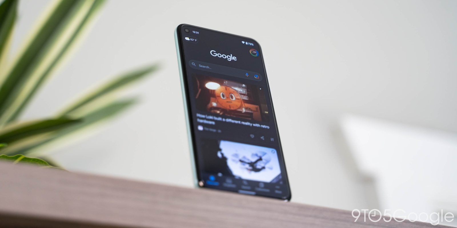
In a curious change, the Google Search app and Discover on Android no longer opens sites in fullscreen, but rather makes use of a sheet.
When opening a Search result or Discover article (both the Google app feed and to the left of Discover), websites now open in a sheet that shows a sliver of the current background.
When in Search, you either get the Google logo if you tap the first result or the field with your query as the background. This might be Google’s way of preserving navigation context and reminding people that there are more results.
Meanwhile, this web sheet is still a Chrome Custom Tab, with Google reminding you that it’s “Running Chrome” at the top until the page fully loads. You still get a close button at the very left, while share, save, and the overflow menu round things out. There is a pull tab at the very top that lets you swipe down to dismiss, while going the opposite direction extends the sheet so the background is hidden.
In terms of usability, you do lose some vertical space, but it’s not that impactful to the reading experience. Meanwhile, Google Search/Discover is smart about what opens in a sheet and what goes fullscreen. For example, an ESPN video automatically opened with previous behavior for a better viewing experience.
We’re encountering this change on a handful of Pixel phones running Google app 13.37, which is currently in beta. It’s unclear how widely rolled out this change is or whether it’s just an A/B test.
More on Google Search:
- Google hosting Search On 2022 later this month
- Search letting you find and shop for train tickets, buses also coming
- Google Lens for Android getting shortcut to launch Image Search
- Google Search tests letting you bookmark pages directly from mobile results
Thanks RKBDI!
FTC: We use income earning auto affiliate links. More.


Comments