The third episode of the Made by Google podcast interviews Isabelle Olsson — Senior Director, Design for Wearables, Nest, and CMF (Color, Material, and Finish) — about the design of the Pixel Watch, the glossy Nest Wifi Pro, and picking the Pixel 7 colors.
As mentioned during the keynote, the Made by Google design team adamantly believes that “round is the shape of time.” They wanted to “reference that deep history of analog watches that have lived with us for centuries.”
One new tidbit we learned is that “the final Pixel Watch that’s in stores now looks pretty similar to the first concept drawings.” Olsson explains how:
We always go through hundreds and hundreds of designs and iterations. But with the Pixel Watch, we had this original inspiration of a seamless form inspired by a water droplet.
…nature just knows how to make beautiful things. So why not be inspired by it? So that’s kind of where the idea started. And then we’ve evolved and refined it over time, but we definitely had many, many concepts, but this is the idea that stuck.
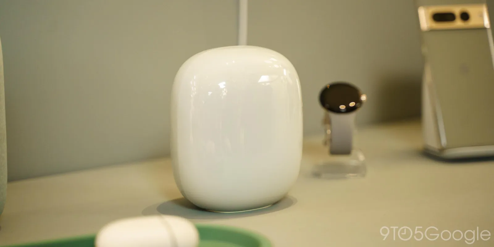
Moving on to the Nest Wifi Pro, the immediately noticeable glossy finish is intended to match ceramic/glass objects that people naturally place in the home.
We needed to create a form and a finish that people would be willing to put out next to their most treasured objects. Whether it be a vase from your grandma or a stack of books, or whatever you want to have out in the open.
And so we started to look at exactly those objects. What do people put out in the open? What do they want to have there? And we started seeing all these beautiful ceramic and glass objects.
So the original inspiration was this almost like glass sculpture and the glossy finish. We experimented with both, just to be transparent. The glass finish just really helped, or the glossy finish, I should say really helped highlight that form and make it look like something that you wouldn’t expect from a tech product.
Another interesting tidbit we learn is how the colors Google uses are often developed 2-3 years in advance. The process involves keeping “fingers on the pulse” of culture, fashion, sportswear, and more, as well as speaking to users.
We always try to make sure we have a light neutral, a dark neutral, a warm pop, and a cool pop. And obviously if it was up to me, we would have, you know, hundreds of color choices, but at the end of the day, that’s not especially practical. And it could lead you to kind of that decision paralysis as well. So we’re trying to be really thoughtful about how many colors, what they are.
For Lemongrass and Hazel for the Pixel 7 series, Google explains how:
Many of these products were designed during the pandemic. We had to kind of lean into thinking about what do people need on this moment in time or coming out of this moment.
And so we wanted to create both a color that was soothing and then also color that was uplifting because I think we need to live in these both worlds. We need to take care of ourselves, but we also need to find that optimism for the future.
And so that’s why we decided to have two different hero colors for the year, and greens tend to be universally soothing but also bring that energy and connection to nature.
More on Nest Wifi:
- What’s new in September’s 22Q2 Nest and Google Wifi update
- Comment: The biggest problem Nest Wifi Pro needs to address is longevity
- Nest Wifi Pro puts Wi-Fi 6E throughout your home with ease; pre-orders now open
FTC: We use income earning auto affiliate links. More.

Comments